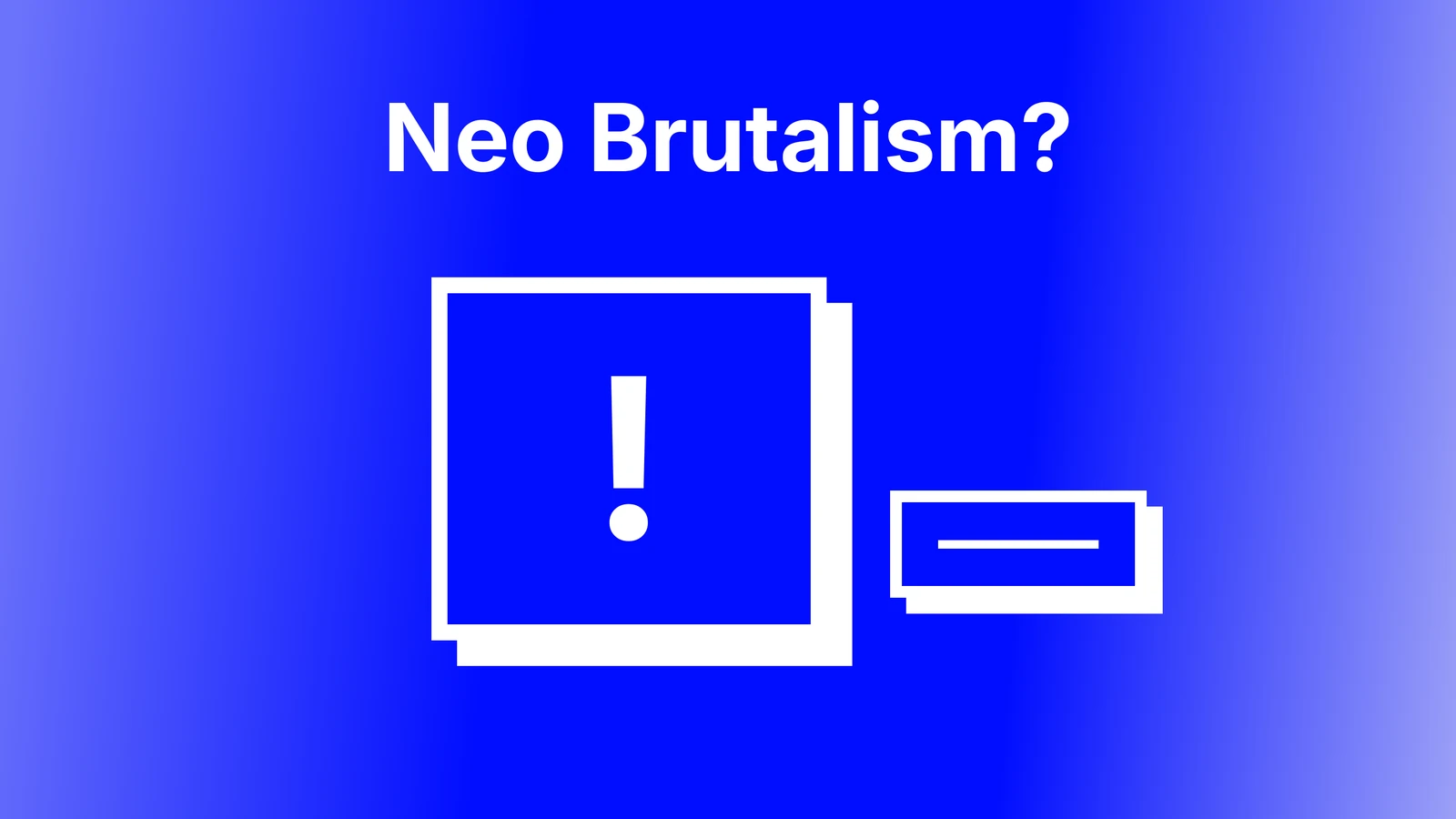


Neo brutalism is a web design style built from thick black borders, hard offset shadows with no blur, flat saturated colours, square corners and oversized type. It borrows the bluntness of brutalist websites but keeps a clear grid and friendly colour, which is why it reads as playful rather than hostile. Our verdict for 2026: it has moved from trend to tool. The brands that launched it have softened, and it still works for products that want to look independent and direct. This post gives the CSS recipe as code, twelve live sites that actually use it (we scanned their stylesheets, because several famous "examples" no longer do), where it fits and where it is a red flag, and the accessibility rules with their sources. It follows the same shape as our glassmorphism guide.
Neo brutalism at a glance
| Trait | The rule |
|---|---|
| Borders | 2px to 4px solid black on cards, buttons and inputs |
| Shadows | Hard offset, zero blur: 4px 4px 0 #000 is the signature |
| Corners | Square, or a small radius at most |
| Colour | Two or three flat saturated fills plus black and white; no gradients |
| Type | A grotesk or system sans at large sizes; display faces for headings only |
| Motion | Hover shifts the element into its shadow; nothing fades |
| Good fits | Creator tools, dev libraries, events, snacks and merch, personal sites |
| Bad fits | Banking, healthcare, government, anything that sells trust |
Brutalist web design vs neo brutalism
Brutalist web design is raw and unstyled: default fonts, plain HTML, little layout. The Brutalist Report, a news aggregator, ships with zero box shadows and zero stylesheets, and it is the clearest living example. Neo brutalism is a deliberate, polished system: the same bluntness, but with bold colour, consistent borders and shadows, and careful spacing. One rejects design; the other performs it. The wave is usually traced to Gumroad's 2021 redesign and Figma's marketing pages of the same period, then spread through Dribbble and React component libraries. By 2026 Figma's Config site has no hard shadows or thick borders at all, which tells you where the big brands went.

The neo brutalism CSS recipe
Borders, shadows, radius, colour, type as code
:root {
  --nb-ink: #000;
  --nb-paper: #fff;
  --nb-accent: #ffde59;   /* one or two saturated fills, not five */
  --nb-accent-2: #ff6b6b;
  --nb-border: 3px;
  --nb-offset: 5px;
}
.nb-card {
  background: var(--nb-paper);
  border: var(--nb-border) solid var(--nb-ink);
  border-radius: 0;
  box-shadow: var(--nb-offset) var(--nb-offset) 0 0 var(--nb-ink);
  padding: 24px;
}
.nb-button {
  background: var(--nb-accent);
  border: var(--nb-border) solid var(--nb-ink);
  box-shadow: var(--nb-offset) var(--nb-offset) 0 0 var(--nb-ink);
  font: 700 18px/1 "Inter", system-ui, sans-serif;
  padding: 14px 22px;
  transition: transform 80ms, box-shadow 80ms;
}
.nb-button:hover {
  transform: translate(2px, 2px);
  box-shadow: 3px 3px 0 0 var(--nb-ink);
}
.nb-button:active {
  transform: translate(var(--nb-offset), var(--nb-offset));
  box-shadow: 0 0 0 0 var(--nb-ink);
}
.nb-button:focus-visible {
  outline: 3px solid var(--nb-accent-2);
  outline-offset: 3px;
}
@media (max-width: 480px) {
  :root { --nb-border: 2px; --nb-offset: 3px; }
}
Five rules are in that block. The shadow has four values and the third is zero: any blur breaks the style. The radius is zero. The palette is two accents plus black and white. The hover state moves the element into its shadow instead of changing colour, and the active state removes the shadow so the button looks pressed. The media query shrinks borders and offsets on phones, because a 5px shadow and a 3px border on a 340px-wide card eat space the content needs. Gumroad's homepage still uses Tailwind's shadow-[2px_2px_0_0_rgba(0,0,0,1)] utility more than 200 times; Feastables and Panda CSS use 6px 6px 0. The number is taste; the zero blur is the rule.
Hover and focus states that keep the look
Two states are usually missing from neo brutalist templates. Focus: keyboard users need a visible outline of at least 2px with 3:1 contrast against the surroundings, per WCAG 2.2 SC 2.4.7 and 2.4.11, and a thick black border is not a focus indicator because it is always there. Use the second accent as an outline with an offset. Reduced motion: the translate on hover is fine at 80 milliseconds, but anything that bounces or wobbles should be wrapped in a prefers-reduced-motion check.
Neo brutalism websites that use it well, with screenshots
1. Gumroad: where the wave started

Steal this: the primary button has the thickest border and the only hard shadow in the hero, so the hierarchy is the style. Where it slips: the floating pink logos are decoration the style does not need. On a phone the bordered cards stack well because the offsets are only 2px.
2. Feastables: the style at consumer scale
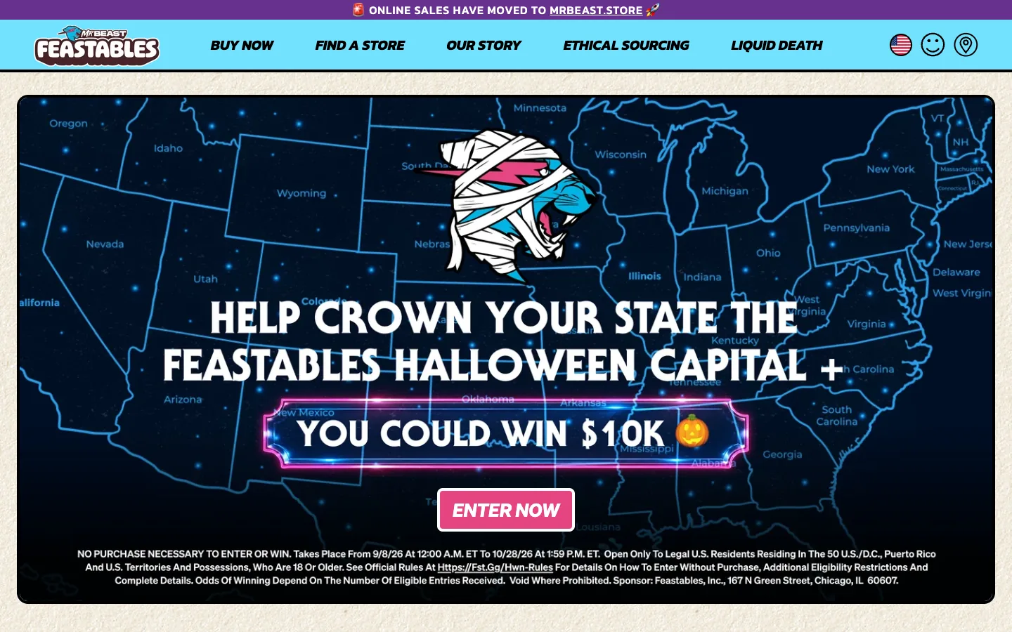
Steal this: the whole campaign block is one bordered card, so the promotion reads as a poster. Where it slips: the legal text under it is tiny white on navy and fails the contrast floor; the style's boldness makes small type look even smaller.
3. Panda CSS: the developer tool
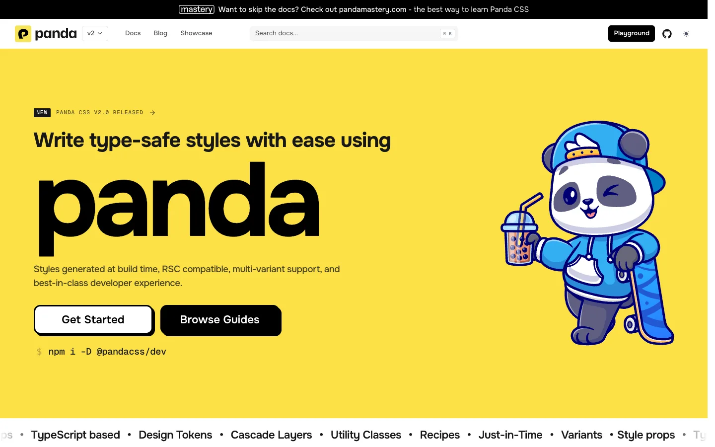
Steal this: one colour for the ground and black for everything else keeps the page readable at any size. Where it slips: the mascot illustration uses soft gradients, which is the one thing the recipe forbids. Mobile holds up because the hero is three stacked elements.
4. Tony's Chocolonely: borders at e-commerce scale
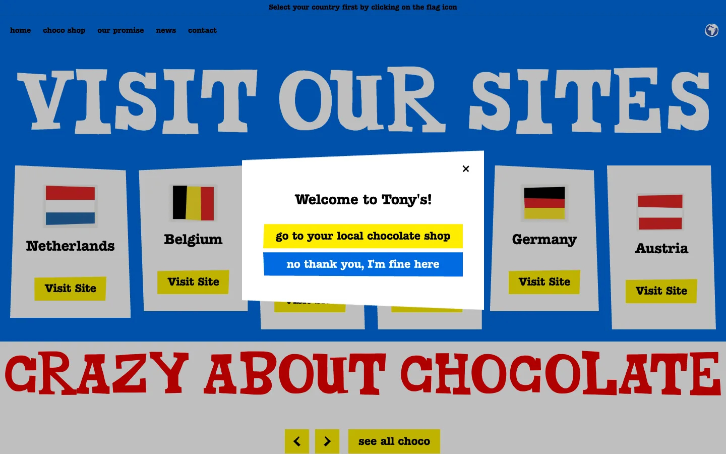
Steal this: the display face is used once, for the headline; the buttons and labels are a plain sans, which is the NN/g advice in practice. Where it slips: a welcome pop-up covers the cards on first visit, and the bold style makes a pop-up feel like a wall.
5. Byooooob: bordered cards and stickers

Steal this: every element, including the portraits, has the same thick outline, so the page feels like one system. Where it slips: the marquee strip under the hero runs constantly with no pause control.
6. Cards Against Humanity's 99% Off Sale: the single-purpose page

Steal this: three colours, no images, and the copy carries the whole page. Where it slips: the scrolling text around the border is small and moves, which is two accessibility problems in one strip.
7. Cyan Banister: the personal site as a desktop

Steal this: the tiles double as navigation, so the style is the information architecture. Where it slips: on a phone a desktop metaphor has to become a list, and the tiles shrink to the point where the labels are the only readable part.
8. Sui Overflow 2026: the event site

Steal this: the tab bar at the bottom is a bordered strip, so the navigation looks like part of the poster. Where it slips: the keycap illustration is 3D, which is a different style sharing the page.
9. Eloy B: the portfolio

Steal this: the repeated outlined headline does the work of a hero image. Where it slips: lime on black at this weight is loud for long reading; the work pages need a calmer ground.
10. Roze Bunker: FMCG outside the US

Steal this: a single bordered card as the hero, which stacks to a phone without any change. Where it slips: white body text on saturated blue is near the contrast floor.
11. Even/Odd and 12. RetroUI: the studio and the library
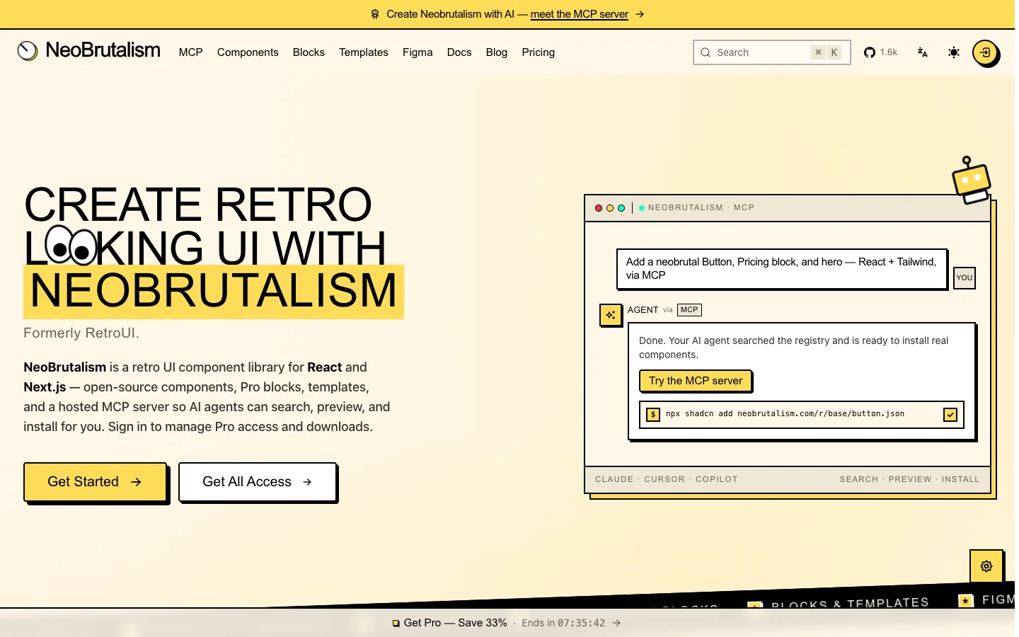
Even/Odd, a Los Angeles studio, uses blue display type and bordered photo cards on a grey ground with 22 thick borders on the homepage. Steal this: photos get the same border as cards, so real imagery joins the system instead of fighting it. RetroUI and neobrutalism.dev are the two libraries that will give you the components ready-made. Where both slip: neobrutalism.dev's own homepage uses twelve gradients, which the style it sells does not allow.
Thinking about this style for your brand?
Send us your logo and one page. We will mock up a neo brutalist and a quieter version of the same section, free, so you can see which one your audience would trust.
Where neo brutalism works, where it fails, and the accessibility rules
Good fits and bad fits
The twelve sites above are creator tools, snacks, a chocolate brand, a design studio, a hackathon, portfolios and component libraries. That is the list of categories where bluntness matches the brand. Finance, healthcare, government and insurance are the opposite: a visitor arrives anxious and the style reads as a joke at their expense. NN/g's neobrutalism article notes the look can overwhelm users and hinder accessibility without balance, and that is the honest limit. We could not verify a single Indian company running the style on its homepage in October 2026, which says something about the local market's appetite for it.
Accessibility and usability rules, with reasons
- Keep text at 4.5:1 contrast even on saturated fills. Black on yellow or pink usually passes; white on bright blue or pink usually fails. WCAG 2.2 SC 1.4.3, and NN/g's warning against vibrant pairings that fail readability.
- Limit the palette to two or three bold colours plus black and white. NN/g recommends restricting the palette so the page does not overwhelm.
- Body copy in a readable grotesk or system font; display faces for headings only.
- Make states explicit: hover shifts into the shadow, focus gets a visible outline with 3:1 contrast (SC 2.4.7, 2.4.11).
- Leave whitespace between bordered blocks. Stacked outlines with no gap read as a grid of noise.
- Shrink borders and offsets on phones with a media query, and keep tap targets at 24 by 24 CSS pixels (SC 2.5.8).
- No gradients, no blur. The whole signal is flatness; one soft shadow breaks it.
- Match the style to the category. Use it for indie, dev, event and snack brands, not for trust-heavy services.
The 2026 verdict
Neo brutalism is no longer a trend you adopt to look current; it is a tool you choose when the brand should feel independent and direct, and it is a liability when the brand should feel safe. The recipe is ten lines of CSS and the hard part is restraint: two colours, one display face, borders that shrink on phones, and states that keyboard users can see. If that describes your product, it is a cheap style to build well in Webflow or code, and we are happy to. If you sell trust, read our website design trends 2026 post for the quieter options, and our UI design trends guide for the interface patterns that travel across categories.
Want this built as a Webflow component system?
We build the cards, buttons, inputs and states above as reusable Webflow components with the mobile overrides and focus styles done. Get a free scope.
Frequently asked questions
What is neo brutalism in web design?
It is a style built from thick black borders, hard offset shadows with no blur, flat saturated colours, square corners and oversized type. It borrows the raw honesty of brutalist websites but keeps a clear grid and friendly colour, which is why it reads as playful rather than hostile, and why creator tools and snack brands adopted it first.
What is the difference between brutalism and neo brutalism?
Brutalist web design is raw and unstyled: default fonts, plain HTML, little layout, as on The Brutalist Report. Neo brutalism is a deliberate, polished system with the same bluntness but bold colour, consistent borders and shadows, and careful spacing. One rejects design and the other performs it, which is why they suit different brands.
Who started neo brutalism?
No single designer did. The wave is usually traced to Gumroad's 2021 redesign and Figma's marketing pages around the same time, then spread through Dribbble and React component libraries such as neobrutalism.dev and RetroUI. By 2026 Figma's own event site has dropped the hard shadows, and the style has settled into indie products, dev tools and events.
Is neo brutalism accessible?
It can be, if contrast is checked. Black text on saturated yellow or pink often passes; white on bright colours often fails. Keep body text at 4.5:1, give focus states a visible outline, limit the palette and avoid condensed display fonts for paragraphs. The thick borders themselves help users see edges and tap targets.
Is neo brutalism still in style in 2026?
It has moved from trend to tool. The big brands that launched it have softened, but it still works for products that want to look independent and direct: creator tools, developer libraries, hackathons and snacks. Use it when bluntness matches the brand and avoid it for finance, health or government sites where visitors need reassurance.
Bold Where It Helps. Quiet Where It Counts.
We design and build in whatever style your audience will trust, with the contrast and focus states checked before launch. Get a free design direction for your next site.


