

Most UI design trends lists are screenshots with adjectives. This one is for product teams, founders and designers who have to decide which of this year's patterns go into a real build. We checked each trend against what Apple, Google, Nielsen Norman Group and Smashing Magazine actually published, kept the ones that survive a Webflow or React sprint, and cut the rest. This post stays at the component and interaction level. Page-level layout lives in our website design trends 2026 post, and the AI workflow side lives in AI UI design. For each of the 11 trends: what it is, why now, how to ship it, when to skip it. The table is the short version.
UI design trends 2026 at a glance
| Trend | Where it fits | Watch out for |
|---|---|---|
| Prompt bars and AI-native inputs | Search, support, creation tools | Blank-box paralysis, chat as the only door |
| Trust states for AI output | Any feature that generates or decides | Fake confidence, no undo |
| Liquid glass control layers | Nav bars, tab bars, floating toolbars | Text on busy backgrounds, low-end phones |
| Progressive blur | Scrolling lists under fixed headers | GPU cost, stacked layer bugs |
| Expressive shapes and button groups | Consumer apps, mobile-first products | Enterprise data tools, dense forms |
| Physics-based motion as feedback | Toggles, sheets, drag, reorder | Motion without a job, reduced-motion users |
| View transitions between states | List to detail, tab switches, filters | Browser support gaps, slow pages |
| Command palettes and keyboard-first nav | SaaS, internal tools, power users | Marketing sites, first-time visitors |
| Dark mode as the default token set | Dev tools, media, fintech, dashboards | Long-form reading, print-heavy workflows |
| Variable typography as interaction | Headlines, nav, hover states | Layout shift, body text |
| Accessibility-first component states | Every product, every component | Treating it as a final QA pass |
The 11 UI design trends worth building in 2026
Ordered roughly by how much they change the work, not by hype.
1. Prompt bars and AI-native inputs
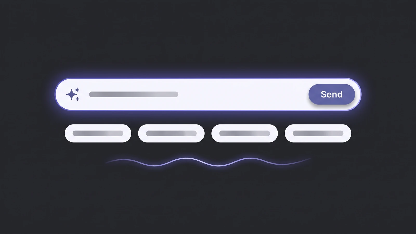
The text box that says "Ask anything" is now a standard component, sitting where search used to be. It is trending because every product shipped an AI feature in the last 18 months and most of them hid it behind a chat window. The better versions are not chat. Vitaly Friedman's design patterns for AI interfaces piece on Smashing Magazine makes the case that typing intent from scratch is slow and hard, and that good input UI adds pre-written prompts, sliders, presets and visual controls around the box. Ship it as a real component: a text input, three to five suggested actions as chips, a visible loading state, and a keyboard shortcut. In Webflow, that is a form block plus a CMS-driven chip list, wired to your backend. Skip it when your product has one job and a button already does it.
2. Trust states for AI output
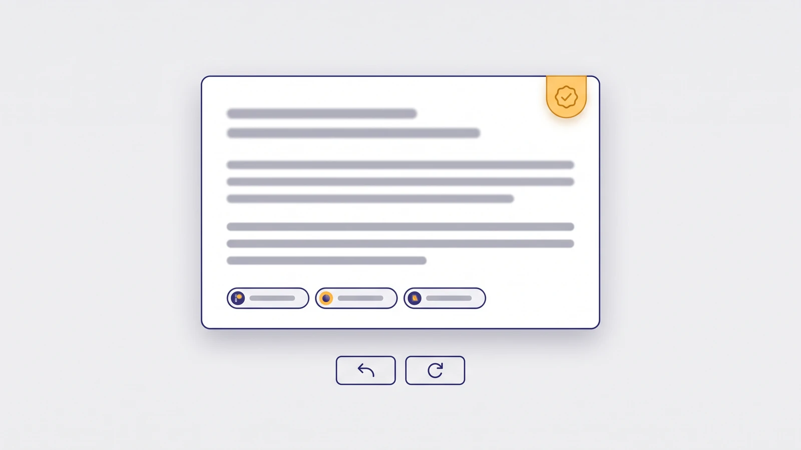
Once a feature generates text, prices, summaries or decisions, the UI has to show where the answer came from and how to reverse it. Nielsen Norman Group's State of UX 2026 names trust as the central design problem for AI experiences and lists the fundamentals: transparency, control, consistency, and support when the system fails. In component terms that means four states most teams skip: a source or citation row, a confidence or "may be wrong" label, an undo that works, and a graceful failure card with a manual path. Build these as variants of one output card so every AI feature inherits them. Skip nothing here. If you are shipping generative output without an undo, fix that before anything else on this list.
Shipping an AI feature without these four states?
Send us a screenshot of your AI output screen. We will mark which trust states are missing and how we would add them. It is free.
3. Liquid glass control layers
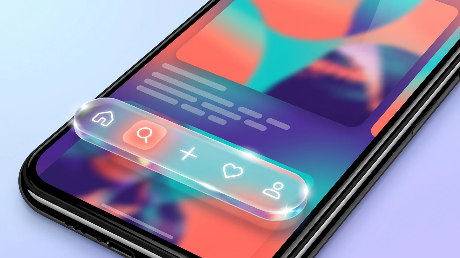
Apple's Liquid Glass announcement in June 2025 put translucency back on every roadmap: controls that refract and tint based on what scrolls underneath, sitting as a separate functional layer above content. The web version is simpler and older. It is a fixed nav or floating toolbar with a semi-transparent background and a backdrop blur, so page content stays visible through it. It fits tab bars, sticky headers, floating action toolbars and media controls. In Webflow, set the background to white or black at 60-75% opacity and add a backdrop filter blur of 12-20px from the Effects panel; in CSS the same two properties do it. Skip it for text-heavy panels, anything that sits over photography with small type, and low-end Android where backdrop blur stutters. Our design trends 2026 post covers the wider glassmorphism style and where it fails.
4. Progressive blur
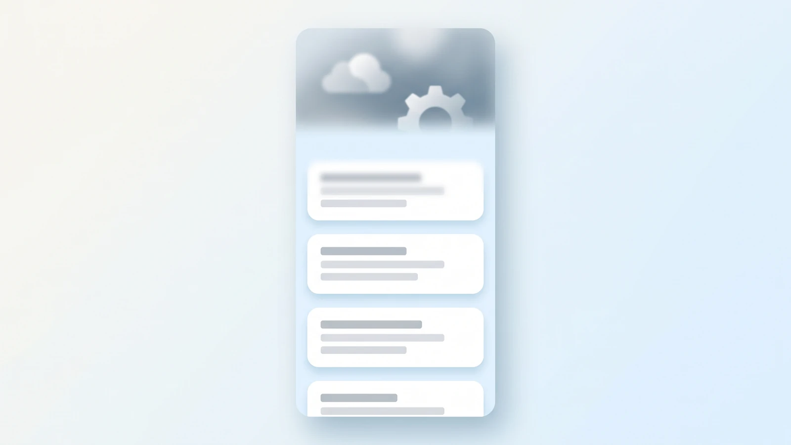
A gradient of blur, sharp at the bottom and fully blurred at the top, replacing the hard-edged blurred header from trend 3. It reads as native because iOS has used it for years, and it solves a real problem: a scrolling list under a fixed control that neither hides content nor lets it collide with the buttons. There is no single CSS property for it. The working technique stacks three to five thin layers, each with a slightly stronger backdrop blur and a mask that fades it out, so the blur ramps instead of stepping. MDN's backdrop-filter documentation notes that masks and filters create new backdrop roots, which is why the layers must be siblings, not nested. Ship it once as a reusable component and keep the layer count low; each layer is GPU work. Skip it on long lists in web views, and skip it entirely if a plain fade-to-background gradient does the job.
5. Expressive shapes and button groups
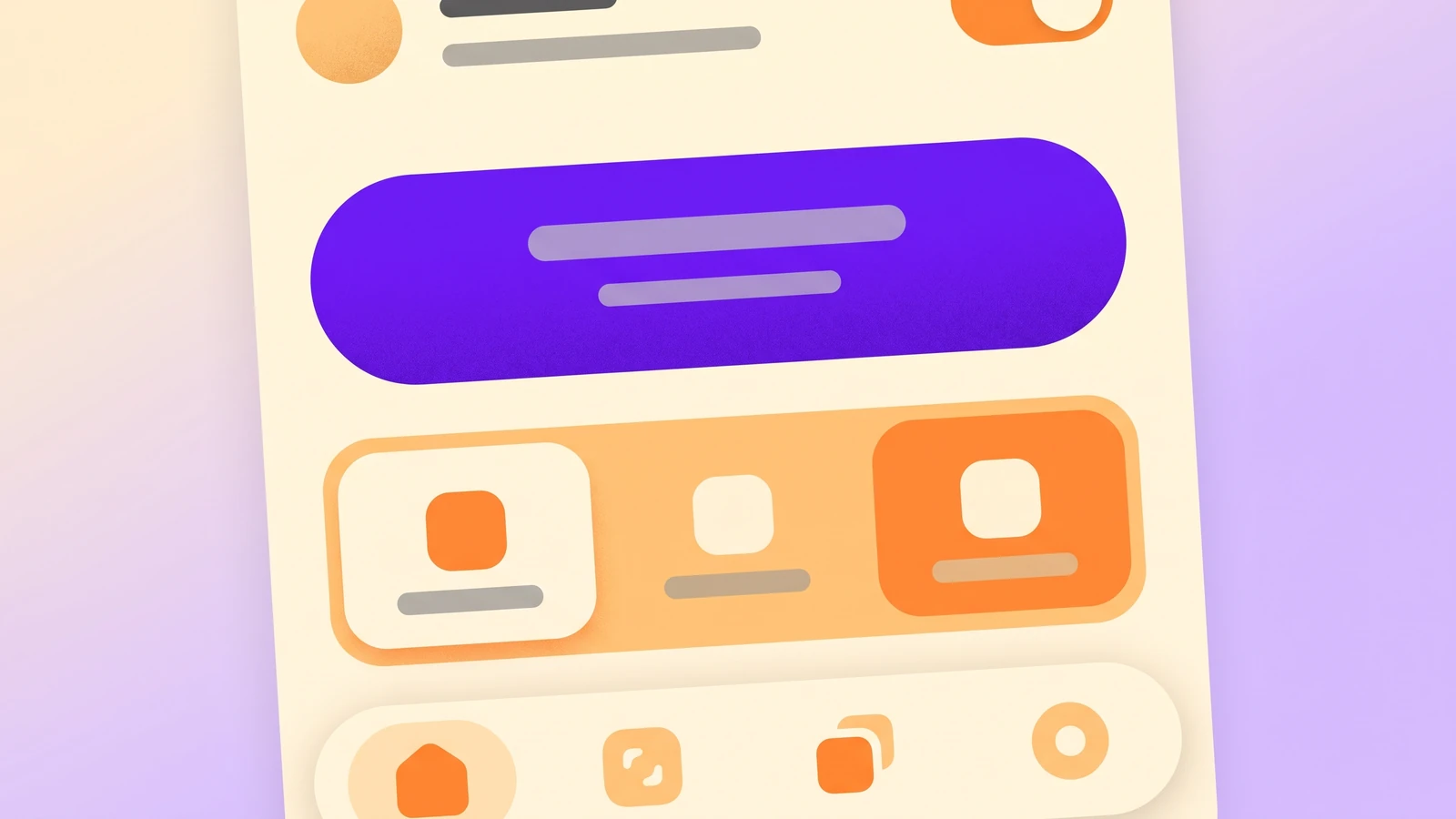
Google's Material 3 Expressive update replaced quiet, uniform components with bigger shapes, pill button groups, floating toolbars and containers that change shape on press. Google's published research across 46 studies and 18,000 participants reported that people spotted key UI elements up to four times faster in the expressive designs, with the strongest preference among 18 to 24 year olds. That is the why: attention, not style. Ship it selectively. Give the primary action a distinctly larger, rounder shape than secondary actions, group related actions into a segmented pill instead of a row of equal buttons, and let the pressed state morph the corner radius. In Webflow this is three combo classes and a transition on border-radius. Skip it for data-dense enterprise tools and long forms, where oversized controls eat the screen and make tables unreadable.
6. Physics-based motion as feedback

Motion in 2026 has a job description: confirm that an input landed. A toggle that overshoots slightly, a sheet that decelerates like it has weight, a card that snaps back when a drag is cancelled. The spring model is now the default in Apple's and Google's systems. Ship it at the component level: 150 to 250ms for state changes, springs only on things the user physically moves (drag, reorder, dismiss), and nothing that plays on page load without a trigger. Every animation needs a reduced-motion fallback via the prefers-reduced-motion media query, which every current browser supports; Webflow interactions can be scoped to it with a small custom CSS override. Skip motion that only exists to look alive. If removing an animation loses no information, remove it.
Is your motion doing a job or just moving?
Send us a page. We will send back a free motion review: which animations to keep, which to cut, and where a reduced-motion fallback is missing.
7. View transitions between states

List to detail, tab to tab, filtered to unfiltered: the element you clicked animates into its new position instead of the whole view cutting. The browser View Transitions API does this without a JavaScript animation library for same-document changes, and cross-document transitions between pages have arrived in current Chromium browsers. It is the first time the web can match native-app continuity without a framework. Ship it progressively: give shared elements a view-transition-name, wrap state changes in a transition call, and let browsers that lack it fall back to an instant swap. On a Webflow site, page-to-page transitions need a custom code embed and a same-origin site; keep them under 300ms. Skip it on slow pages. A transition that waits on a 2-second fetch feels worse than a cut.
8. Command palettes and keyboard-first navigation
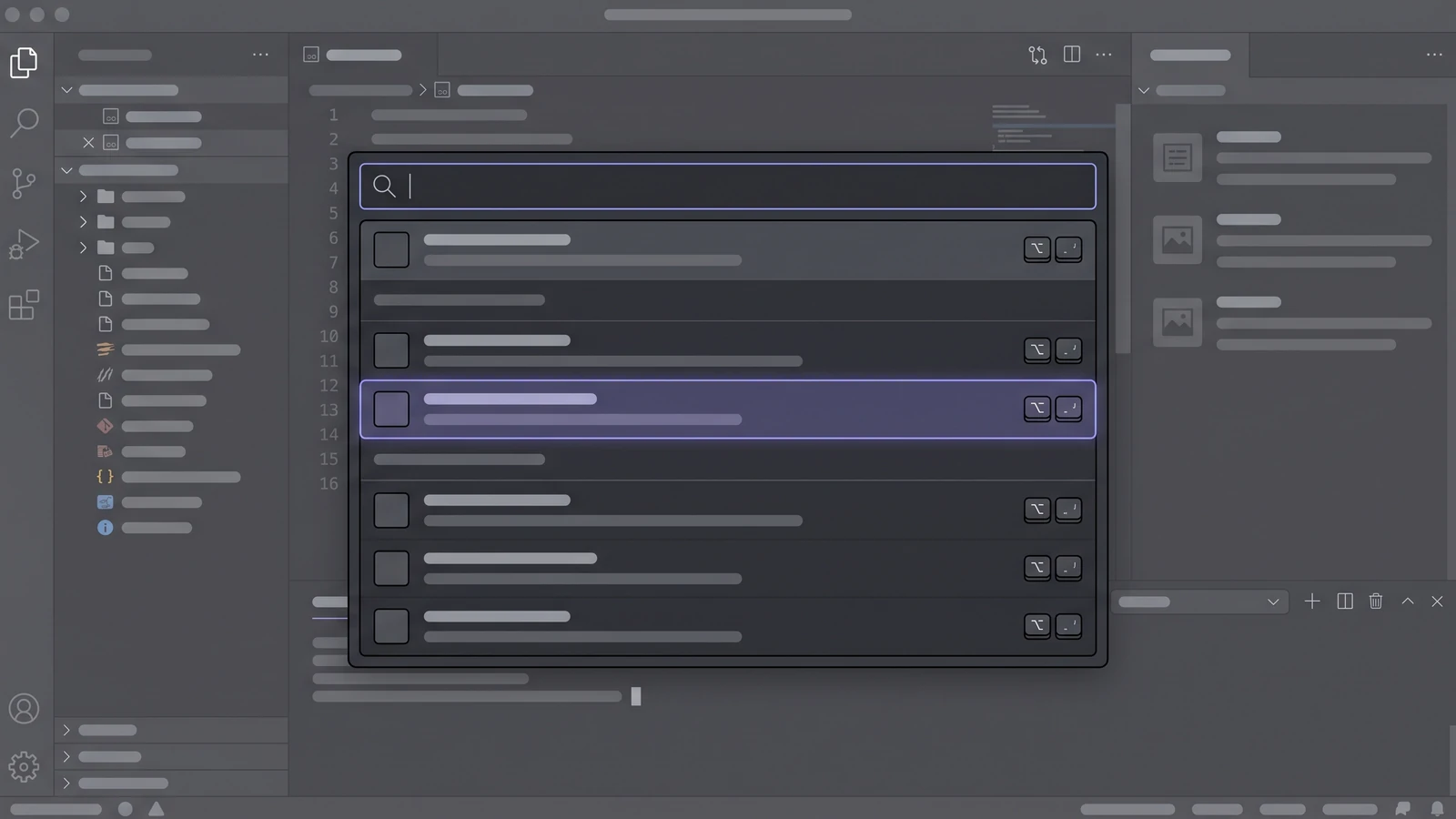
Press Cmd+K, type, done. Linear, Raycast and Vercel made the command palette the expected way to move around a SaaS product, and by now users of any professional tool try the shortcut before they look for a menu. Several of the products in our best UI websites list are built around it. It fits internal tools, dashboards, admin panels and anything a user opens daily. Ship it as a modal with a fuzzy-search input, grouped results, recent items and visible shortcuts; there are small open source libraries for the search part, and the component itself is a hundred lines of markup. Skip it on marketing sites and consumer apps for first-time visitors. Nobody presses Cmd+K on a pricing page.
9. Dark mode as the default token set
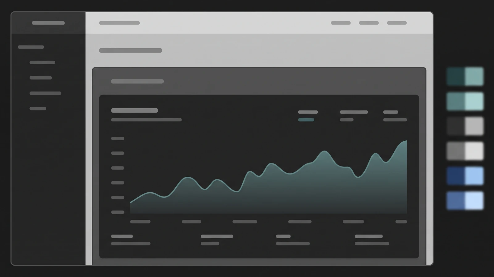
The shift is not "add dark mode". It is that the dark theme is designed first and the light theme is the variant, because that is how dev tools, media apps, fintech dashboards and most AI products now launch. The component-level consequence: elevation is shown with lighter surface tints instead of shadows, borders get one step brighter than the surface rather than darker, and every accent color needs a desaturated dark-surface version. Ship it with design tokens, not overrides. In Webflow, variables with modes let you define a dark and light value per token and switch the whole site with one attribute; in CSS, the light-dark() function and prefers-color-scheme do the same. Skip a dark default for long-form reading products, documentation and anything printed or screenshotted into slide decks, where light backgrounds still win.
10. Variable typography as interaction
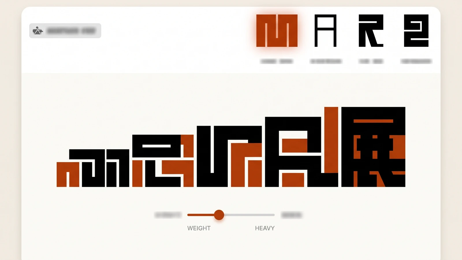
A variable font carries weight, width and optical size as continuous axes in one file, so a headline can thicken on hover, a nav label can widen on focus and a display face can tighten its letterforms at large sizes, all without loading extra fonts. It is trending because the good open fonts now ship as variable by default; our best fonts for websites guide lists which ones. Ship it on headlines and navigation only: upload the variable file to Webflow, then animate font-variation-settings or font-weight on hover with a 200ms transition. Use width and optical-size axes for responsive sizing rather than swapping fonts by breakpoint. Skip it on body text and on any element where a weight change alters line length, because that causes layout shift and the whole paragraph jumps. Our font trends 2026 post covers the typographic side in more depth.
11. Accessibility-first component states
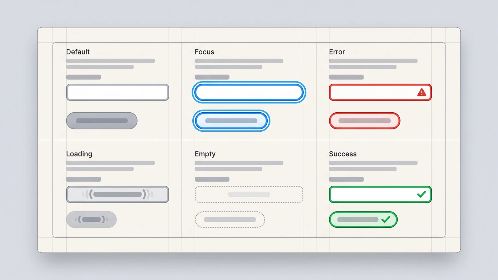
Focus, error, disabled, loading, empty and success are designed states now, not afterthoughts, and the visible focus ring has become a deliberate part of the visual language rather than something removed for looking untidy. WCAG 2.2 added criteria for focus appearance and minimum target size, and procurement teams in regulated industries increasingly check for them. Ship each component with all six states drawn before it is built: a two-color focus ring that survives any background, an error state that names the fix, an empty state with a next action, and loading skeletons shaped like the content. In Webflow that is a state-per-combo-class discipline plus a focus-visible rule in custom CSS. Skip nothing, but sequence it: do buttons, inputs and links first, since they carry most of the interaction, and tackle complex widgets like date pickers after. Treating accessibility as a final QA pass is the failure mode.
Are all six states designed in your UI?
Share your site or product URL. We will check focus, error, empty and loading states on your buttons, inputs and links, free of charge.
How to pick UI trends for your product
Three questions, in order, for every trend above.
- Does it remove a step or add one? Prompt bars, command palettes and trust states remove steps for the right user. Glass, blur and expressive shapes add visual work. Take removals first.
- Can your stack ship it at 60fps on a mid-range phone? Backdrop blur, stacked progressive blur and view transitions are all GPU-bound. Test on a three-year-old Android before committing, not on the designer's laptop.
- Will it still make sense in 18 months? Accessibility states, dark-first tokens and motion with a job will. Liquid glass and progressive blur are strong bets while native platforms carry them, and easy to strip later if built as isolated components.
The honest read on UX design trends this year comes from the NN/g report: interface polish is becoming table stakes as design systems and AI tooling make decent UI cheap to produce. That is not an argument against any of the eleven. It is an argument for picking the three or four that fit your product and building them properly, with states, tokens and fallbacks, instead of sprinkling all eleven across one homepage. If you want a second opinion on which ones fit your product, that is what our UI and UX design service is for.
Frequently asked questions
What are the biggest UI design trends in 2026?
The ones changing how components are built: AI-native inputs like prompt bars, trust states for generated output, translucent control layers in the Liquid Glass style, progressive blur, Material 3 Expressive shapes and motion, view transitions, command palettes, dark-first design tokens, variable typography on interaction, and accessibility-first component states. Visual styles matter less this year than interaction patterns.
What is the difference between UI trends and UX design trends?
UI trends describe how components look and respond: shapes, motion, translucency, typography, states. UX design trends describe how products are structured and how people get things done: delegating tasks to AI assistants, fewer navigation steps, trust and transparency in automated decisions. This post covers UI. Most 2026 UX trends push in the same direction, toward fewer clicks and clearer feedback.
Can I build these UI trends in Webflow?
Nearly all of them. Backdrop blur, variable fonts, dark and light modes through variables with modes, hover and state transitions and component variants are native to the Webflow Designer. Progressive blur, view transitions and command palettes need a small custom code embed. Prompt bars and AI trust states need a backend, but the interface components themselves are ordinary Webflow elements.
Do UI design trends hurt accessibility?
Some do if applied carelessly. Translucent glass over busy content fails contrast checks, motion without a reduced-motion fallback affects users with vestibular disorders, and variable-weight hover effects can cause layout shift. Each has a fix: solid fallback colors, the prefers-reduced-motion media query, and restricting weight animation to headlines. Accessibility-first states are themselves one of the year's strongest trends.
Should a small business website follow UI design trends at all?
Only the ones that help the visitor act. Clear button hierarchy, designed focus and error states, and honest motion feedback apply to every site. Command palettes, glass layers and progressive blur are for products people use daily, not a brochure site. Pick two trends that fit, build them properly with fallbacks, and ignore the rest until they earn a place.
Find Out Which Trends Fit Your Product.
Send us your product or site and your main user. We will tell you which three of these eleven patterns are worth building, which to skip, and what each costs in Webflow or code.