

Glassmorphism is a UI style where a panel looks like frosted glass: a translucent background, a blur applied to whatever sits behind it, a thin light border, and a soft shadow so it reads as a layer floating above the page. It is built with one CSS property, backdrop-filter, plus a semi-transparent background colour. Apple popularised it in macOS Big Sur, Microsoft in Windows 11, and it is still everywhere in SaaS heroes and dashboards. Below: the honest use-case table, the glass effect CSS recipe, the Webflow setup, and a verdict on where glassmorphism belongs in 2026.
Where glassmorphism works and where it fails
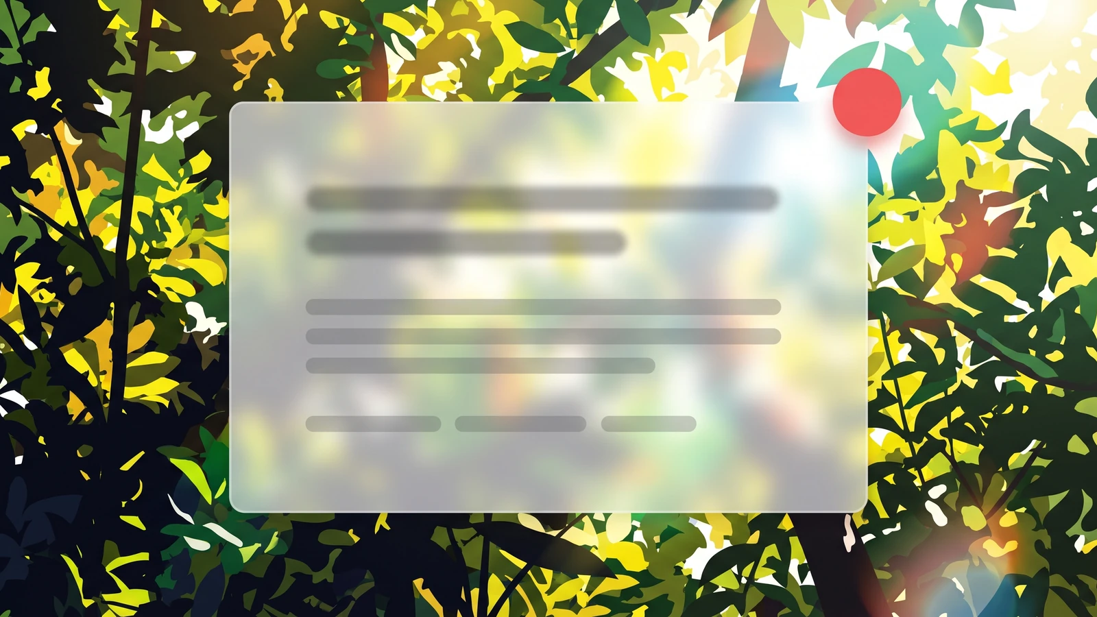
Check the table before you reach for the blur slider. The effect has two hard failure modes, text contrast and rendering cost, and both depend on placement.
| Use case | Works? | Watch out for |
|---|---|---|
| Sticky nav bar over scrolling content | Yes | Keep background alpha high (0.7 or more) so links stay readable over photos and dark sections. |
| Cards over a single hero image or gradient | Yes | Test contrast against the busiest part of the image, not the calm corner you designed on. |
| Modals and dropdown menus | Yes | Blur is applied to the page behind, so a parent with opacity below 1 will break the effect. |
| Body text panels or long-form content | No | Variable backgrounds make 4.5:1 contrast impossible to guarantee. Use a solid surface. |
| Dozens of glass cards in a grid | Rarely | Every backdrop-filter is repainted on scroll. On mid-range Android phones this drops frames. |
| Glass over video or animated backgrounds | Risky | The blur recalculates every frame. Fine for one hero card, bad for anything below the fold. |
| Dark mode interfaces | Yes | Use a low-alpha white or a tinted dark fill. Pure black glass looks like a rendering bug. |

The contrast problem is the one that gets sites into trouble. WCAG 2.2 success criterion 1.4.3 asks for a 4.5:1 ratio for normal text and 3:1 for large text, measured against the background the text actually renders on. A glass panel has no fixed background, so a card that passes over the blue half of your hero image can fail over the white half. Nielsen Norman Group's guidance is blunt about this and recommends heavier blur, not lighter, because a stronger blur flattens the background into something closer to a solid colour you can measure.
The performance problem is quieter but real. MDN's backdrop-filter reference notes the property can be expensive depending on blur intensity. The browser re-samples and blurs the pixels behind the element whenever anything moves. One nav bar is nothing. Twenty cards in a pricing grid on a phone is a stutter you will feel.
Does your site stutter on mid-range phones?
Send us the URL and we will run a free mobile performance check, then point to the effects and scripts that are costing you frames.
The glass effect CSS recipe
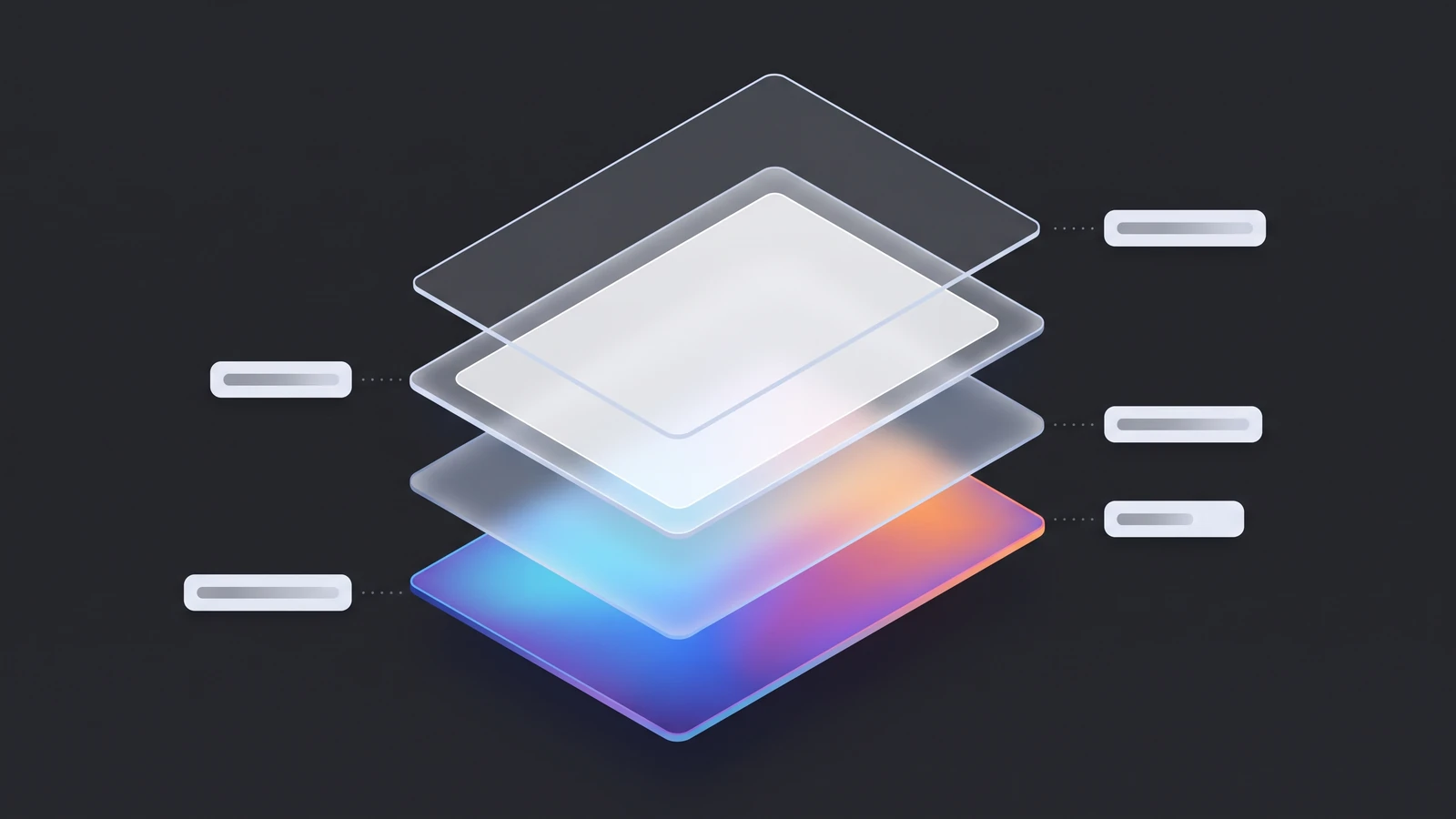
Every glassmorphism css generator on page one of Google outputs the same five declarations. You need the order, not the tool.
- Translucent background. Set the background to white (or your surface colour) at 10 to 30 percent alpha, for example rgba(255, 255, 255, 0.2). Without alpha, backdrop-filter has nothing to show through.
- Backdrop blur. Add backdrop-filter with a blur between 8px and 20px. Modern Safari supports the unprefixed property, but adding the -webkit- prefixed copy first costs nothing and covers older iOS versions.
- Optional saturation. Chain saturate(150%) or so after the blur to keep the background colours from going grey.
- Hairline border. A 1px solid border in white at around 30 percent alpha gives the panel an edge so it reads as glass rather than fog.
- Soft shadow and radius. A large, low-opacity box-shadow (something like 0 8px 32px at 10 percent black) and a 12 to 16px border radius finish the layered look.
Two things break this recipe more than anything else. First, the backdrop root trap: MDN documents that the blur is clipped to the nearest ancestor with opacity below 1, a filter, a mask, a clip-path, or mix-blend-mode. If you fade a whole section in with opacity, every glass card inside it stops blurring the page and only blurs its own siblings. Animate transform instead of opacity, or move the fade to a child wrapper. Second, the fallback: backdrop-filter reached Baseline "newly available" status only in September 2024 per MDN, so older Android WebViews and corporate Windows fleets still exist without it. Wrap a stronger, more opaque background in an @supports not (backdrop-filter: blur(1px)) block so the text remains legible when the blur never arrives.
How to build glassmorphism UI in Webflow
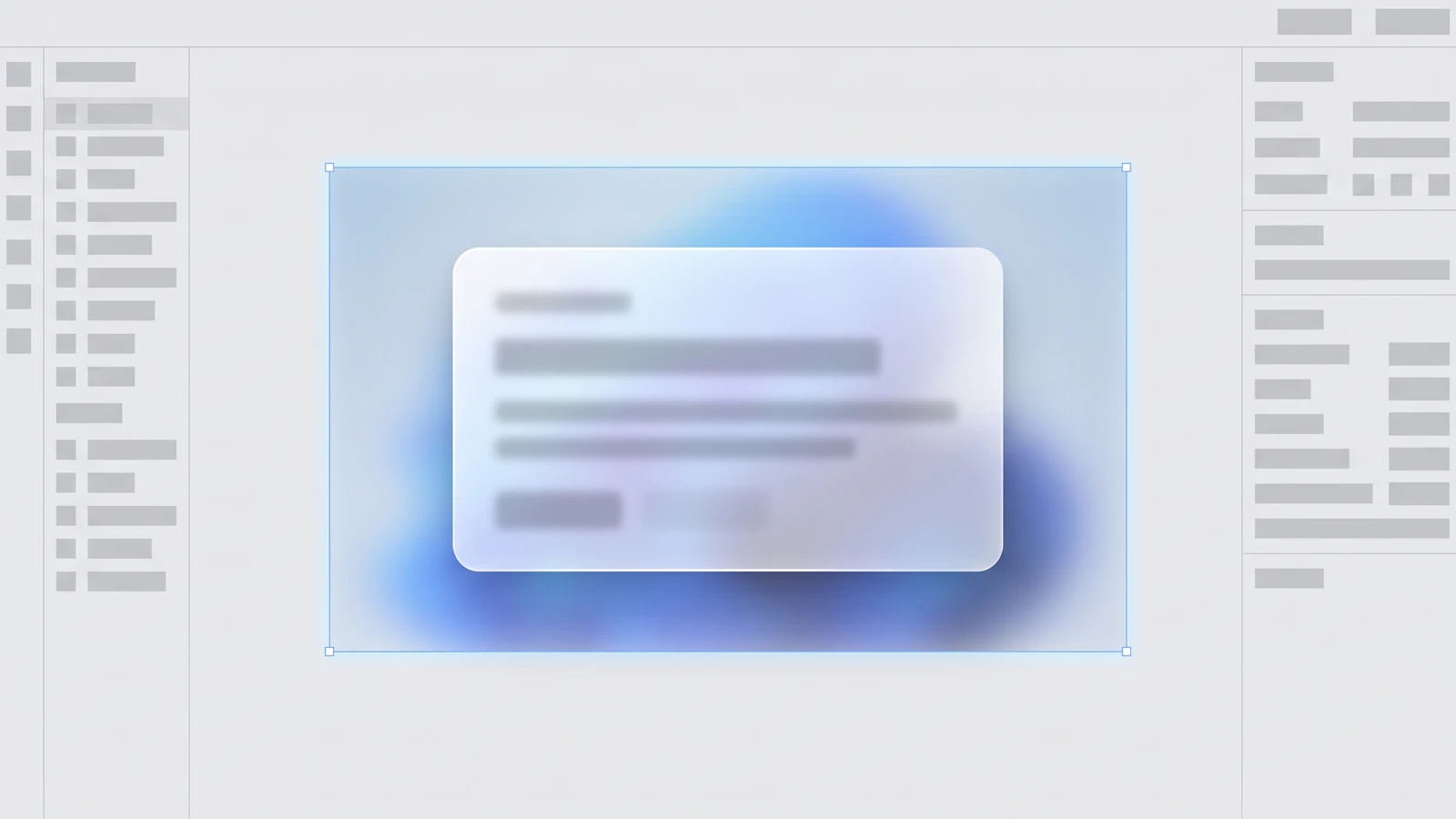
Webflow exposes the whole recipe natively; the core effect needs no custom code.
1. Set the fill with alpha
Select the card or nav element, open Backgrounds, pick a colour and drag the alpha slider to 15 to 25 percent. Do not use the Opacity setting: it fades the text too and, per the backdrop root rule, kills blur for any glass children.
2. Add the backdrop blur
In the Effects section add a Backdrop filter of type Blur, 12px to start. Webflow writes the prefixed property for you. Add Saturate in the same panel if the colours behind look grey.
3. Border, radius, shadow
Add a 1px white border at 20 to 40 percent alpha, a 12 to 16px radius, and a large low-opacity shadow. Store all three as variables so every glass surface stays consistent.
4. Check contrast in the busiest state
Preview, scroll the panel over the brightest and darkest parts of the background, and run a contrast checker in both positions. If either fails, raise the background alpha before you lower the blur. Most teams do the opposite and ship a card nobody can read.
5. Add the fallback in custom code
The Designer has no @supports block, so paste a three-line rule into the page head that sets a near-opaque background on your glass class when backdrop-filter is unsupported. If you are pushing designs from Figma, our AI UI design guide covers how generated mockups tend to over-use glass and what to strip before build.
Have a Figma file waiting to be built?
Share the design and we will send a free Webflow build quote, including what we would simplify before it ships.
Verdict: where glassmorphism belongs in 2026
Glassmorphism is a component, not a theme. On one or two floating surfaces, a sticky nav, a hero card, a command palette, it adds depth cheaply. As the default for every card on the page, it fails WCAG at some scroll position, costs frames on mid-range phones, and dates the design within a year, as neumorphism did. In our design trends for 2026 round-up we filed it under "still useful, no longer a differentiator", and the website design trends for 2026 post shows what has replaced it as the headline look: bold type, solid colour blocks, and motion that respects reduced-motion settings.
Our rule on client builds: glass on surfaces that sit above content, never on surfaces that hold it. Contrast measured at the worst scroll position, backdrop-filter capped to a handful of elements, @supports fallback shipped every time. If you want a second opinion on a design system that leans on the glass effect, our design service starts with a teardown of exactly these accessibility and performance risks.
Frequently asked questions
What is glassmorphism in UI design?
Glassmorphism is a visual style where interface panels look like frosted glass. It combines a translucent background, a blur applied to the content behind the panel, a thin light border and a soft shadow so the element appears to float above the page. It is implemented in CSS with backdrop-filter and a semi-transparent background colour, and it is best known from macOS Big Sur and Windows 11.
Which CSS property creates the glass effect?
The glass effect comes from backdrop-filter, usually set to a blur between 8px and 20px, combined with a background colour that has partial transparency such as rgba(255, 255, 255, 0.2). A 1px semi-transparent border and a large low-opacity box shadow complete the look. Safari accepts the unprefixed property in current versions, but adding the -webkit- prefixed copy still covers older iOS releases.
Is glassmorphism bad for accessibility?
It can be, because the text sits on a background that changes as the user scrolls, so a contrast ratio that passes in one position can fail in another. WCAG 2.2 requires 4.5:1 for normal text. To stay compliant, raise the panel's background alpha, use a heavier blur, test at the busiest scroll position, and avoid placing long body text on glass surfaces at all.
Does backdrop-filter slow down a website?
One or two blurred surfaces have no noticeable cost. The problem starts when many elements use backdrop-filter at once, or when glass sits over video or animated backgrounds, because the browser must re-sample and blur the pixels behind every element on each frame. On mid-range Android devices this shows up as dropped frames during scroll. Limit the effect to a few floating surfaces per page.
Get Your Design System Audited.
Send us the site or Figma file. We check every glass surface for contrast at the worst scroll position, count the backdrop-filter cost, and send back a fix list in 48 hours.