

About us page design is the trust work a company does before anyone books a call. A buyer who is close to saying yes opens the about page to check three things: that you are real, who they would be dealing with, and why you do this at all. This post shows 15 about pages from established companies, including Amul, Tata, Fabindia and Groww, captured by us on 7 November 2026. Each comes with what it does well and one idea worth stealing. After them: what an about page has to include, and a simple rule for choosing between a founder story, the team or the mission.
About us page examples at a glance
| Company | Leads with | What to steal |
|---|---|---|
| Ben & Jerry's | Founder story | Real numbers inside the origin story |
| Wise | Founder story | The founders' own problem, told plainly |
| Amul | History | A long story split into eras |
| Tata | Heritage and ownership | Say who owns the company |
| Buffer | Team | A team grid you can filter |
| Zapier | Team | A year and place on every team photo |
| Airbnb | Numbers, then founders | A last-updated date on the numbers |
| Ghost | Open metrics | Real revenue on the page |
| GitLab | Numbers | A number that proves a habit |
| Plausible | Funding | Answer who pays you |
| Groww | The market problem | Name the old problem in one line |
| Fabindia | Legacy and legal details | Company name, CIN and registered address |
| Mozilla | Mission | A mission written as an action |
| Headspace | Mission | Who, what and how in three blocks |
| Bombay Shaving Company | Brand voice | The same voice as the product |
About us page design examples from 15 companies
Desktop captures at 1440px, each showing the section that makes the point. Pages change, so read them as what was live on the capture date.
1. Ben & Jerry's: a founding story with numbers in it
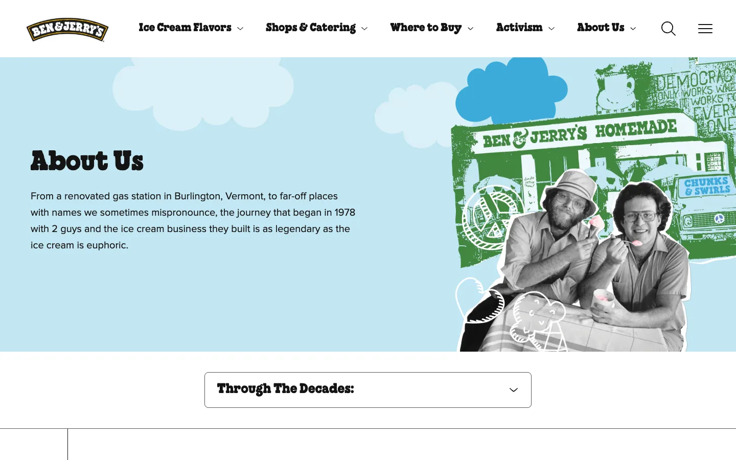
The intro packs the whole story into one sentence: a renovated gas station in Burlington, Vermont, 1978, two guys. The timeline below opens with the detail that makes it believable: a $5 correspondence course in ice cream making and a $12,000 investment. Values follow as three short cards. Steal this: put real numbers in the origin story. "Small beginnings" means nothing; a $5 course is memorable.
2. Wise: the founders' own problem
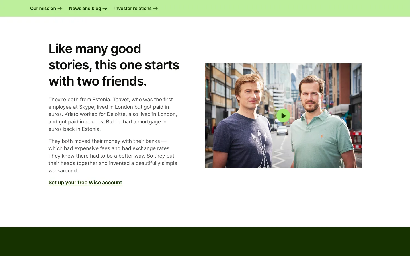
Taavet lived in London but was paid in euros. Kristo lived in London, was paid in pounds and had a mortgage in euros. Both lost money to bank fees and bad rates, so they built a workaround. Steal this: tell the founding story as the problem you had, in the customer's terms. If the reader has the same problem, the story does the selling.
3. Amul: a long history, split into eras
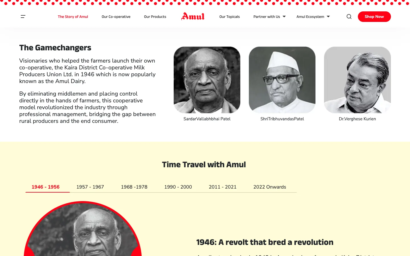
"The Gamechangers" puts faces on the 1946 Kaira District co-operative: Sardar Vallabhbhai Patel, Tribhuvandas Patel and Dr Verghese Kurien. "Time Travel with Amul" then splits 80 years into tabs, from 1946 to 1956 through 2022 onwards. Further down, the co-operative model gets its own numbers, including 3.6 million producer members. Steal this: when your history is long, break it into eras so it never becomes a wall of text.
4. Tata: heritage, then ownership
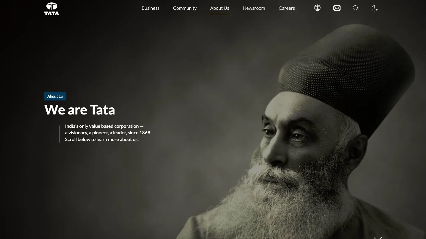
The first screen is a portrait of Jamsetji Tata and three short lines ending in "since 1868". Scroll and the page moves through Business, Ownership, Values, Financials, People and Community, with headlines such as "1868: A startup. Today: A global enterprise" and "66% of Tata Sons is owned by trusts". Steal this: say who owns the company. For a buyer weighing a long contract, ownership is a trust question.
5. Buffer: a team you can filter
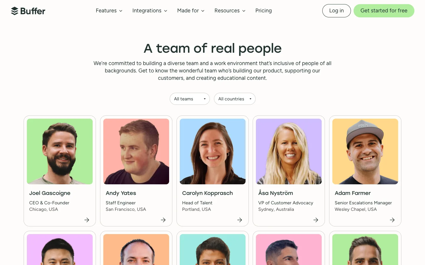
"A team of real people" is followed by two filters, All teams and All countries, and a grid where each card has a name, role and city, starting with the CEO. Lower down, a note warns that scammers send fake job offers in Buffer's name. Steal this: if you have more than a dozen people, add filters. Visitors want to find the person they will deal with, not scroll a wall of faces.
Is your website designed to win customers?
Conversion optimization starts with what a first-time visitor sees. Our free test reviews your page on desktop and phone and tells you what to fix first.
Take the free test6. Zapier: photos with a date and a place
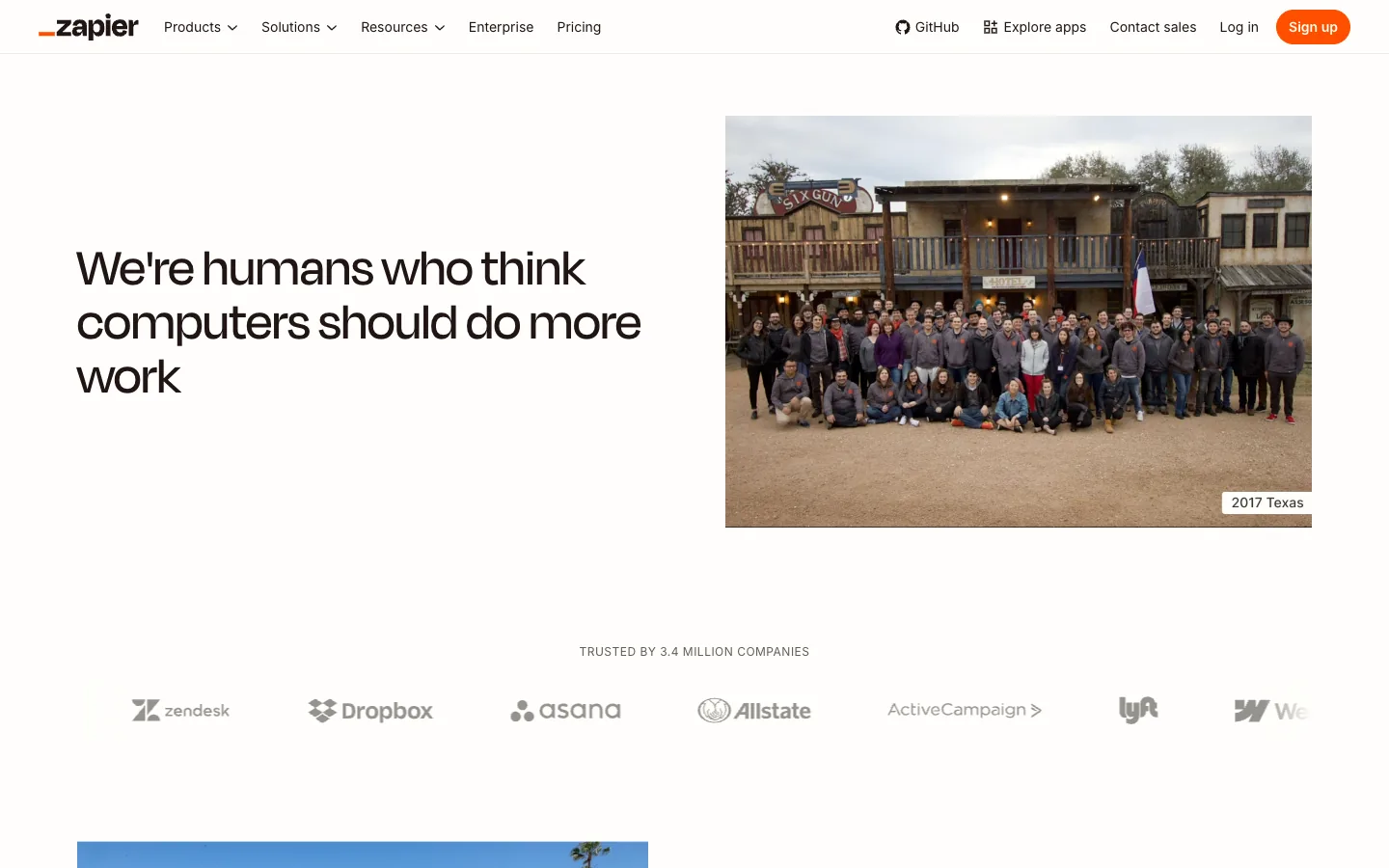
The headline sets the tone, "We're humans who think computers should do more work", and the group photo carries a small label: 2017 Texas. Below sit "trusted by 3.4 million companies", usage numbers, values, and a remote section: 800+ people across 38 countries. Steal this: caption team photos with the year and place. A dated photo reads as a real moment, not a stock image.
7. Airbnb: numbers with a date on them
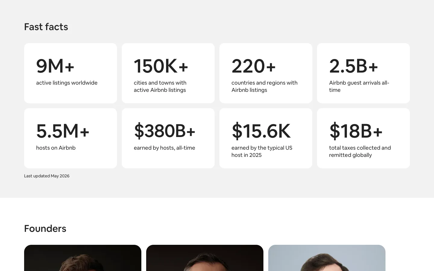
Eight cards give the scale, from 9M+ active listings to 5.5M+ hosts, and a small line under them says when they were last updated. The founders follow with names and titles, then a year-by-year story that starts with three guests in 2007. Steal this: date your numbers. An undated "10,000+ clients" could be from 2019; a dated one is a fact.
8. Ghost: the real numbers, live
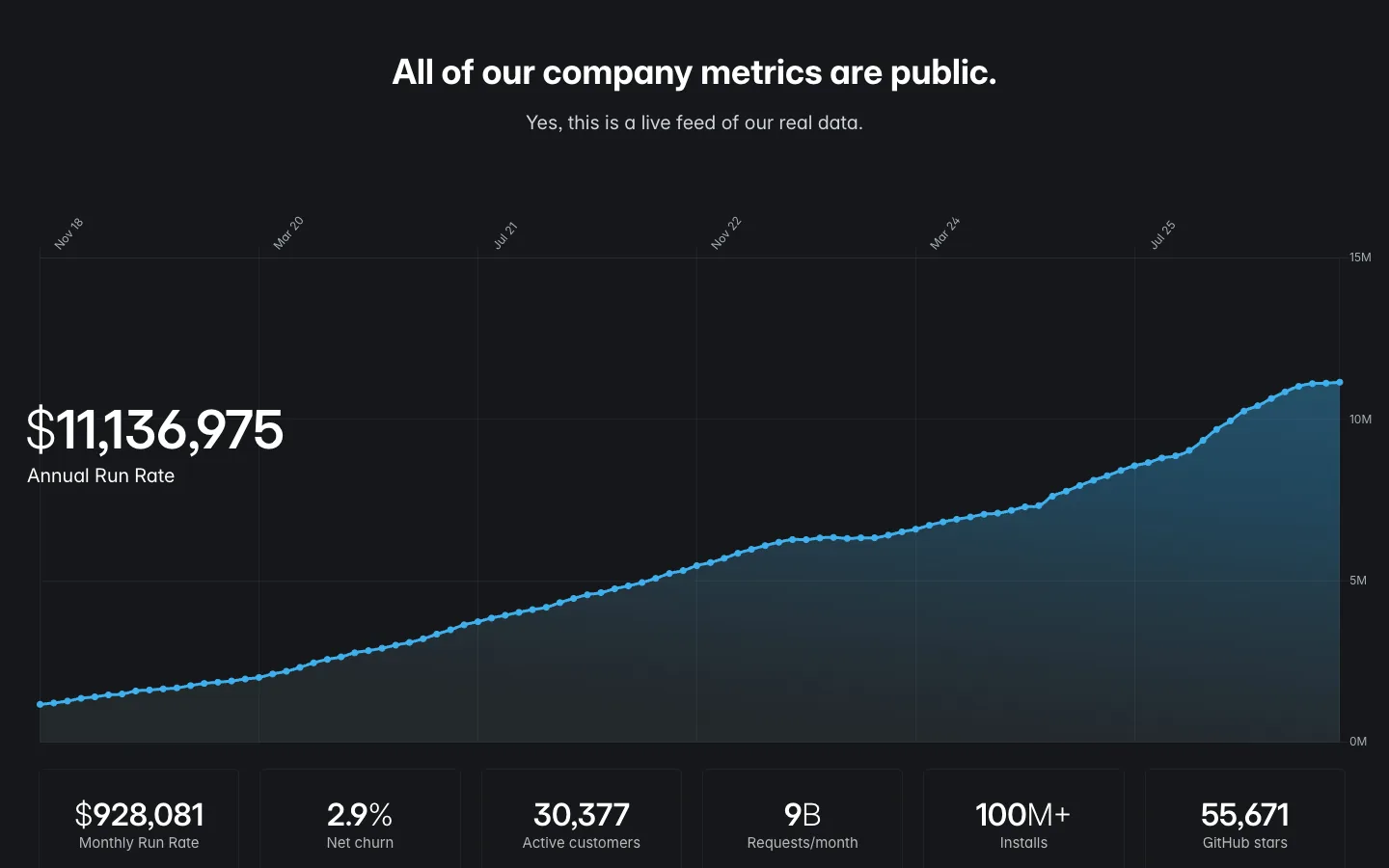
Ghost opens by saying it is a non-profit, founded in April 2013 by John O'Nolan and Hannah Wolfe, and shows the team in candid photos. Then comes a live chart of annual run rate, with monthly revenue, net churn and active customers beside it. Steal this: you do not have to publish revenue, but every number you show should be real and sourced. Readers can tell the difference.
9. GitLab: a number that proves a habit
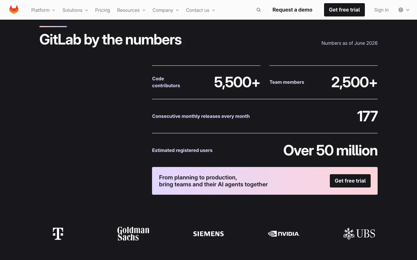
Most numbers on about pages prove size. One of GitLab's proves behaviour: 177 consecutive monthly releases. It sits beside 5,500+ code contributors and 2,500+ team members, with "Numbers as of June 2026" in the corner. Steal this: pick a number that proves the habit you want to be known for: projects delivered on time, years without a missed release, repeat clients.
10. Plausible: who pays the company
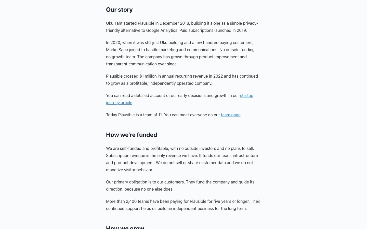
The story is told in dated steps: started alone in December 2018, a second person in 2020, $1 million in annual recurring revenue in 2022, a team of 11 today. Then a section most companies skip: self-funded, no outside investors, subscriptions as the only revenue. The page even links to a note on when Plausible is not a fit. Steal this: answer "who pays you?" plainly. It tells buyers whose interests you serve.
11. Groww: the market problem in one line
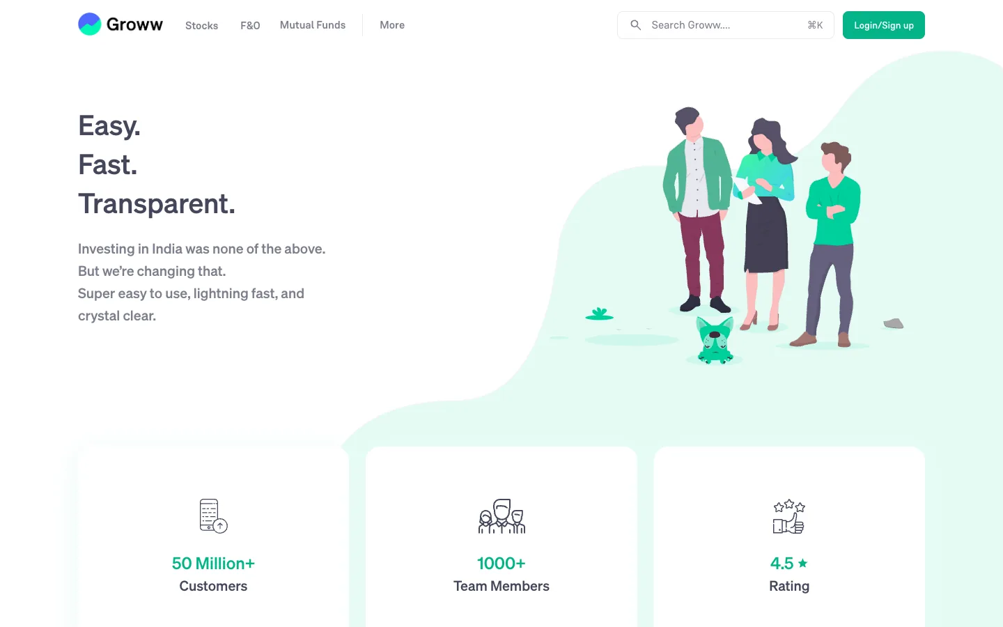
"Easy. Fast. Transparent." is followed by the line that earns it: "Investing in India was none of the above." Three cards give customers, team size and rating, then come values and a row of investors. Steal this: name the old problem in your market in one line, then show the numbers that say you fixed it. The slip: the illustrated people tell you nothing about the real team.
12. Fabindia: the legal details, in plain sight

Above this section sit a legacy strip with photos from 1960, 1976 and 1981, and the vision and mission. The values open with founder John Bissell's own words. Then the part most Indian about pages leave out: Fabindia Limited, its CIN, the corporate office in Faridabad, the registered address in New Delhi, a phone number and an email. Steal this: publish your legal name, CIN and registered address. A cautious buyer can check you exist in two minutes.
13. Mozilla: a mission written as an action
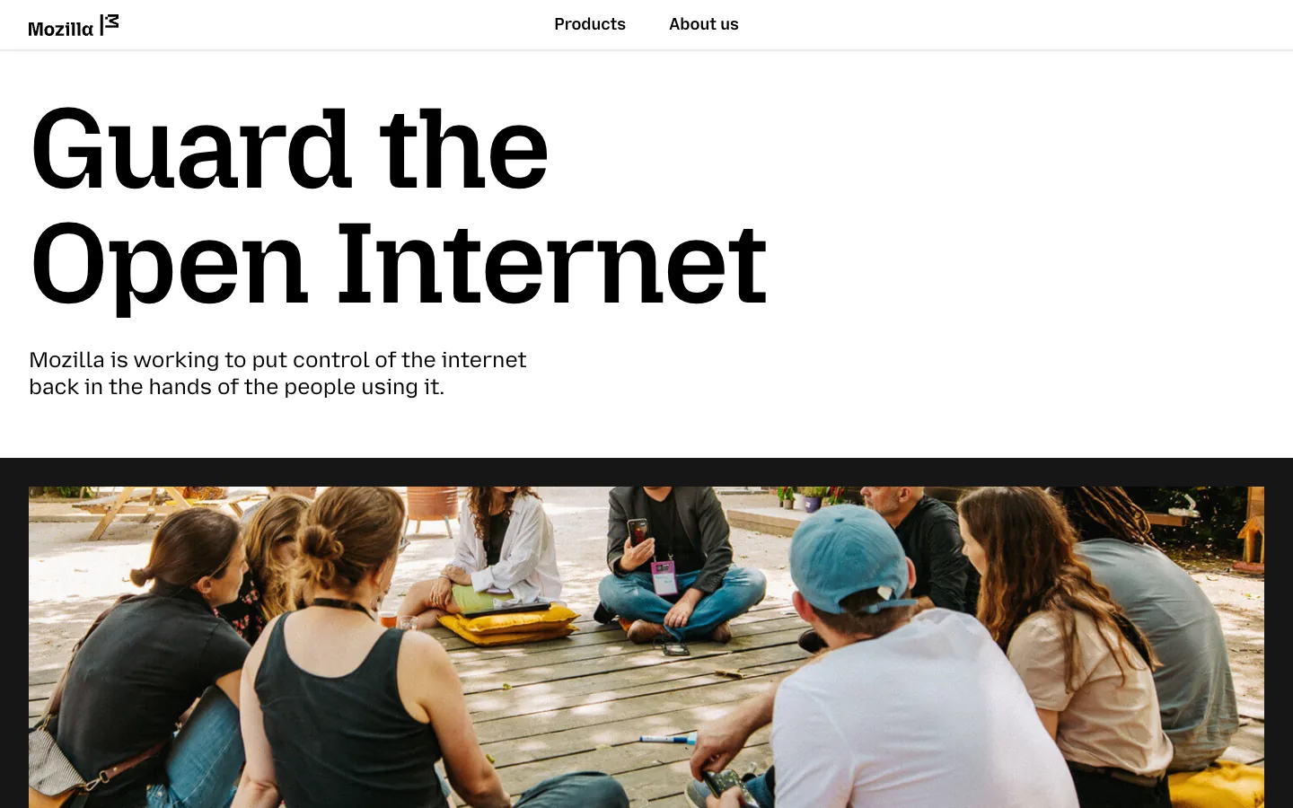
"Guard the Open Internet" is a mission you could join, not a slogan you admire. The line under it says what that means, and the page moves on to a manifesto and the family of organisations behind Firefox and Thunderbird. Steal this: write the mission as a verb. "We help clinics fill their calendars" beats "We are passionate about healthcare".
14. Headspace: who, what and how
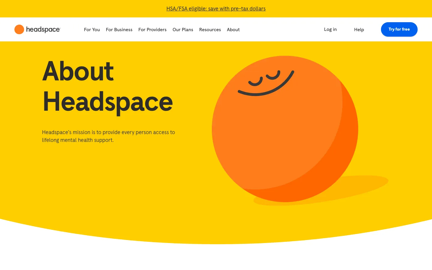
The mission is one sentence under the H1: access to lifelong mental health support for every person. Below the fold, three labelled blocks answer the questions in order: Who we are, What we do, How we do it. Steal this: use those three labels on a small company's about page. They force you to say what the company actually does, the first thing visitors look for.
15. Bombay Shaving Company: the brand's own voice
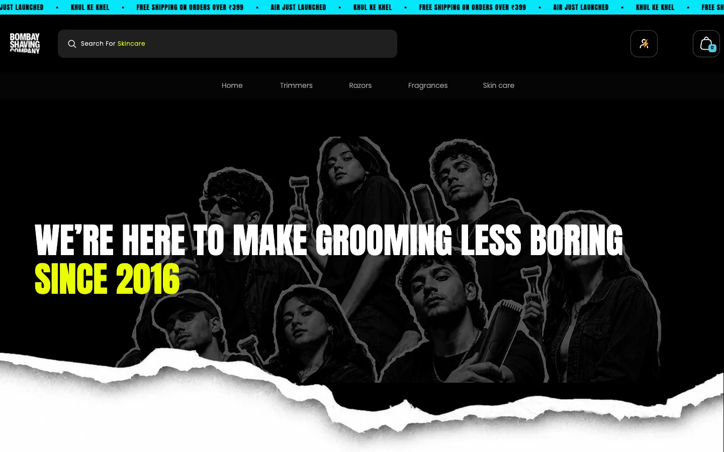
The headline reads like the packaging: "We're here to make grooming less boring", with "since 2016" in yellow. The story follows in two lines, "It started with a shave. Then we kept going." Steal this: write the about page in the voice customers already know from your ads and products. The slip: lower sections, such as the four pillars, read like an internal culture deck.
The trust job an about page does before a sales call
Nielsen Norman Group's research on about pages (Kaley and Nielsen, May 2019, more than 70 users and 100 sites tested) found people arrive with practical questions: partners and vendors checking you out, journalists, investors and job seekers. Their first need was simple: what does this company do? Real photos of real employees, plain language and storytelling made companies seem authentic. Stock photography, corporate speak and walls of text did the opposite.
For a business that sells through calls, that sets the brief for about page design: answer four doubts before the buyer voices them.
- Are you real? Legal name, registered address, a phone number, a founding year (Fabindia, Tata).
- Who will I deal with? Faces, names and roles, not illustrations (Buffer, Airbnb).
- Have you done this before? Dated numbers and named work (GitLab, Airbnb).
- Why do you do this? The founder's problem or the mission, in plain words (Wise, Mozilla).
What to include on an about us page
- One sentence on what you do and for whom, at the top.
- The story: founder, team or mission, chosen with the rule below.
- Real photos with names and roles.
- Three to five numbers, each dated.
- Proof: named clients, logos or reviews you can stand behind.
- Legal name, registered address and contact details. Indian companies can add the CIN and GSTIN.
- One clear next step, such as a link to your contact page or work.
To see how a page reads to a first-time visitor, run it through our free landing page review. It checks the offer, trust and proof, every visible section, and the phone view.
Not sure which story your about page should tell?
Send us your about page. We will mark what a buyer cannot yet answer before a call, and send back a free outline of what to add.
Founder story, team or mission: a decision rule
Every example above leads with one thing. To pick yours, ask what your buyer is least sure about, and lead with the answer.
| The buyer's doubt | Lead with | Fits |
|---|---|---|
| Why should I trust your judgement? | Founder story | Early startups, D2C brands, founder-led services (Wise, Ben & Jerry's) |
| Who will I actually work with? | Team | Agencies, consultancies, clinics, remote companies (Buffer, Zapier) |
| What do you stand for? | Mission | Non-profits, open source, health, causes (Mozilla, Headspace) |
| Are you big and stable enough? | Numbers and history | Established firms, enterprise sellers (Amul, Tata, GitLab) |
Lead with one, then support it with the others in that order of doubt. A ten-person agency usually leads with the team, because the buyer is hiring people. A two-year-old product company leads with the founder, because there is no history yet. Do not lead with a mission unless you can point to something you gave up for it.
Good about us page design comes down to answering the buyer's real doubt first, with proof you can show. For layouts to borrow, see our best SaaS websites and best portfolio websites, and for a young company's full site, website design for startups.
Frequently asked questions
What is an about us page?
It is the page where a company explains what it does, who is behind it and why it exists. Buyers, partners, journalists and job seekers use it to check that the business is real and worth dealing with. A good one leads with one clear story, shows real people and dated numbers, and gives a next step.
What should an about us page include?
One sentence on what you do and for whom, a founder, team or mission story, real photos with names and roles, a few dated numbers, proof such as named clients, your legal name and registered address, and a clear next step such as contact details. Skip stock photos and corporate phrasing; Nielsen Norman Group lists both as common mistakes.
How do you design an about us page?
Decide what your buyer doubts most and lead with that: the founder story, the team, the mission or the numbers. Put a one-line summary at the top, break long history into eras, use real photos with names, date every number, add legal details near the bottom, and end with a link to contact or your work.
How long should an about us page be?
Long enough to answer what the company does, who is behind it, why it exists and how to get in touch. For most small businesses that is a short summary plus four or five sections. Nielsen Norman Group recommends a scannable one or two paragraph summary, with deeper pages such as history or team linked from it.
Should an about us page have team photos?
Yes, if they are real. Nielsen Norman Group found realistic photos of real employees made companies seem more authentic, and lists stock photography among the common mistakes. Add each person's name and role, and a year or place on group photos. Illustrations are fine for decoration, but they cannot stand in for the people.
Make the Page Buyers Check Before They Call.
Talk to Waris about your about page. We work out the story your buyers need, write and design it in Webflow, and add the proof and details that answer their doubts before the first call.