

Most graphic design trends roundups are written to be scrolled, not used. They name forty moods and never say which one survives a 300 dpi print run, a 1080px Instagram crop, or a packaging line that has to pass a barcode scan. This one is for founders, marketers and designers picking a direction for print, social, brand collateral, packaging, illustration or motion work. We pulled the 2026 reports from Adobe, It's Nice That, VistaPrint, Envato and Behance, kept 12 trends that hold up off-screen, and rated how fast each will date. Web layout trends live in our separate website design trends guide.
Graphic design trends 2026 at a glance
| Trend | Where it shows up | Risk of dating fast |
|---|---|---|
| Chaos packaging | FMCG, snacks, beverage, D2C boxes | High |
| Photocopy grain | Posters, zines, event print, indie brands | Medium |
| Micrographics and barcode decoration | Labels, tech and streetwear collateral | High |
| Pick-and-mix lettering | Campaign type, social, merch | High |
| Elemental folk | Packaging, festive campaigns, hospitality | Low |
| Tactile craft | Social, illustration, children's and food brands | Medium |
| Candid camera-roll photography | Instagram, D2C, lifestyle brands | Medium |
| Saturation revival | Social, outdoor, youth brands | Medium |
| Cloud Dancer neo-minimalism | Premium packaging, stationery, decks | Low |
| Collage and the visual index | Editorial, brand books, campaign print | Medium |
| Surreal and absurdist imagery | Social, OOH, launch campaigns | High |
| Motion as the default deliverable | Logos, social, pitch decks, signage | Low |
Three of these (folk, neo-minimalism, motion) are safe to build a brand system on. The rest are campaign tools: use them for a season, on a layer you can peel off later.
The 12 graphic design trends shaping print, packaging and social in 2026
1. Chaos packaging
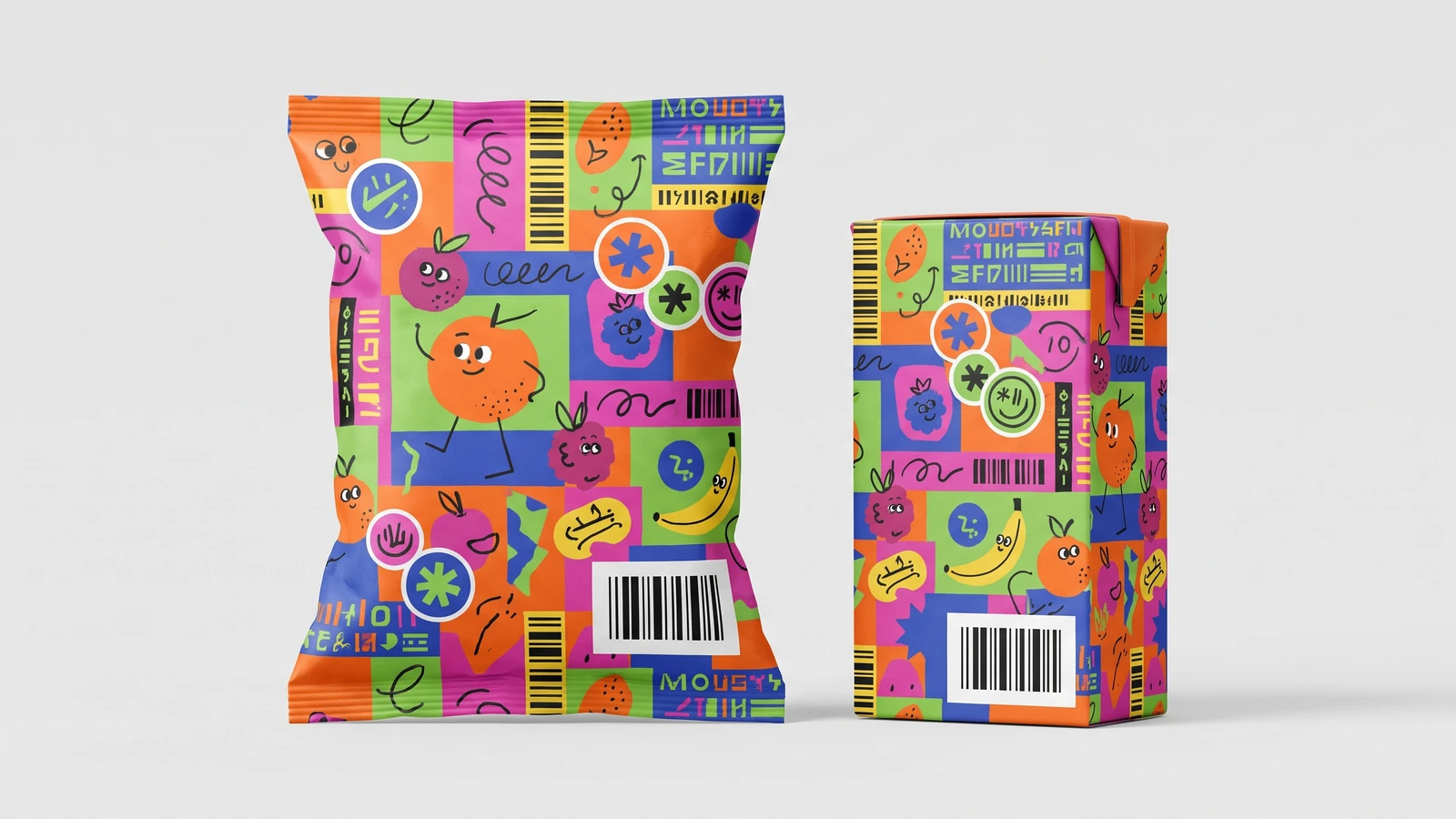
Loud, overpacked labels: quirky illustration, novelty type, colour collages, copy running up the side of the pack. Envato calls it chaos packaging and it is a direct reaction to a decade of sterile, sans-serif, white-box D2C branding. To use it without looking dated, keep the chaos on the front face only. Nutrition panels, ingredient lists, batch codes and the barcode stay clinical, because a label that fails a scan or an FSSAI check is not a design. Build the system on one fixed grid with interchangeable illustration so line extensions do not need a redesign. Skip it if you sell to pharma, baby care or anyone over 50; the same energy that reads playful to a 24-year-old reads untrustworthy to a parent.
2. Photocopy grain and print debris
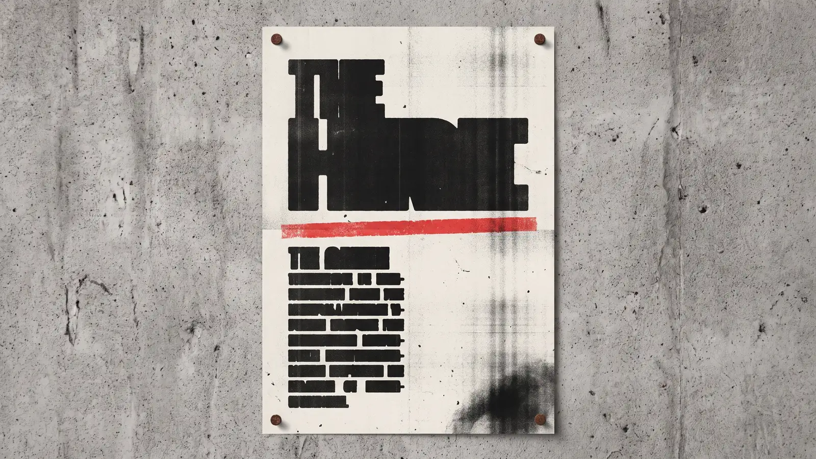
Low-resolution grain, toner smudges, scan lines and the dust marks of an office copier, applied on purpose. It's Nice That tracked it into 2026 through work like How&How's identity for Big Cartel and Charlotte Rohde's type campaigns. Where it came from: AI imagery is too clean, and a photocopied texture is the fastest way to signal a human made this. Use it as a texture layer, not a base style: keep type and logo crisp on top, and print a test on your actual stock because grain that looks rich on screen turns to mud on uncoated paper. Skip it if you are a bank, a hospital or a law firm. Deliberate roughness only works when the audience knows it is deliberate.
3. Micrographics and barcode decoration
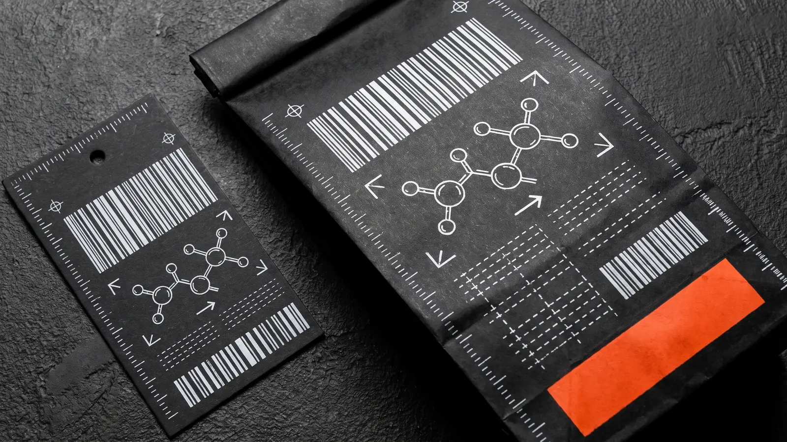
Tiny technical details pulled into the foreground: chemistry-style diagrams, spec sheets, blueprint symbols, barcodes and QR codes used as pattern. It's Nice That names it micrographics; VistaPrint calls the same idea micro-industrial. It comes from garment care labels and shipping cartons, the utilitarian print people already trust. Use it sparingly, as a secondary graphic language under a clean primary mark, and never fake a barcode that a real scanner could read wrong. Streetwear, coffee, tech hardware and lab-adjacent brands wear it well. Skip it if your product has no technical story to tell; a diagram of nothing is decoration, and this trend dates as quickly as any other decoration.
4. Pick-and-mix lettering and hand type
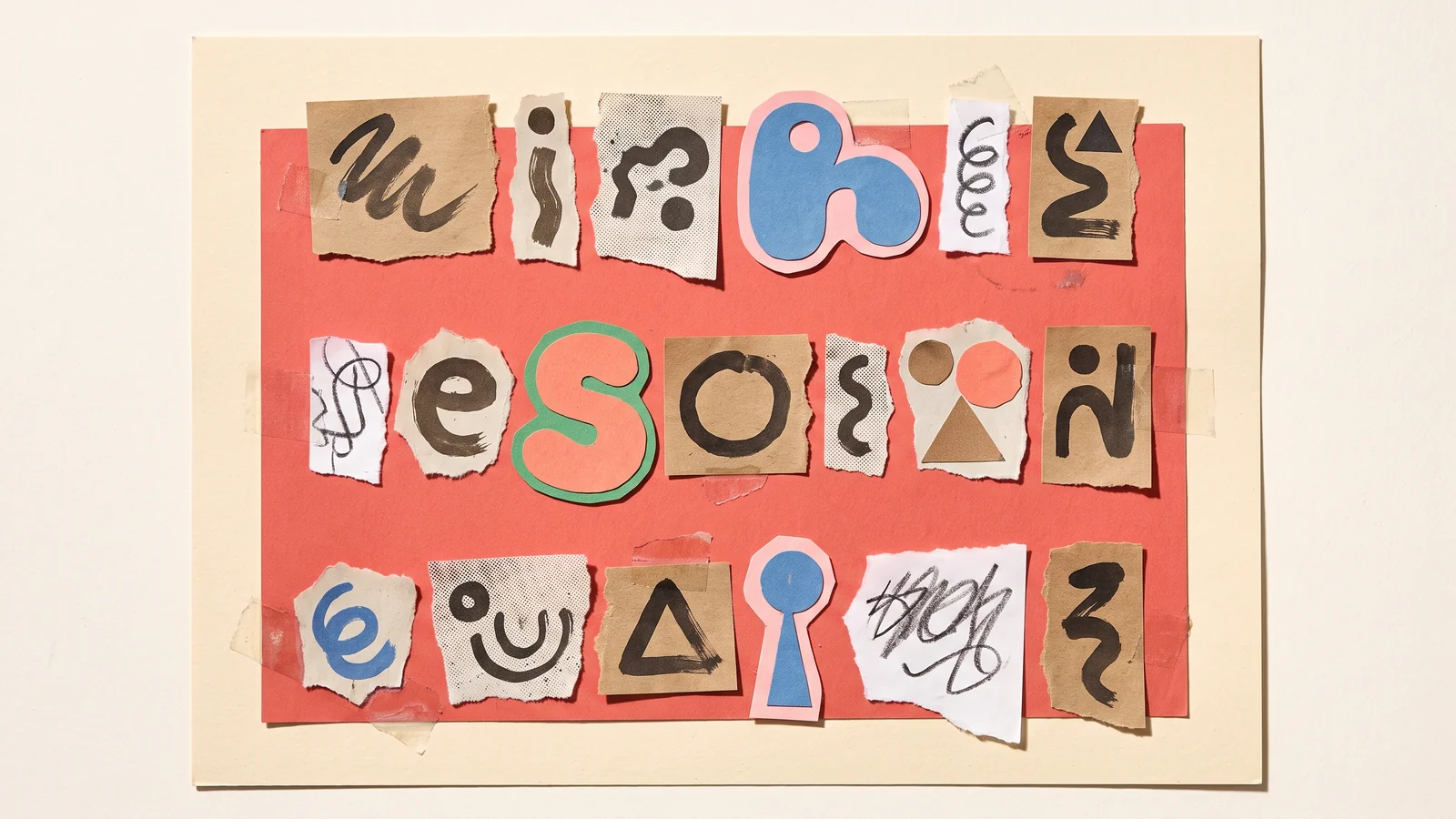
Ransom-note lettersets, scavenged characters, diary handwriting cut into type, brush-stroke logotypes. It's Nice That covers the collaged version (Harriet Richardson with F37 Foundry) and Behance's 2025 report logged the hand-lettered version under Type by Hand, strongest in food, drink and craft brands. Adobe's 2026 list adds oversized, bubbly, wavy letters to the same family. It came from the flatness of default sans-serifs on every screen. Use it for headline moments, campaign titles and merch, with a plain workhorse font for everything else; our font trends guide covers the pairings. Never set legal copy, prices or dosage in it. Skip it if your wordmark is the asset you are protecting; letter-by-letter chaos and a registered logo do not mix. See our logo design trends guide before touching the mark.
Not sure your logo should follow a trend?
Book a free call and we will tell you honestly whether the mark needs a redraw or just a campaign treatment around it.
5. Elemental folk and local flavour
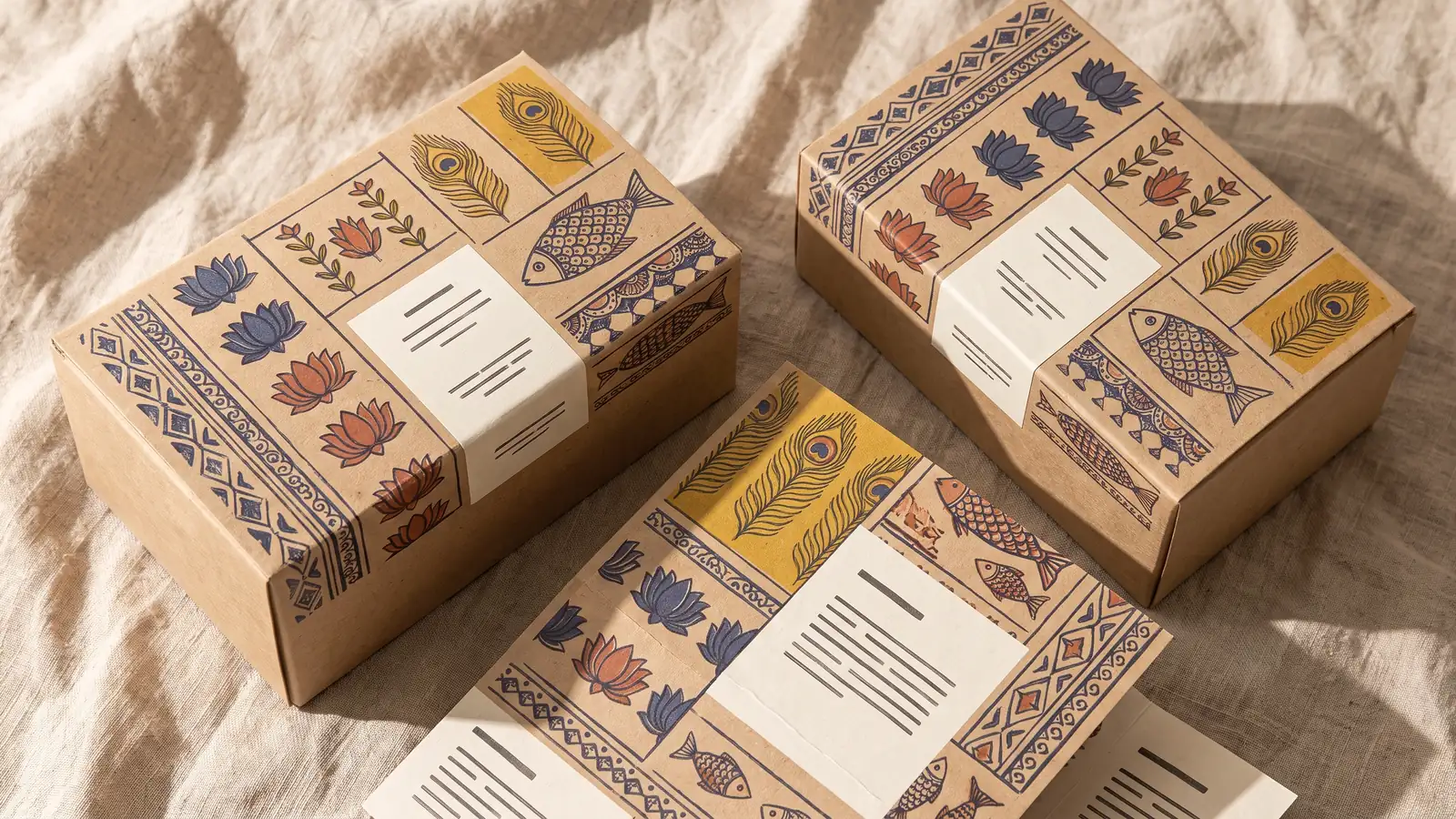
Regional craft motifs, hand-drawn florals and animals, ornamental borders, heritage patterns and documentary-style photography, set inside modern layouts. VistaPrint calls it Elemental Folk; Adobe files it under local and cultural flavour. It is trending because global-looking design now looks like every other AI-generated mood board, and rootedness is the new differentiator. For Indian brands this is the most useful trend on the list: Madhubani, Warli, Kalamkari, Pattachitra and block-print vocabularies already exist and already mean something. Use them with a clean modern grid and a restrained palette so the pattern reads as a system, not a souvenir. Commission or license from actual artisans and credit them. Skip the trend if you are borrowing a region's craft you have no connection to; audiences spot that in seconds.
6. Tactile craft
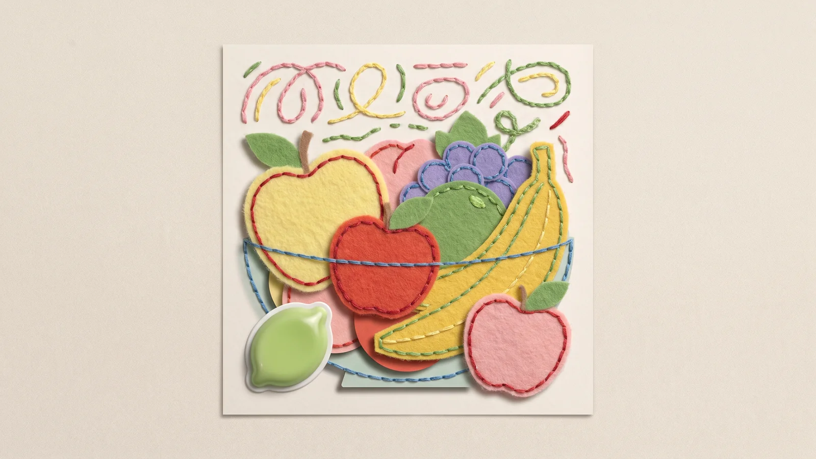
Digital work that looks like felt, embroidery, cut paper, clay and puffy vinyl, with visible stitches and real shadow. VistaPrint tracks it as Tactile Craft; Adobe's top trend for 2026 is the sensory version, hyper-real materials you want to touch. It grew out of screen fatigue: flat vectors have been the default since 2013 and people are bored. Use it for illustration systems, social series and children's, food and festive collateral. Keep one material per brand (all felt, or all paper), because mixing textures reads as clip art. Watch file weight; a 30 MB textured hero is fine for print and useless for a reel thumbnail. Skip it for finance, B2B SaaS and anything that needs to look precise.
7. Candid camera-roll photography
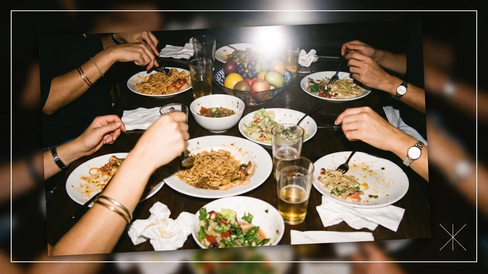
Grainy, flash-lit, slightly off-centre photos that look like they came from a friend's phone, paired with minimal type. VistaPrint lists it as Candid Camera Roll. It came from creators outperforming brands on Instagram with worse cameras, and from AI photography making polished shots feel synthetic. Use it for lifestyle, D2C and hospitality feeds, and shoot it deliberately: real flash, real locations, a shot list, then a light edit. The trap is inconsistency; candid does not mean random, so fix a crop ratio, a colour treatment and a type lockup that stays the same across every post. Skip it if your product is the hero (jewellery, electronics, cosmetics packaging). Those still need controlled lighting.
8. Saturation revival
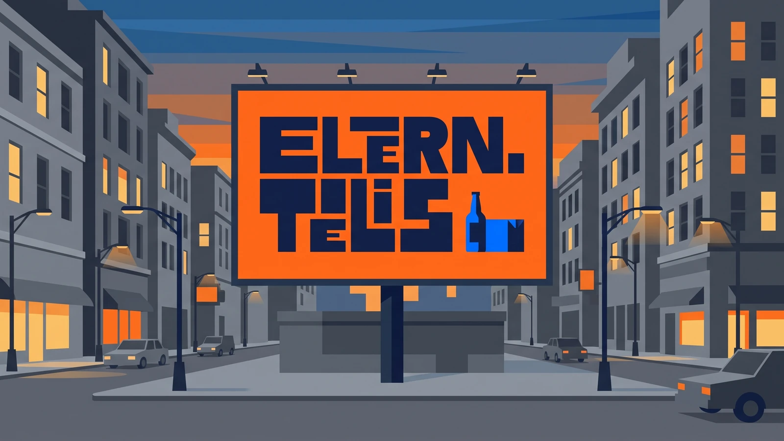
High-contrast, high-chroma colour, single-hue brand takeovers, colour clashes on purpose. Envato calls it Saturation Revival and Adobe's immersive, high-energy style is the same pendulum swing away from the sage-and-beige palettes of the early 2020s. Dopamine colour works on social and outdoor because the feed and the street are both crowded. Use one dominant brand colour at full saturation and let it own 70 percent of every composition, with a neutral for type. Proof it on a real printer: RGB neon does not exist in CMYK, so pick your saturated colour from a Pantone swatch first or you will get a dull surprise on press. Our color trends guide has the 2026 palettes. Skip it if your brand promise is calm, premium or clinical.
9. Cloud Dancer neo-minimalism
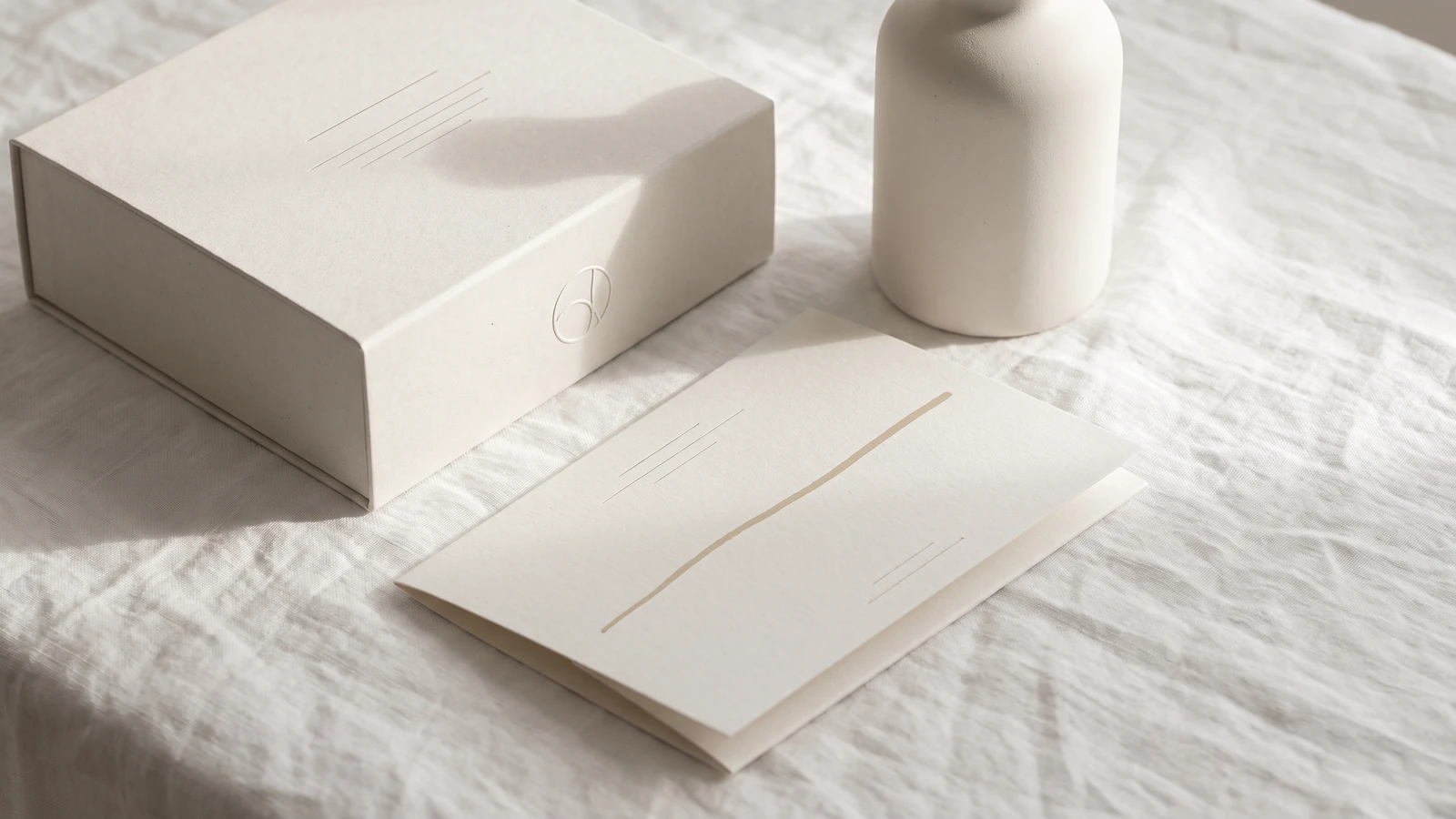
Pantone named Cloud Dancer (PANTONE 11-4201), a soft white, its Color of the Year for 2026, and Envato's Neo-Minimalism trend describes the same mood: clean layouts warmed up with natural paper stock, a serif, and tactile materials rather than pure Helvetica-on-white. It is the counterweight to everything else on this list. As chaos packaging and saturation get louder, quiet becomes a luxury signal again. Use it on premium packaging, stationery, investor decks and anything where the material does the talking: choose the paper first, then the type, then the (small) colour accent. Give it one human touch, a hand-drawn mark or a debossed detail, or it slides back into generic. Skip it if you are a challenger brand on a crowded shelf; quiet gets ignored when nobody knows you yet.
Planning a quieter, premium identity?
Tell us about the brand and we will send a free quote for the identity work: logo, typeface, colour and brand guidelines.
10. Collage and the visual index
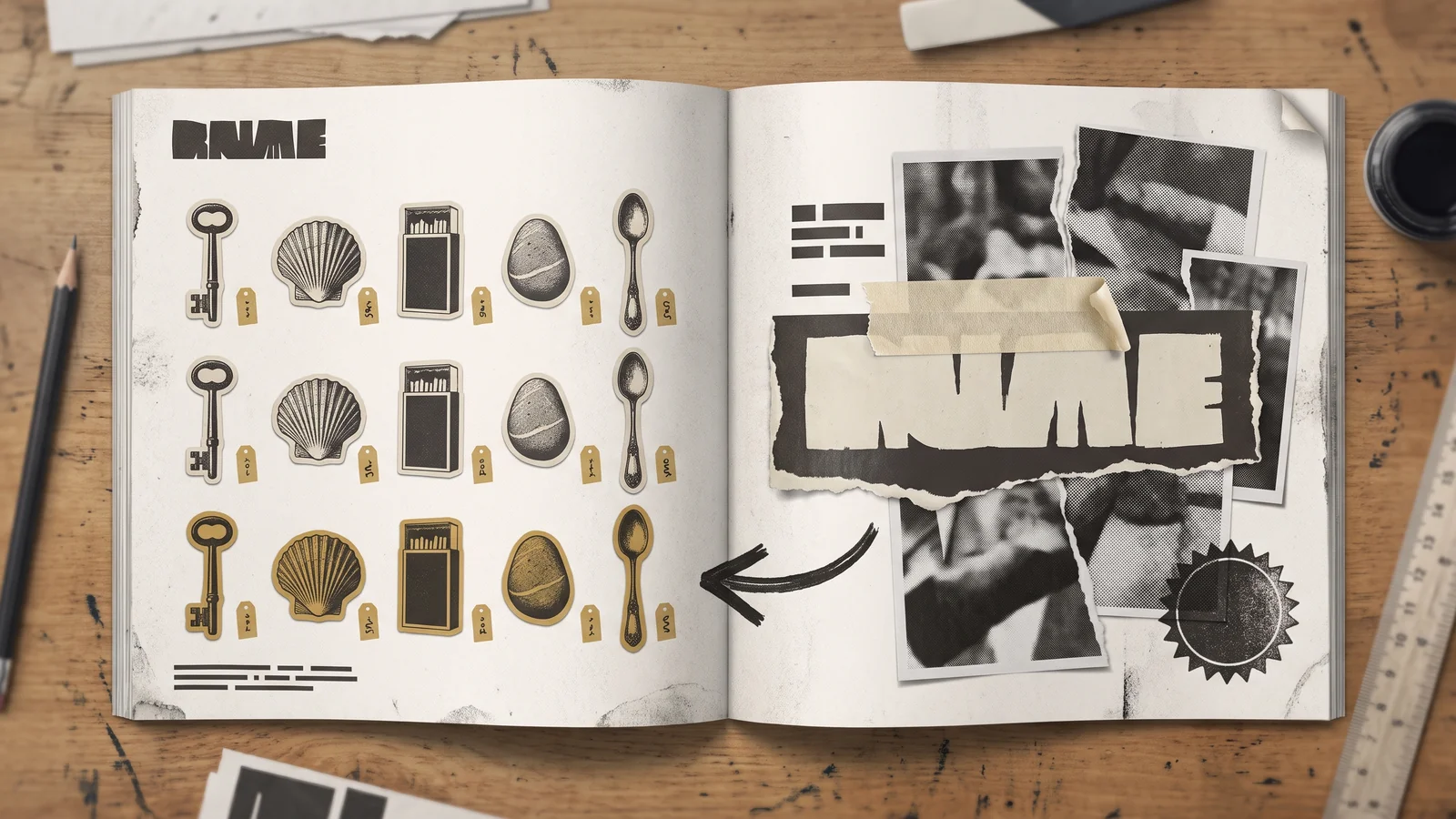
Layered photos, doodles, stamps, torn edges and, in its 2026 form, the visual index: flattened, numbered objects arranged like specimens in a display case (It's Nice That cites Miguel Vides and Sunroom). Adobe lists collage separately; VistaPrint's Distorted Cut is the angry cousin with fragmented photography. It comes from zine culture and from the fact that AI is bad at intentional mess. Use it for editorial spreads, brand books, campaign print and carousel posts where you have real objects to show. Shoot or scan your own elements; stock cut-outs make it look like a template. Keep a strict type hierarchy underneath so the eye has somewhere to land. Skip it if you have only one product and nothing else to collage; a single item on a torn-paper background is just a busy product shot.
11. Surreal and absurdist imagery
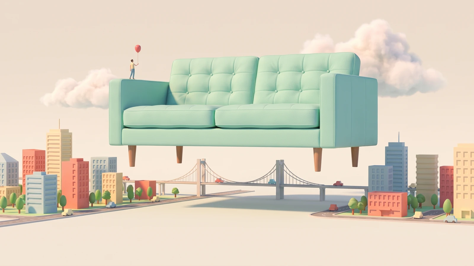
Wrong scales, floating objects, visual jokes, dreamlike composites: a sofa the size of a city, a tube of toothpaste with a weather system. Adobe calls it surreal and absurdist; VistaPrint's Hyper-Individualism is the same instinct. Generative tools made this cheap, which is both why it is everywhere and why it will date fast. Use it for launch campaigns, OOH and social, with one clear idea per image, not a generator prompt gone wild, and check the AI usage rules of every platform you post on. Read our note on AI for graphic design before building a whole campaign on generated imagery. Skip it if your category punishes weirdness: insurance, healthcare, B2B infrastructure.
12. Motion as the default deliverable
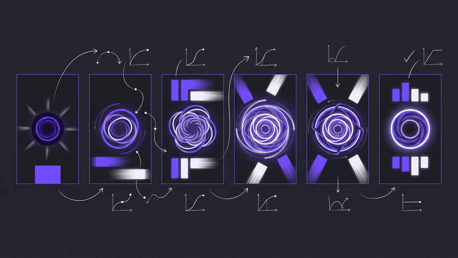
Logos that animate, social templates built as 3-second loops, kinetic type, product demos cut for vertical video. Behance's 2025 report flagged Designed to Move as the shift in how work is presented, and in 2026 it is the shift in what clients order: a static brand guide is now the exception. It came from every feed going video-first and from Rive, After Effects and Lottie making motion cheap to ship. Use it by designing the motion rule (how the logo enters, how type reveals, one easing curve) once, in the brand guidelines, so every reel and signage loop behaves the same. Deliver still, GIF and MP4 variants of every key asset. Nobody should skip it. This trend does not date; the tools do.
How to use these trends without dating your brand collateral
The trend does not decide the outcome; where you apply it does. The rule we use on brand and design work at Gleam:
- Core layer, five-year horizon: the logo, primary typeface, primary colour and the grid. Only low-risk trends belong here: elemental folk, neo-minimalism, motion rules. Never chaos packaging or a ransom-note letterset.
- Campaign layer, one season: illustration style, photo treatment, secondary colour, texture. This is where saturation, photocopy grain, collage, tactile craft and surreal imagery live. When they date, you swap the layer and the brand underneath is untouched.
- Test on the real surface: print a proof on the actual stock, view the social asset on a ₹12,000 Android phone at arm's length, scan the barcode.
- Pick one loud thing: chaos packaging with pick-and-mix lettering and surreal photography is three trends fighting. The 2026 work that holds up pairs one loud trend with one quiet one, which is the dual aesthetics pattern Envato describes.
The web version of this decision (which of these translate to CSS and which tank your Core Web Vitals) is in our design trends 2026 art-styles guide. Read the two together if the same brand has to work on a pack and a landing page, which it usually does.
Does the brand have to work on a website too?
Send us your brand guide and we will outline, free, how it carries over to a Webflow landing page: type, colour and motion.
Frequently asked questions
What are the biggest graphic design trends in 2026?
The trends showing up across the 2026 reports from Adobe, VistaPrint, Envato and It's Nice That are chaos packaging, photocopy-style textures, technical micrographics, hand-made and collaged lettering, folk and local craft motifs, tactile materials, candid photography, saturated colour, warm minimalism around Pantone's Cloud Dancer, collage, surreal imagery, and motion as a standard deliverable. The common thread is a reaction against smooth, AI-generated sameness.
What is the difference between graphic design trends and web design trends?
Graphic design trends cover print, packaging, social assets, illustration, brand collateral and motion graphics, where the constraints are paper stock, CMYK, crop ratios and file formats. Web design trends cover layout, interaction and performance in the browser. Some overlap (colour, type, illustration style), but a trend that works on a poster can fail on a page, and vice versa. We keep separate guides for each.
Which graphic design trends are safe for a long-term brand identity?
The low-risk ones: elemental folk and local craft motifs, warm neo-minimalism, and a defined motion system. These are rooted in material, culture or behaviour rather than a visual fad, so they age slowly. Chaos packaging, saturation, surreal imagery, barcode decoration and ransom-note lettering are campaign tools. Use them for a season on a layer you can replace without touching the logo or grid.
Are these trends relevant for Indian brands and print work?
Yes, and the folk and local flavour trend is the most useful one for Indian brands because the craft vocabularies (Madhubani, Warli, Kalamkari, block print) already exist and carry meaning. Two practical cautions: saturated RGB colours often do not reproduce on Indian offset presses, so pick from a Pantone swatch first, and candid or textured social assets should be checked on a budget Android phone, not a MacBook.
Will AI replace graphic designers if trends are this easy to generate?
Generators can produce the look of most trends in seconds, which is exactly why the 2026 reports lean toward things AI does badly: intentional mess, real materials, regional craft, hand lettering and coherent motion systems. The value shifts from producing the style to choosing it, applying it to the right layer of the brand and making it survive print and packaging constraints. Our separate post on whether AI will replace graphic designers goes deeper.
Get a Brand Collateral Review.
Send us your packaging, social templates or brand guide. We will tell you which trends you can adopt on the campaign layer, which will date your core identity, and what to fix first.