

Quick answer
Good product page design puts the photo, price with MRP, a pincode-based delivery date, the rating and one primary button on the first phone screen. Examples worth copying include boAt's sticky buy bar, Mokobara's delivery date above Add to Cart, Lenskart's AR try-on and Sleepy Owl's price inside the cart button.
- Name the next step on the main button: Lenskart's Select lenses beats a generic Buy when a step sits in between.
- Show EMI only for big tickets like a ₹7,999 bag or a laptop, not on a ₹1,099 product.
- Keep pop-ups off product pages; notification prompts covered part of the screen on two of the nine pages captured.
Product page design is the layout of the one page where a shopper decides to buy: photos, price, delivery promise, reviews and the add to cart button. Get those five right on the first screen and most of the page's work is done. We captured nine live product pages on 7 November 2026, six Indian D2C brands and three global ones, on desktop and phone. Each entry gives one idea to steal and one slip; the rules at the end come from what we saw.
Product page design examples at a glance
| Store and product | On the first screen | Idea to steal |
|---|---|---|
| boAt, Airdopes Plus 221 | Price vs MRP, pay later, pincode delivery date | Sticky Add To Cart and Buy Now bar on phones |
| Bombay Shaving Company, Power Groomer | Rating, price, EMI, pincode check | Sticky price and cart bar on desktop too |
| Minimalist, Niacinamide 10% | Review count, review summary, skin claims | Summarise what reviewers praise |
| Sleepy Owl, Cold Brew Pack | Four product facts as icons, pack sizes | Price printed inside the cart button |
| Mokobara, Em Cabin Pro | Delivery dates, damage cover, pay in 4 | Delivery date right above Add to Cart |
| Lenskart, Air POP frames | Try on, 360 view, exchange and warranty | Let the shopper test the product |
| Glossier, Boy Brow | Rating count, shades, price in button | Choose the shade, then one button |
| Allbirds, Tree Runner NZ | Price with free shipping, size grid | A fit note under the sizes |
| Apple, MacBook Air (India) | Monthly EMI price first, model choice | One decision per step for big tickets |
Product page examples from Indian D2C and global brands
1. boAt: the sticky buy bar
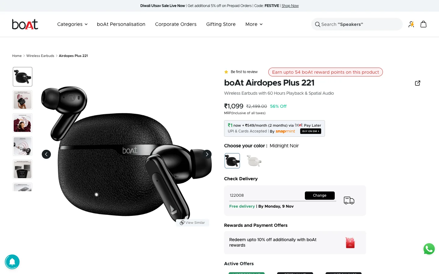
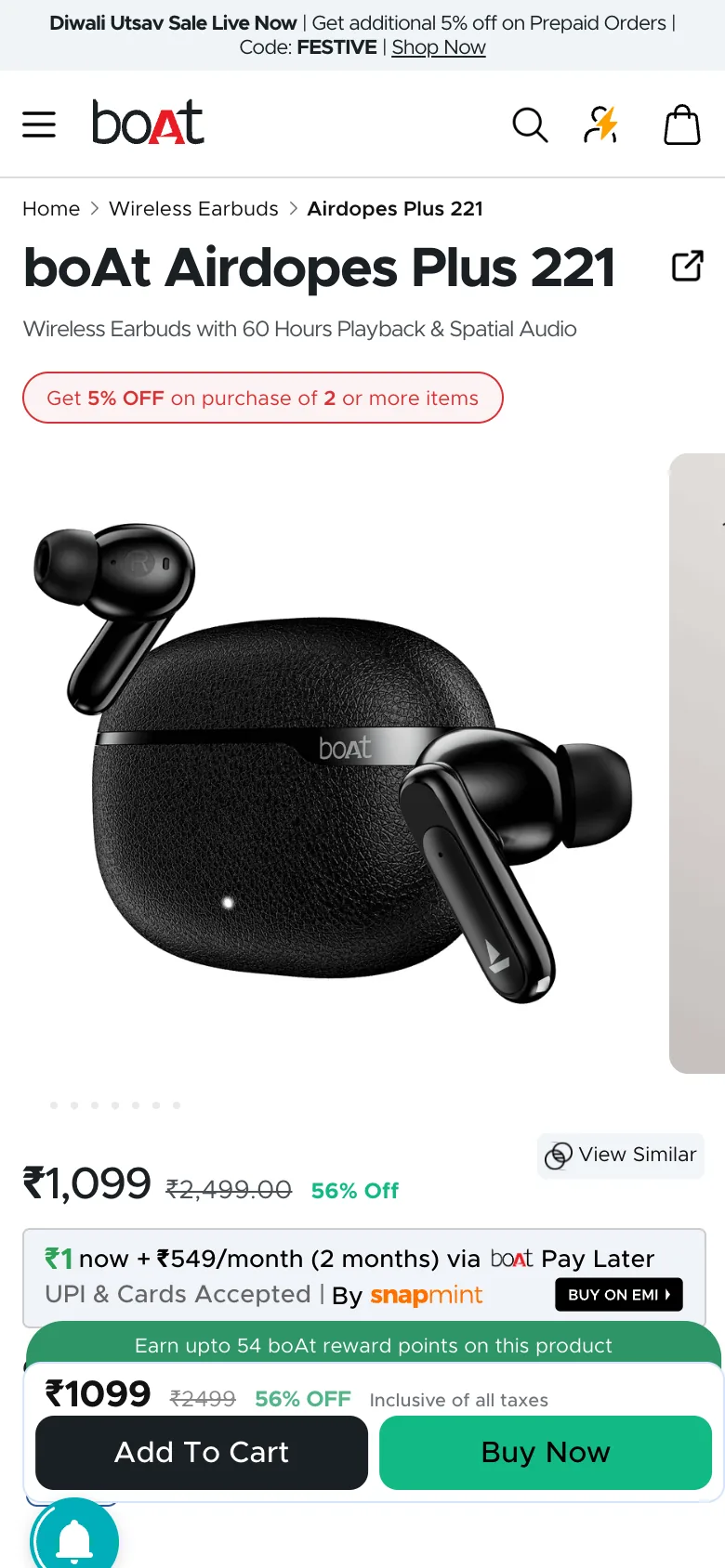
Steal this: on a phone the price, Add To Cart and Buy Now sit in a bar that never scrolls away. On desktop the pincode box already reads "Free delivery, By Monday, 9 Nov". Where it slips: "Be first to review" sits above the title of a sale product, which reads as no one has bought it.
2. Bombay Shaving Company: a buy bar on desktop too
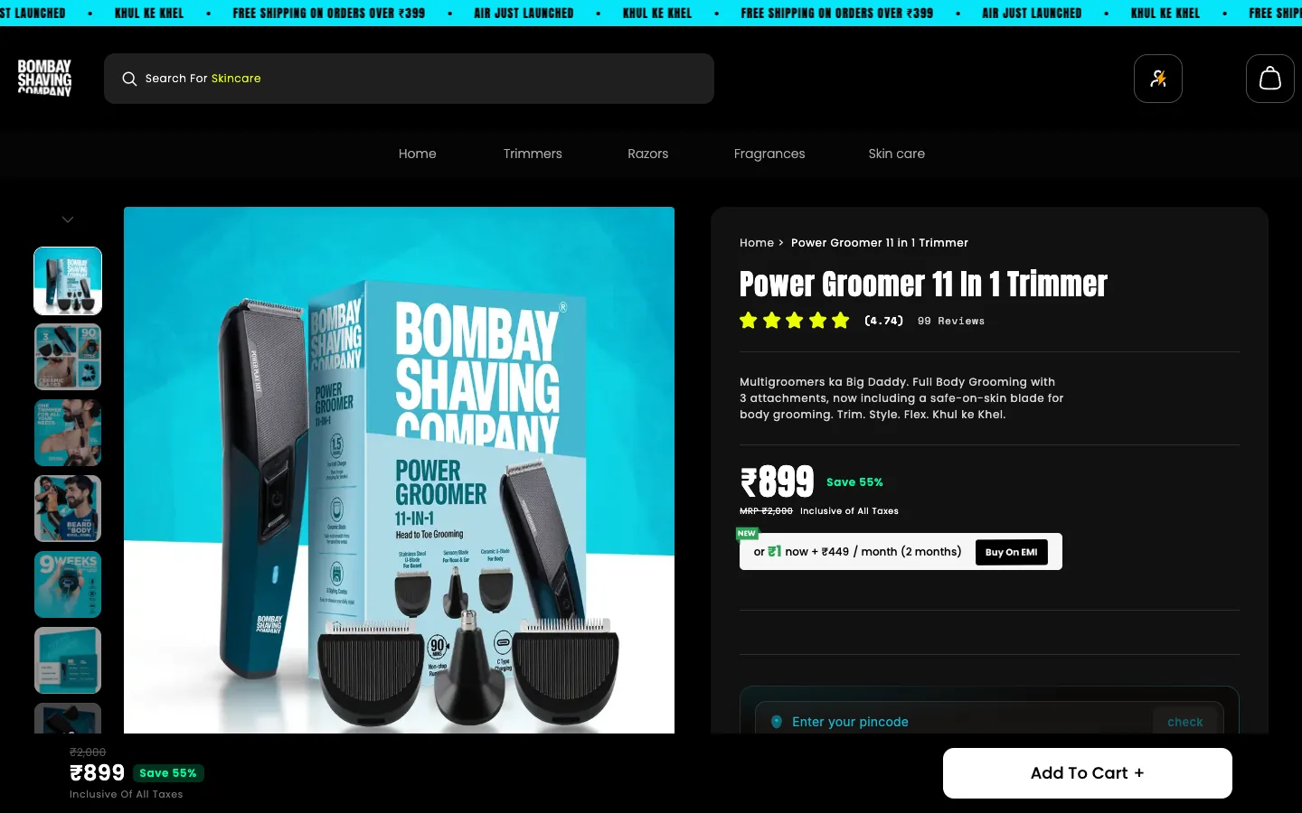
Steal this: the rating (4.74 from 99 reviews) sits under the title, and the bottom bar repeats price and Add To Cart while you read. Where it slips: the pincode check is pushed to the bottom edge, so delivery timing is the last thing a visitor sees.
Is your website designed to win customers?
Conversion optimization starts with what a first-time visitor sees. Our free test reviews your page on desktop and phone and tells you what to fix first.
Take the free test3. Minimalist: reviews that say what the product is good for
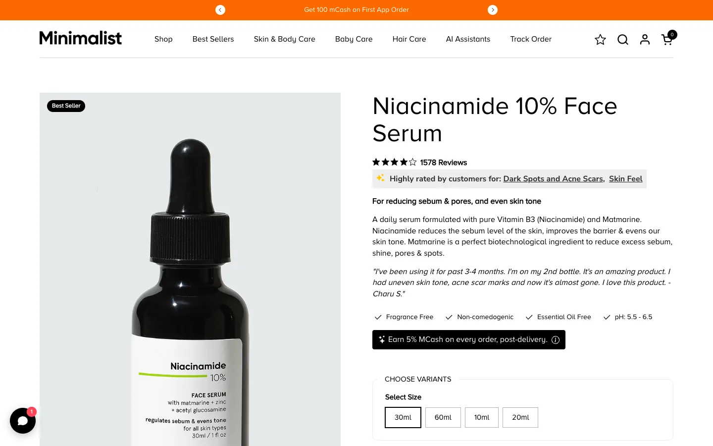
Steal this: under the review count, "Highly rated by customers for: Dark Spots and Acne Scars, Skin Feel" turns hundreds of reviews into one reason to buy. Where it slips: on a 1440px screen there is no price and no button yet.
4. Sleepy Owl: price inside the button
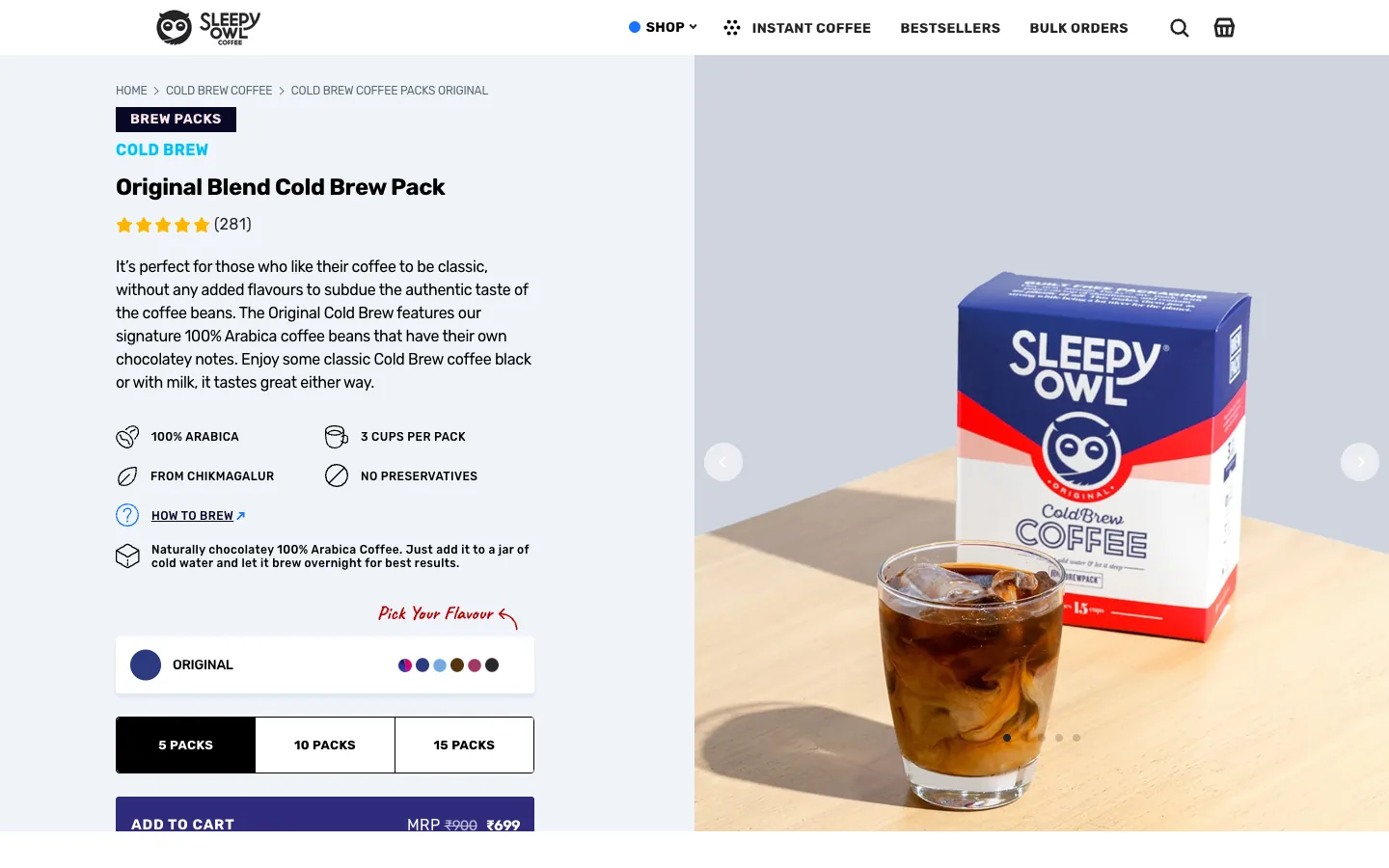
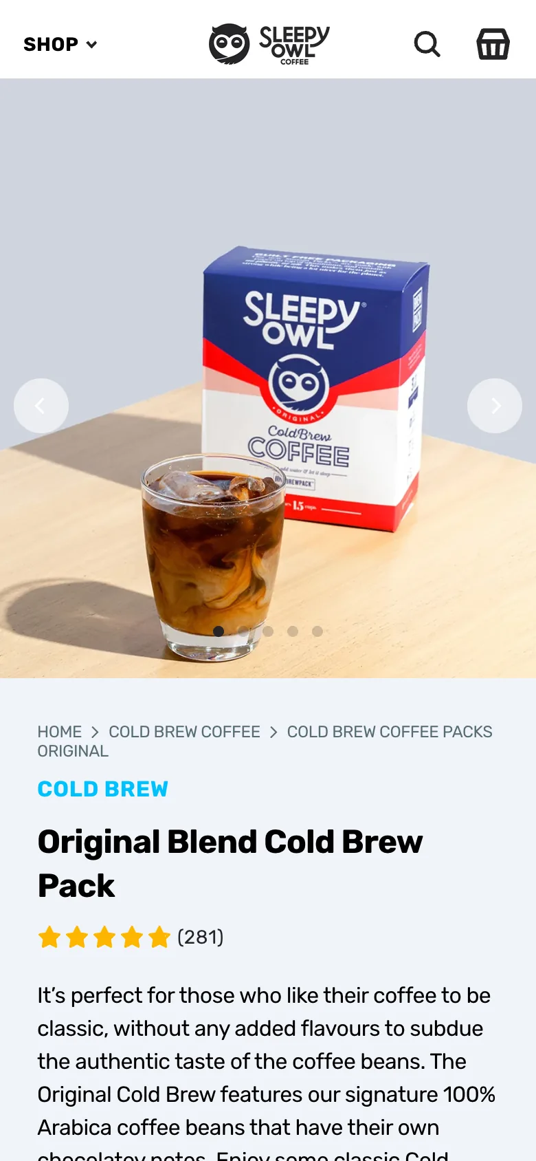
Steal this: the button reads "Add to cart, MRP ₹900, ₹699", so the shopper never hunts for the price. "3 cups per pack" answers value in four words. Where it slips: on a phone the description comes before the price, and the button sits further down.
5. Mokobara: the delivery date next to the button
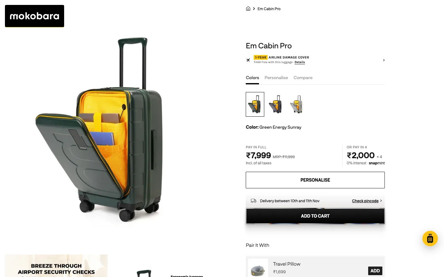
Steal this: the delivery window is printed on the line above the button, where the decision happens. A one-year airline damage cover, marked as free with the bag, answers the obvious worry about a ₹7,999 bag. Where it slips: no rating or review count anywhere on the first screen.
6. Lenskart: let the shopper try it
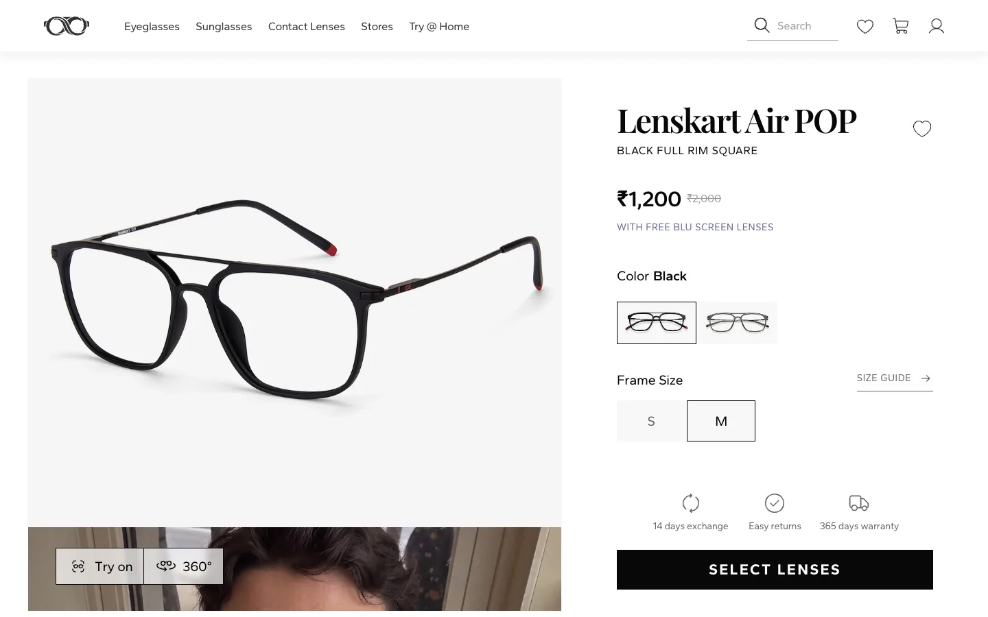
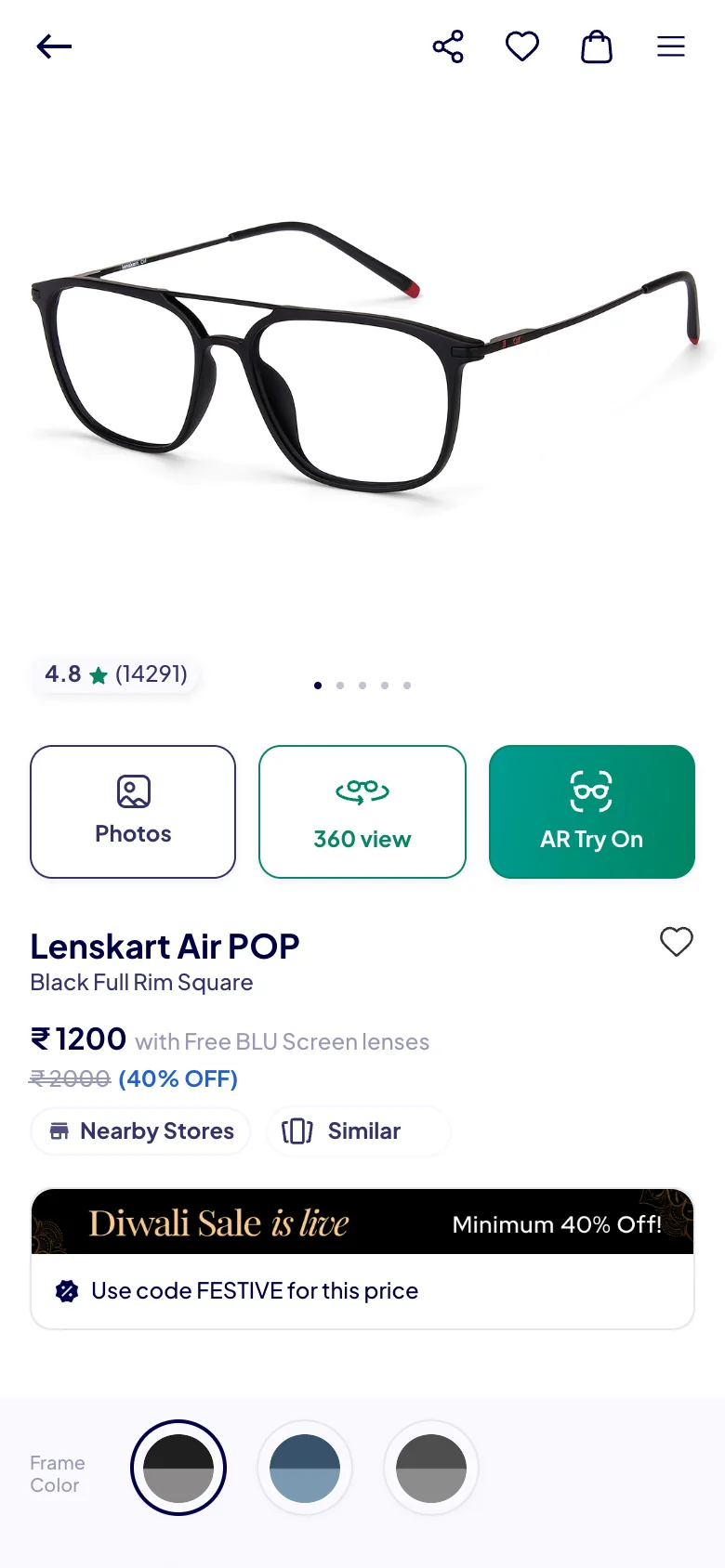
Steal this: on the phone, AR Try On is the only filled button on the first screen, because fit is the real objection with glasses. The main button says "Select lenses", the actual next step. Where it slips: the 4.8 rating from 14,291 ratings shows on the phone but not on the desktop first screen.
7. Glossier: shade first, then one button
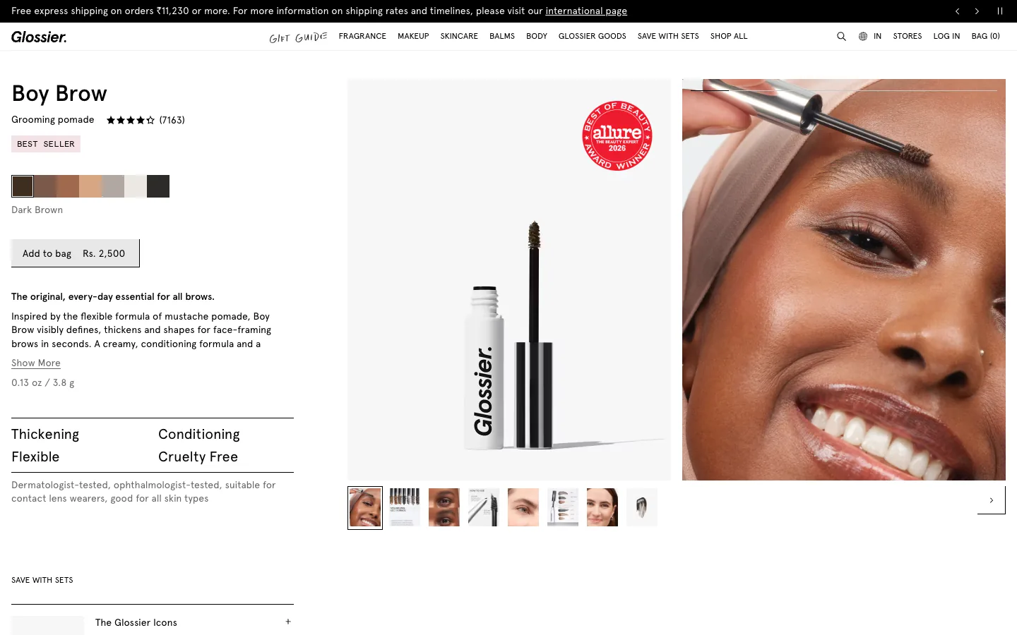
Steal this: title, rating count (7,163), shade swatches and "Add to bag Rs. 2,500" stack in the order a buyer decides. Where it slips: the size reads "0.13 oz / 3.8 g", ounces first for an Indian store.
8. Allbirds: answer the fit question at the size grid
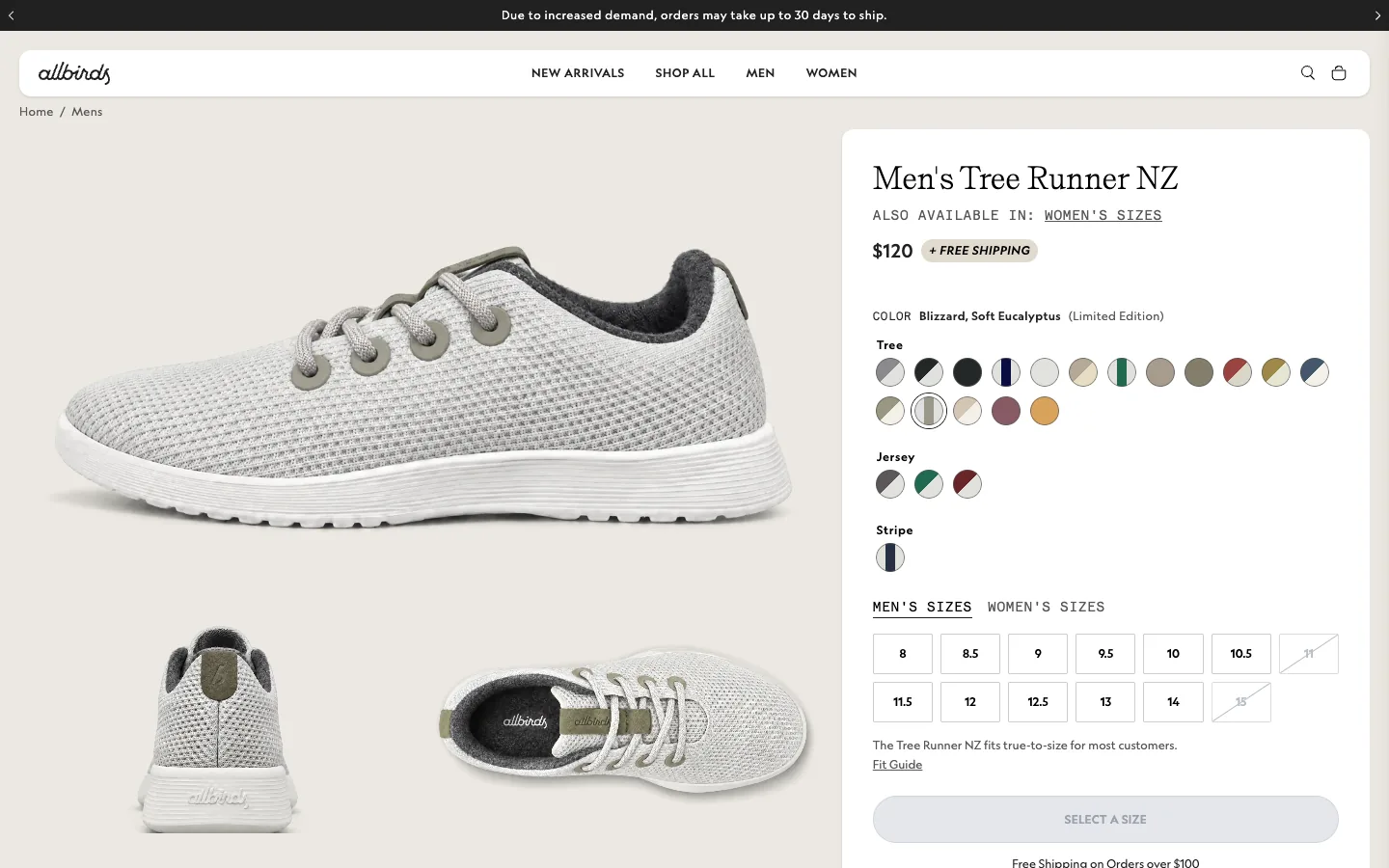
Steal this: sold-out sizes are struck through, and one line under the grid says how the shoe fits, with a link to the fit guide. Where it slips: the top banner warns that orders may take up to 30 days to ship. Honest, but it is the first sentence on the page.
9. Apple: the monthly price first
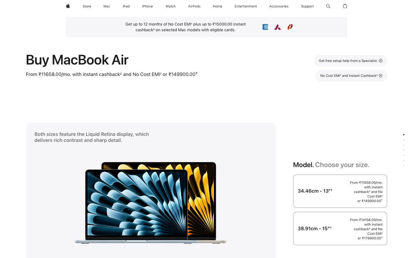
Steal this: for a ₹1,49,900 laptop the page leads with "From ₹11658.00/mo." and asks one question at a time, starting with size. Where it slips: a footnote symbol after almost every price makes the offer feel like small print.
Product page design rules, with the reasons
- Price, delivery date and the button belong on the first phone screen. Sleepy Owl shows only photo and copy there; boAt's sticky bar fixes it without a redesign.
- Turn the pincode into a date. "By Monday, 9 Nov" (boAt) and "between 10th and 11th Nov" (Mokobara) answer "when will it arrive" better than any "fast delivery" badge.
- Show MRP and "inclusive of all taxes". boAt, Bombay Shaving Company and Mokobara all print both. Leave them out and your price looks incomplete next to theirs.
- Put the rating and count under the title, and never show "be first to review" on a bestseller. Lenskart's 4.8 from 14,291 ratings does more than any badge.
- Answer the main objection next to the selector. Fit for shoes and glasses, skin type for skincare.
- Use one primary button and name the next step. "Select lenses" beats a generic "Buy" when there is a step in between.
- Show EMI for big tickets only. It earns its place on a ₹7,999 bag or a laptop; on a ₹1,099 product it is one more line to read.
- Keep pop-ups off product pages. On first load, notification prompts covered part of the screen on two of the nine pages we captured, and a cookie bar hid Minimalist's size selector.
Checking your own product page on a phone
Open your best seller on a phone and stop at the first screen. Can you see the price, a delivery date, the rating and the button? If any needs a scroll, fix that before touching the photos. Our free landing page review runs that check on desktop and phone, section by section. For the store build itself, see our guides to Shopify development companies in India and ecommerce website development in India, and our hero section design examples for the homepage that sends people here.
Good product page design is not a new layout. It is the five answers a shopper needs, on the first screen of a phone, in the order they ask them.
Frequently asked questions
What is a product page?
A product page is the page for one item in an online store, where a shopper decides whether to buy. It holds the product photos, name, price, options such as size or colour, delivery information, reviews and the add to cart button. It differs from a category page, which lists many products and sends shoppers to individual product pages.
How to design a product page?
Start on a phone. Put the photo, name, price with MRP, rating, a delivery date from the pincode and one primary button on the first screen, in that order. Add the main objection answer, such as fit or skin type, next to the options. Then add details, reviews and related products below, and keep pop-ups off the page.
Is there a product page design template I can use?
Shopify themes and Webflow ecommerce templates ship with a product template, and most are a sound starting point. The template matters less than the order of the first screen. Use the table at the top of this post as a checklist, then test your page on a phone before and after you change it.
Make the First Phone Screen Sell.
Tell us which product page matters most. Waris will walk through it with you on a phone and say what to move first, or we can rebuild it for you.