

Most branding trends lists stop at the logo, the smallest part of a brand system and the part that changes least. What moved in 2025 and 2026 is everything around it: how a mark flexes between an app icon and a hoarding, how it moves, how it sounds, and who, or what, drew it. This post takes nine branding trends brands are actually shipping, names a verified brand for each, and says how a small business applies it and when to skip it. Read it with our logo design trends 2026 post, which covers the mark itself, and the graphic design trends 2026 guide.
Branding trends 2026 at a glance
| Trend | Best for | Risk |
|---|---|---|
| 1. Flexible identity systems | Multi-product brands, apps | Low, if one fixed core stays |
| 2. Motion identities | Screen-first brands, media, SaaS | Medium: the static must still work |
| 3. Sonic and micro-branding | Fintech, delivery apps, hospitality | Low, only with a real touchpoint |
| 4. AI-assisted brand generation | Pre-launch startups, internal tools | High: sameness across a category |
| 5. Warm minimalism | D2C, wellness, premium services | Medium: blends in without one owned cue |
| 6. Brand colour drift | Legacy brands with faded palettes | Medium: recall loss if pushed too far |
| 7. Heritage revival | Indian D2C, hospitality, family firms | Medium: pastiche without nuance |
| 8. Typography-led identities | B2B, consultancies, publishers | Low, if the typeface is licensed |
| 9. Brand architecture splits | Groups with several products | High for small firms |
The nine brand design trends, one at a time
1. Flexible identity systems
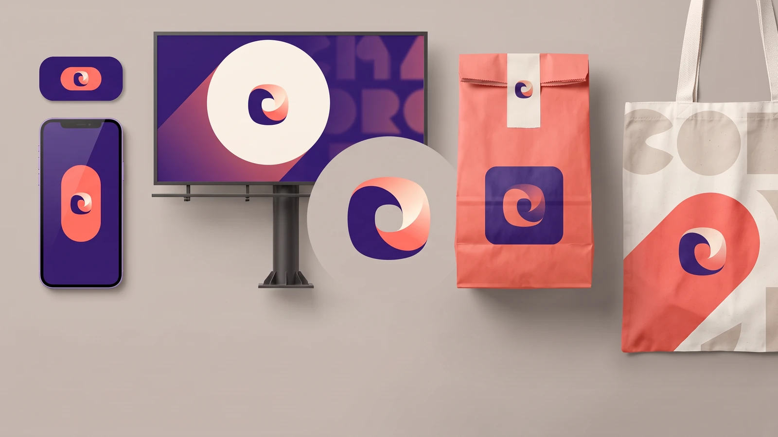
What it is: one core mark plus written rules for its permitted variations (colour, container, crop, motion). Who is doing it: PhonePe's identity by Bengaluru studio Codesign built "the Beam", a flexible brand marker that adapts across static and moving media. How to apply it: one page splitting the fixed part (mark, primary colour, typeface) from the flexible part (accents, one pattern, one container). When to skip it: single product, two-person team.
2. Motion identities
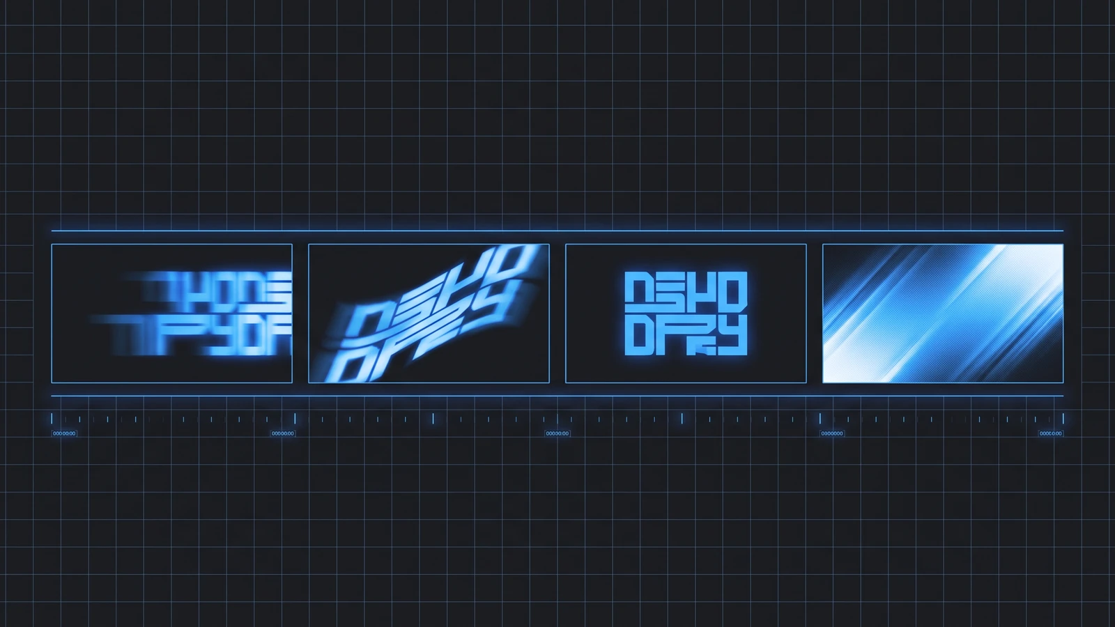
What it is: movement rules as fixed as the palette: how the logo enters, how type moves. Who is doing it: The Brand Identity's roundup of identities driven by motion includes Pinterest's "Pinterest Push" by DIA, one behaviour on every asset, and Landor & Fitch's Orchestra Sinfonica di Milano mark, which widens and narrows with the music. How to apply it: pick one behaviour (a slide, a bounce, a wipe) and use it everywhere: app splash, Reels, website hero, via one Lottie file. When to skip it: print-first brands, or a weak static mark. Motion on a weak mark is decoration.
3. Sonic and micro-branding
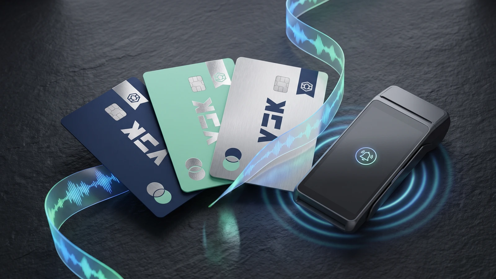
What it is: a sound logo, a notification tone, and the small repeated moments: a payment chime, a haptic buzz. Who is doing it: Mastercard's 2019 sonic identity plays at checkout and in ads. In India, Zomato commissioned BrandMusiq for its order-status notification sounds, and in January 2026 Taj Hotels became the first Indian hospitality brand with a registered sound mark. How to apply it: if you run an app or a counter, own one sound and one micro-interaction. The cost is a composer's day. When to skip it: no repeatable audio touchpoint.
4. AI-assisted brand generation, and the sameness problem
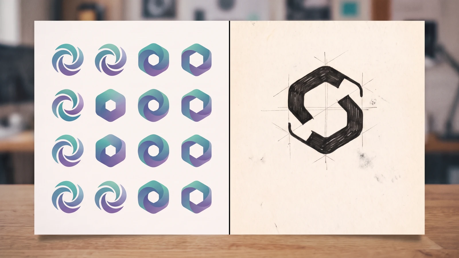
What it is: generators that output a logo, palette and type pairing in minutes. The problem: Left Hand Design's 2025 analysis of why AI logos look alike is blunt: generators reach for symbols the web already reads as logo-like, broad prompts push toward category conventions, and the output is interchangeable. How to apply it: use AI for exploration and mockups, then have a designer own the one distinctive element; our AI design generators test shows the line. When to skip it: never ship a generated mark without a trademark search.
Have AI logo drafts that need a designer?
Send us the drafts you like. We will reply with a free itemized quote to turn them into one distinct, finished mark.
5. Warm minimalism
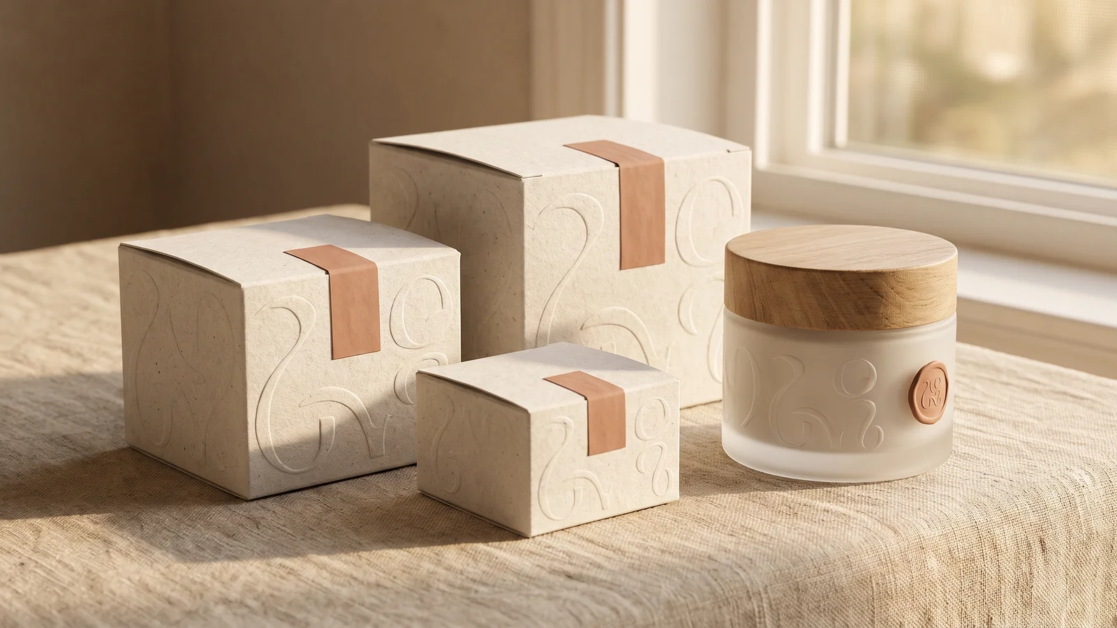
What it is: minimalism with heat: off-white instead of pure white, rounded type, paper textures. Pantone's 2026 Colour of the Year, Cloud Dancer, is an off-white; our colour trends 2026 guide gives it a hex and a contrast check. Who is doing it: on Indian D2C shelves, mCaffeine and The Whole Truth both lead with minimal, transparent packaging. How to apply it: swap #FFFFFF for a warm off-white, keep one accent, pick a typeface with soft terminals. When to skip it: a category where every competitor is already beige. Without one owned cue you are the eleventh calm brand.
6. Brand colour drift
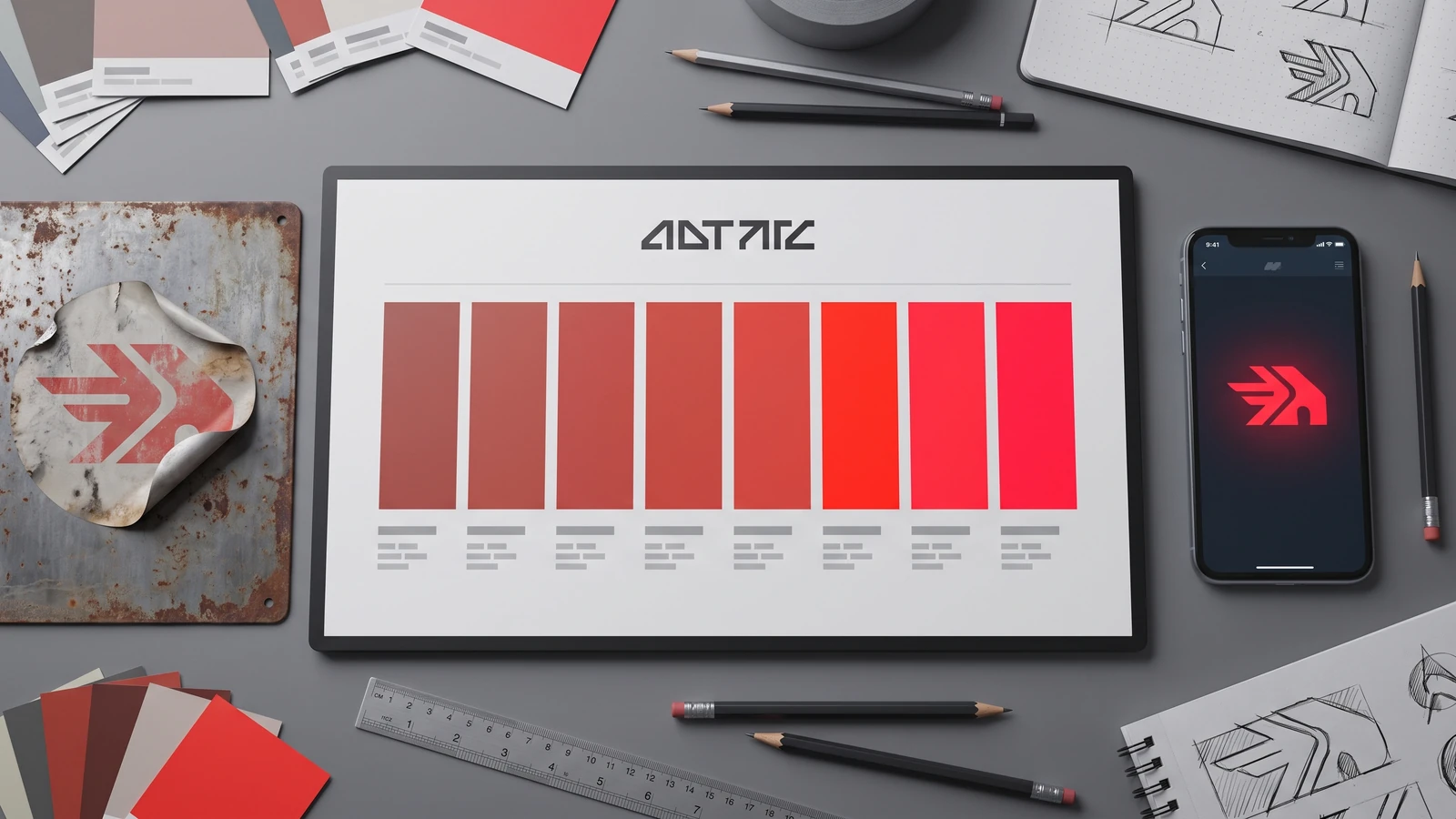
What it is: legacy brands moving their primary colour a few steps rather than replacing it. Who is doing it: Adgully's roundup of 2025 rebrands lists Amazon's more vibrant orange, Google's smoother gradients and Hindalco's contemporary palette. Jaguar went further in its November 2024 reset: primary yellow, red and blue. How to apply it: keep the hue, adjust saturation and lightness for screens, and contrast-check every text-on-colour pair. When to skip it: when the colour is the recall. A courier's red changes in exact values, never in hue.
7. Heritage revival for Indian brands
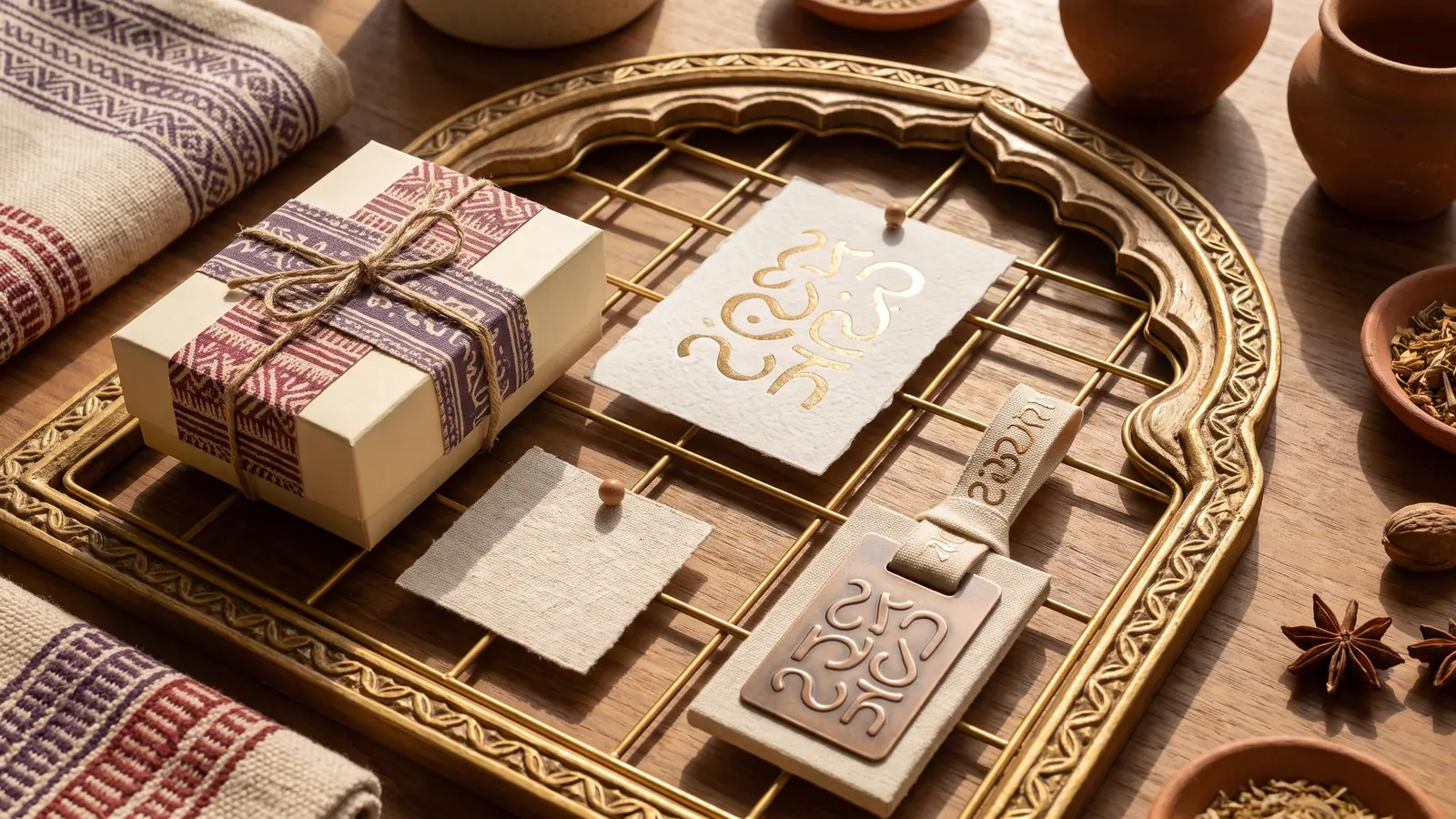
What it is: motifs, crafts and scripts from the brand's own region, used structurally, not as a border. Who is doing it: Air India's 2023 identity by FutureBrand reimagined the Indian window as a gold frame called The Vista, with a custom Air India Sans and a deep red, aubergine and gold palette. PrintMag's critique argues the loss of the Konark Chakra and the Maharaja left it resembling competitors. At D2C scale, cookware brand Cumin Co. built on cast iron and inherited cooking tradition. How to apply it: pick one real reference from your own state (a script, a weave) and let it drive the grid or pattern. When to skip it: when the heritage is not yours. Borrowed nostalgia reads as costume.
8. Typography-led identities
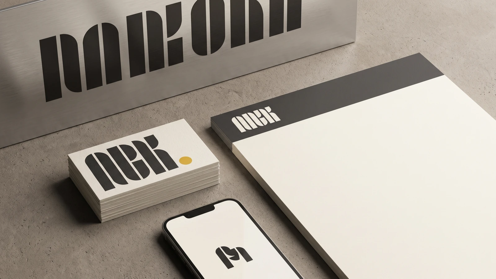
What it is: the wordmark and a custom or licensed typeface carry the brand; the symbol is optional. Who is doing it: Amazon rolled a bespoke Amazon Logo Sans across more than 50 sub-brands in 2025. Reykjavik agency Aton built Nota, a custom face whose counterforms shift between circles and squares. How to apply it: license one distinctive family for web, set three sizes and two weights, and you have most of a system. Our font trends 2026 post lists candidates. When to skip it: when the mark must work alone at 16px; a wordmark needs a monogram fallback.
9. Brand architecture splits
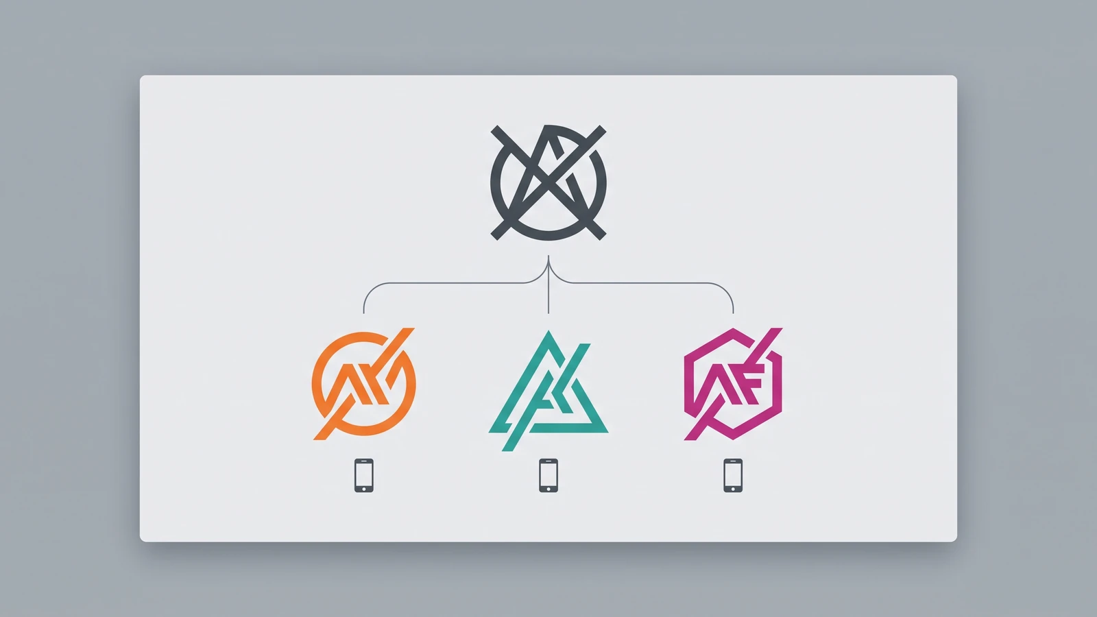
What it is: the holding company takes its own name while consumer brands keep theirs. Who is doing it: Zomato's listed entity became Eternal in 2025 while the Zomato app kept its identity, and Zee replaced its circular channel logos with one stylised Z, both in the Adgully roundup above. How to apply it: only with two products for different customers, and then share one accent or typeface so the family shows. When to skip it: a single product. Splitting a small brand splits a small budget.
What no branding trend fixes
Three things sit under every trend above, none visual. Positioning: if you cannot say in one sentence who you are for, a motion system animates a vague idea. Trademark: search IP India before you fall in love with a mark, generated or drawn. Consistency: a modest identity applied the same way for three years beats a brilliant one applied four ways. For pricing, our logo design cost in India guide covers the mark and our design service page covers the system; layout and type sit in design trends 2026. Pick two branding trends that fit your touchpoints, build the fixed core first, and let the rest go.
Not sure where your brand should start?
Book a free 20-minute call. We will talk through positioning, the fixed core, and what is worth building first for your budget.
Frequently asked questions
What are the biggest branding trends in 2026?
The verified shifts: flexible identity systems, motion identities, sonic and micro-branding, AI-assisted generation, warm minimalism, brand colour drift, heritage revival, typography-led identities and brand architecture splits. The common thread: brands are investing in the system around the logo, because most touchpoints are now screens that move and make sound.
How is a brand identity system different from a logo?
A logo is one mark. A brand identity system is the logo plus the rules around it: colour palette and its permitted variations, typography and sizes, motion behaviour, sound, photography style, and how sub-brands relate. PhonePe's Beam and Pinterest's Push are system decisions, not logo decisions. For a small business it can fit on two pages, but it has to exist.
Should a small business follow branding trends or ignore them?
Follow those matching a touchpoint you actually have. An app justifies motion and a notification sound; a physical shop justifies signage-first typography and packaging. Ignore the rest. Two well-chosen trends on a fixed core (mark, primary colour, typeface) beat five trends with no core. Recheck every two years, not every quarter.
Get Your Brand System Checked.
Send us your current logo, colours and type. We map what is fixed, what is flexible and what is missing, and tell you which of these trends your touchpoints actually justify.