

Quick answer
A UX audit reviews a site against usability principles and real data, then ranks what to fix. For a small business site, run one in about four hours: pick one goal, pull the numbers, walk the journey on desktop and phone, score screens against Nielsen's 10 heuristics, run a checklist, rank problems and write one page.
- Rate each problem by severity (3 blocks the goal, 2 slows people, 1 is polish); fix high severity, low effort first.
- Pass marks: 4.5:1 body text contrast, 24 by 24 CSS pixel tap targets, LCP within 2.5 seconds, INP 200 ms or less.
- Treat a solo audit as a first pass; Nielsen Norman Group recommends three to five independent evaluators.
A UX audit is a structured review of a website against usability principles and real usage data, ending in a ranked list of things to fix. For a small business site you can run a useful one in a single afternoon: pick one goal, walk that journey on desktop and phone, score what you see against Nielsen's 10 usability heuristics, check a few numbers, and fix the worst problems first.
Maze's guide puts a standard audit at three to four weeks, which suits a product team. For a ten-page service site or a small store, the afternoon version below finds the problems most likely to cost enquiries, and tells you whether a bigger audit is worth paying for.
How to run a UX audit in an afternoon
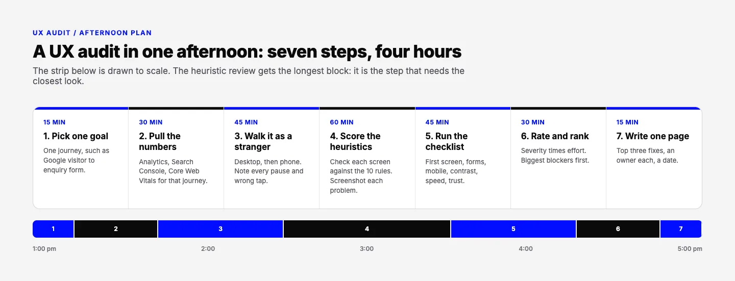
- Pick one goal and one journey (15 minutes). "A visitor from Google sends an enquiry" or "a shopper buys one product".
- Pull the numbers (30 minutes). For that journey: where visitors land, where they drop off, phone versus desktop, and your Core Web Vitals.
- Walk it as a stranger (45 minutes). In a private window, on desktop and then on a phone, try to complete the goal. Note every pause and wrong tap.
- Score the screens against the heuristics (60 minutes). Go back through each screen with the 10 rules below and screenshot each problem.
- Run the checklist (45 minutes). The table below covers the things heuristics miss: contrast, tap targets, speed and proof.
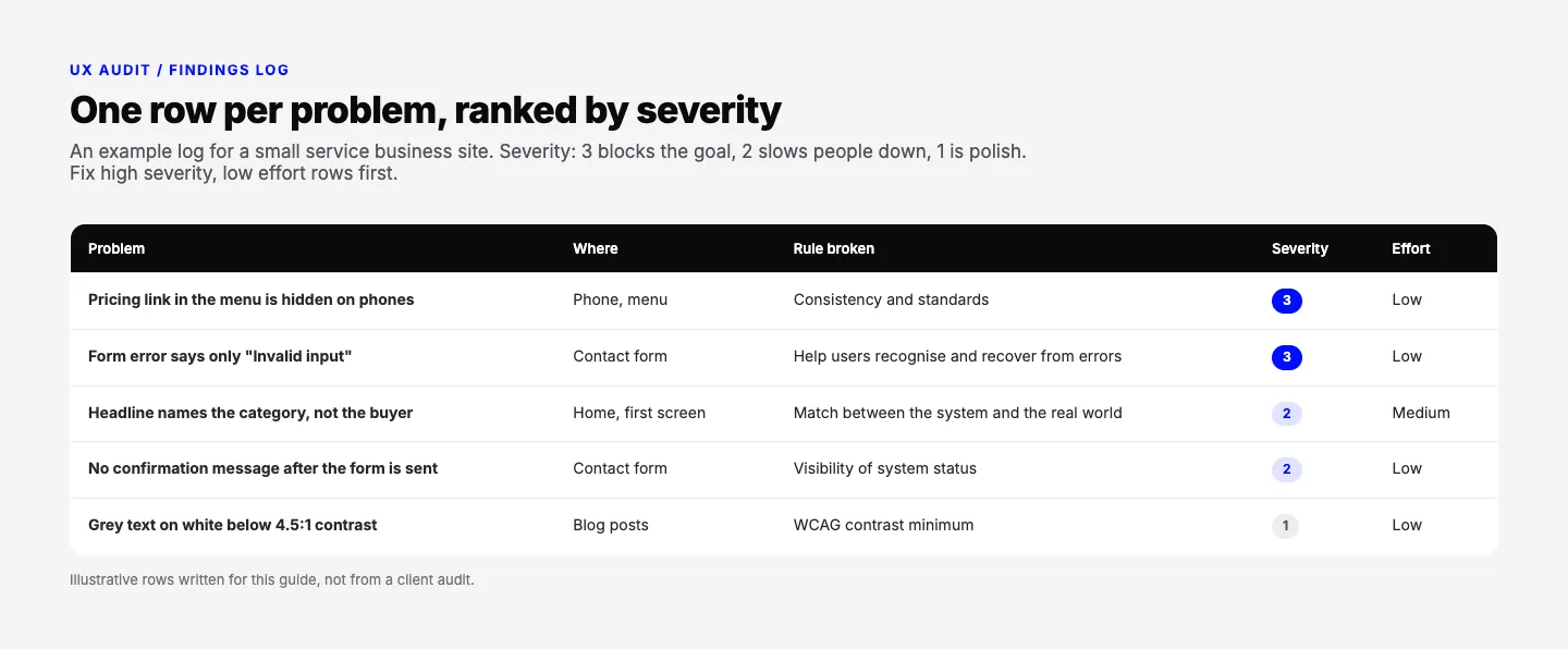
- Rate and rank (30 minutes). Give each problem a severity (3 blocks the goal, 2 slows people down, 1 is polish) and an effort. High severity, low effort goes first.
- Write one page (15 minutes). The top three fixes, who owns each, and a date. Everything else waits for the next round.
Is your website designed to win customers?
Conversion optimization starts with what a first-time visitor sees. Our free test reviews your page on desktop and phone and tells you what to fix first.
Take the free testUX audit checklist for a business website
Run these after the heuristic pass. Thresholds come from Google's web.dev guidance and the W3C's WCAG 2.2.
| Area | What to check | A pass looks like |
|---|---|---|
| First screen | Offer, who it is for, proof, main action | A stranger can say what you sell and what to click in a few seconds |
| Navigation | Menu labels, the same links on phone and desktop | Every key page is one tap away, with plain labels |
| Forms | Number of fields, error messages, confirmation | Only the fields you need; errors say how to fix them |
| Phone view | Tap targets, text size, sticky elements | Targets at least 24 by 24 CSS pixels (WCAG 2.2, level AA) |
| Readability | Text contrast | 4.5:1 for body text, 3:1 for large text |
| Speed | Core Web Vitals | LCP within 2.5 seconds, INP 200 ms or less, CLS 0.1 or less |
| Trust | Named customers, reviews, real photos, contact details | Proof sits near the main action, not only on an About page |
| Errors and dead ends | 404 page, empty search, broken links | Every dead end offers a way back to the goal |
For the first-screen row, our free landing page review is a quick first step. It opens a page on desktop and on a phone, reviews every visible section, and checks the offer, the main action, trust and proof, the phone view and the art direction. It reviews what is on screen, not traffic or conversion data, so pair it with your own numbers. For what a strong first screen looks like, see our hero section design examples.
Nielsen's 10 usability heuristics, in plain words
A heuristic evaluation is the core of most audits: you judge each screen against a short set of rules. The standard set comes from Jakob Nielsen: developed with Rolf Molich in 1990, then refined by Nielsen in 1994 from a factor analysis of 249 usability problems. Nielsen Norman Group last reviewed the list in January 2024. Here is our summary, with what each looks like on a business website.
- Visibility of system status. Always show what is happening. A form that sends with no "Thanks, we got it" message fails.
- Match between the system and the real world. Use your customers' words, not internal jargon. "Solutions" in a menu tells nobody anything.
- User control and freedom. Let people back out. Pop-ups need a visible close, and carts need a remove button.
- Consistency and standards. The same thing looks and works the same everywhere, and follows the conventions people know from other sites.
- Error prevention. Stop mistakes before they happen: date pickers instead of free text, confirmation before anything irreversible.
- Recognition rather than recall. Keep options visible. Do not make a shopper remember the size they picked two screens ago.
- Flexibility and efficiency of use. Shortcuts for regulars, such as saved addresses, without confusing first-timers.
- Aesthetic and minimalist design. Every extra element competes with the one that matters. Cut what does not help the goal.
- Help users recognise, diagnose and recover from errors. "Invalid input" fails. "Phone number needs 10 digits" passes.
- Help and documentation. Ideally nobody needs it. When they do, answers are easy to find and written as steps.
One limit to know: Nielsen Norman Group recommends that three to five people evaluate the same interface independently, because each evaluator misses issues that others catch. So treat a solo audit as a first pass, and if you can, have a colleague score the same journey separately.
What to measure, and when to hire an expert
Measure only what shows where the journey breaks:
- Journey conversion rate from your analytics: of the people who land on the key page, how many reach the thank-you page or order confirmation.
- Drop-off by step and by device. If phones convert at a fraction of desktop, start the audit on the phone.
- Landing pages and queries from Search Console, to check that pages match what people searched for.
- Core Web Vitals. Google's web.dev guidance measures them at the 75th percentile of page loads, segmented by mobile and desktop.
- For stores, checkout abandonment. Baymard Institute documents an average cart abandonment rate of 70.22% across 50 studies, and its survey puts extra costs such as shipping, tax and fees at the top of the reasons, at 40%. Compare yours, and show costs early.
Hire it out when the afternoon version finds problems you cannot explain, when the site has many flows, or when you need user testing and independent evaluators. On testing, Jakob Nielsen's research found that five participants from a similar user group uncover about 85% of usability problems, and he recommends several small rounds over one big one.
If the audit says the problems are structural rather than a few fixes, read how to start a website redesign, and wireframe the new layout before anyone designs it: our website wireframe guide shows how. Either way, a UX audit you repeat after every major change beats a long one you run once.
Frequently asked questions
What is a UX audit?
A UX audit is a structured review of a website or app that finds where people struggle to complete their goals. It combines a walk-through of key journeys, an expert check against usability heuristics, and data such as analytics and page speed. The output is a ranked list of problems with fixes, so the team knows what to change first.
What is heuristic evaluation?
Heuristic evaluation is a method where reviewers judge an interface against a set of usability rules, such as Jakob Nielsen's 10 heuristics. Each reviewer works through the design alone, notes every screen that breaks a rule, and then the findings are combined. Nielsen Norman Group recommends three to five independent evaluators, because each one misses problems the others catch.
How long does a UX audit take?
A focused audit of one journey on a small business website can be done in an afternoon, about four hours, using the seven steps in this guide. Larger audits covering many flows, user testing and several evaluators take weeks; Maze's guide puts a standard audit at three to four weeks. Start small, fix the top three issues, then decide if you need more.
What is the difference between a UX audit and a design audit?
A UX audit asks whether people can get things done: find the page, understand the offer, fill the form, finish checkout. A design audit looks at the visual system: whether type, colour, spacing, buttons and components are consistent across pages. They overlap, and many teams run both together, but a beautiful, consistent site can still fail one.
Want a Second Pair of Eyes?
Book a free 20-minute call with Waris. Bring your audit notes or just your URL, and leave knowing which fixes to make first and whether you need a redesign at all.