

Quick answer
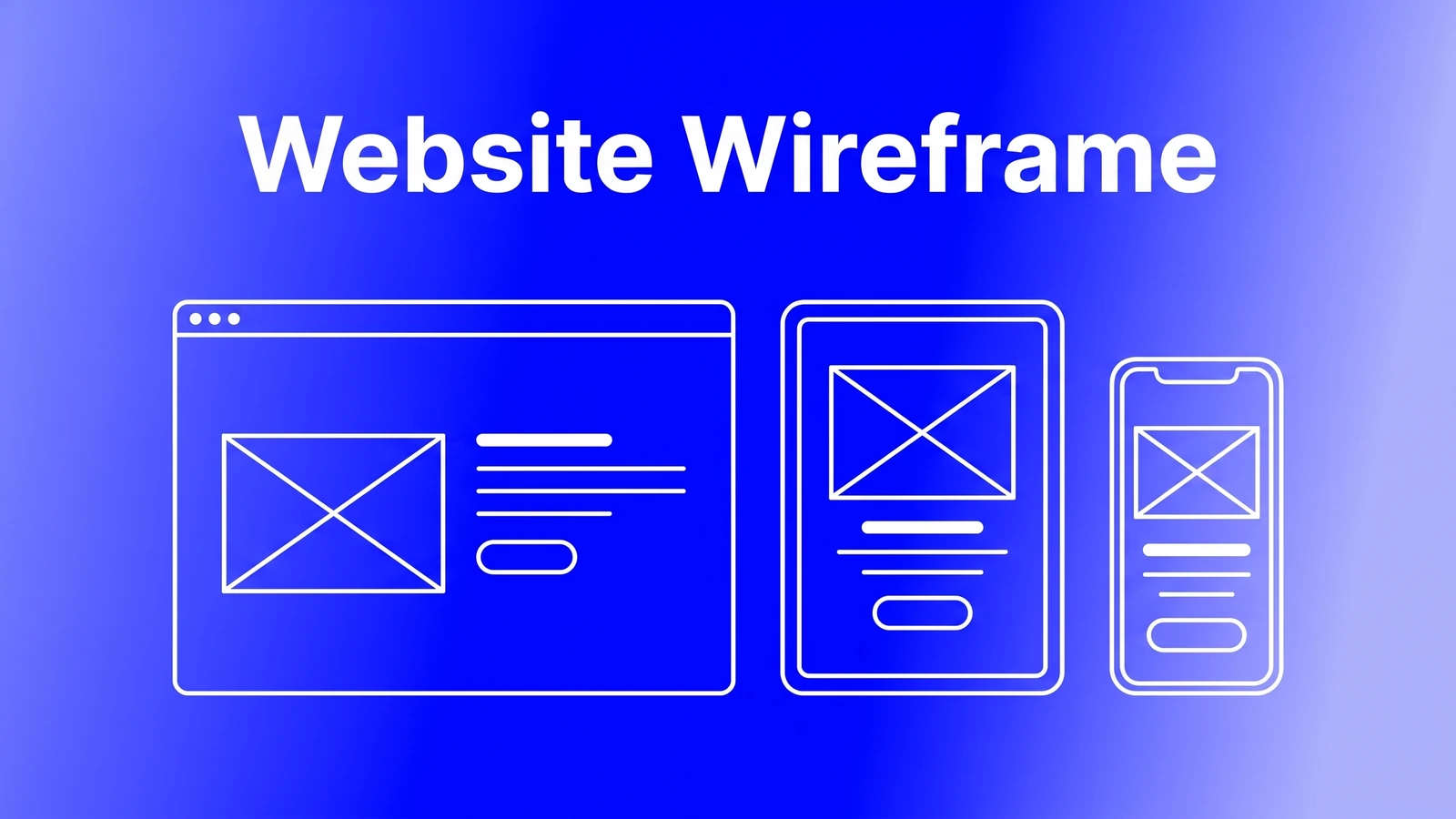
A website wireframe is a low-fidelity, grey-box plan of a page that fixes what goes where, from headline and button to images and sections, before any colour, fonts or final copy. It differs from a mockup, which shows the finished look, and a prototype, which shows what happens on click.
- Every first screen needs five boxes: the offer, who it is for, proof, one main action and the real product shown.
- Write the content list before drawing, then sketch on paper, draw grey boxes in Figma with desktop and phone side by side.
- Webflow's Figma plugin converts Auto Layout frames to flexbox, but semantic tags, breakpoints and interactions still need hands-on work.
A website wireframe is a plain, grey-box drawing of a web page that shows what goes where: the headline, the button, the images and the sections, in the order a visitor meets them. It leaves out colour, fonts and final copy on purpose, so everyone argues about structure before anyone spends a day on looks.
Below: how a wireframe differs from a mockup and a prototype, the five boxes every first screen needs, six wireframes we drew for common pages, and our route from wireframe to a live Webflow site.
What is a wireframe, and how is it different from a mockup or prototype?
A wireframe answers "what is on this page, and in what order". A website mockup answers "what will it look like". A prototype answers "what happens when someone clicks". Skip the first and you end up redesigning in code.
| Stage | Wireframe | Mockup | Prototype |
|---|---|---|---|
| What it shows | Layout, content order, the main action | Final colours, type, images and copy | Clicks, screens linked together, states |
| Fidelity | Low: grey boxes and placeholder lines | High, but static | Medium to high, interactive |
| Question it settles | Does the page make its case in the right order? | Does it look like our brand and feel trustworthy? | Can someone actually get through the flow? |
| Cost of changing it | Minutes | Hours | Hours to days |
Wireframes themselves come in levels. A wireframe sketch is pen on paper or a whiteboard, made in minutes and thrown away. A low-fidelity wireframe is the same idea drawn neatly in a design tool, like the six below. A high-fidelity wireframe adds real copy and blurs into a mockup. For most business sites, low fidelity is where the useful arguments happen.
The five boxes every first screen needs
We wireframe the homepage first screen before anything else, because every visitor sees it. We check it against five boxes. If one is missing, no amount of styling fixes the hole.
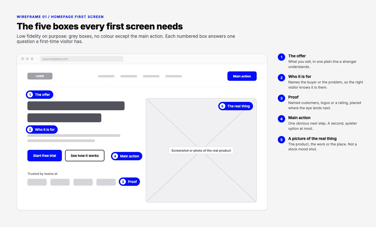
- The offer. What you sell, in one line a stranger understands. "AI-powered growth platform" fails this test; "Payroll for Indian startups, filed for you" passes.
- Who it is for. The support line names the buyer or the problem, so the right visitor recognises themselves and the wrong one leaves early.
- Proof. Named customers, logos or a rating, placed where the eye lands after the headline. Not three screens down.
- The main action. One obvious next step with a specific label. A second, quieter link at most.
- A picture of the real thing. The product, the work, the room, the team. A stock photo of people smiling at a laptop tells the visitor nothing.
Is your website designed to win customers?
Conversion optimization starts with what a first-time visitor sees. Our free test reviews your page on desktop and phone and tells you what to fix first.
Take the free testOur guide to hero section design shows how 17 real companies handle these boxes, and where each one slips. If your site is already live, the free landing page review opens your page on desktop and on a phone and checks the same ground: whether a first-time visitor can tell what you offer, who it is for and what they get from the first screen, and whether there is one obvious next step.
Website wireframe examples for six common pages
We drew each of these for this post. Rename the boxes for your business and you have a brief for a designer and a copywriter.
Landing page: one goal, top to bottom
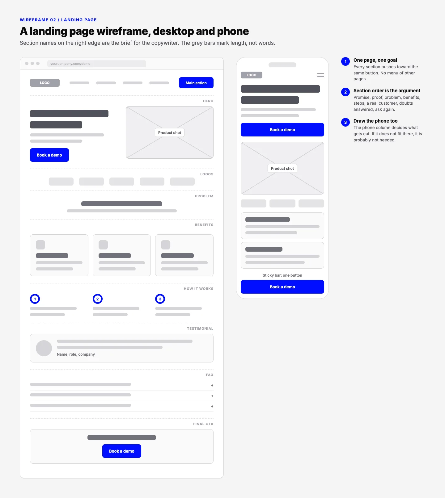
A landing page has one job, so the wireframe has one button repeated. The section order is the argument: promise, proof, the problem, benefits, how it works, a real customer, doubts answered, then ask again. Our study of 100 startup landing pages found only 3% scored 8 or more on our eight factors. Three of those factors, clarity, the call to action and proof, are mostly settled at wireframe stage.
Pricing page: three tiers, one pushed
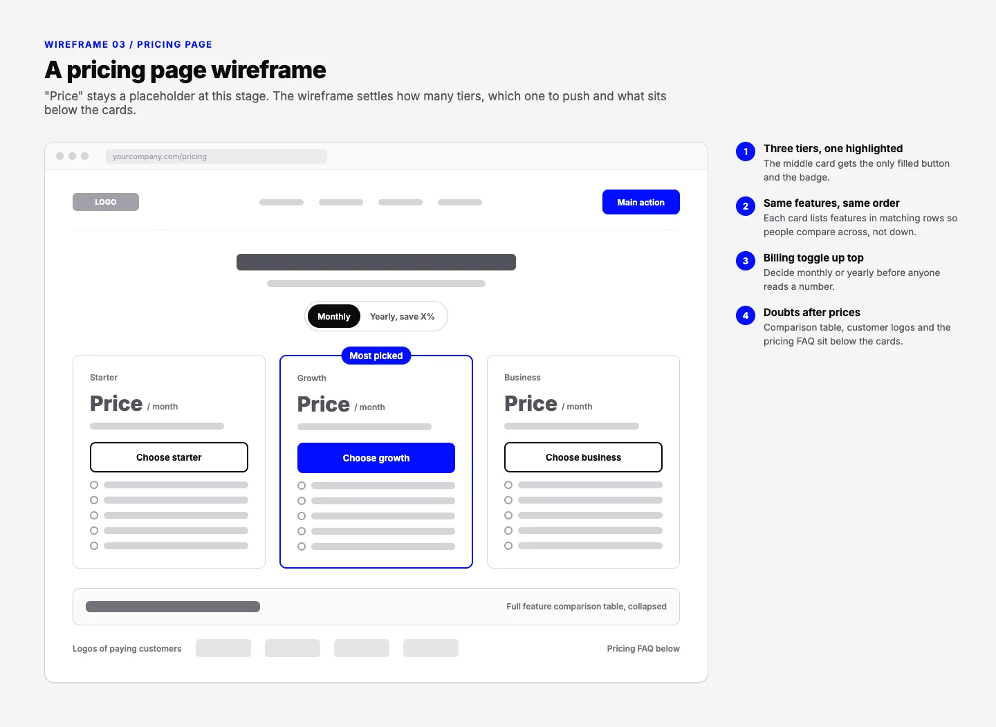
Put the billing toggle above the cards, list features in the same order on every card so people compare across, and push comparison tables and FAQs below the prices.
Product page: choices sit above the button
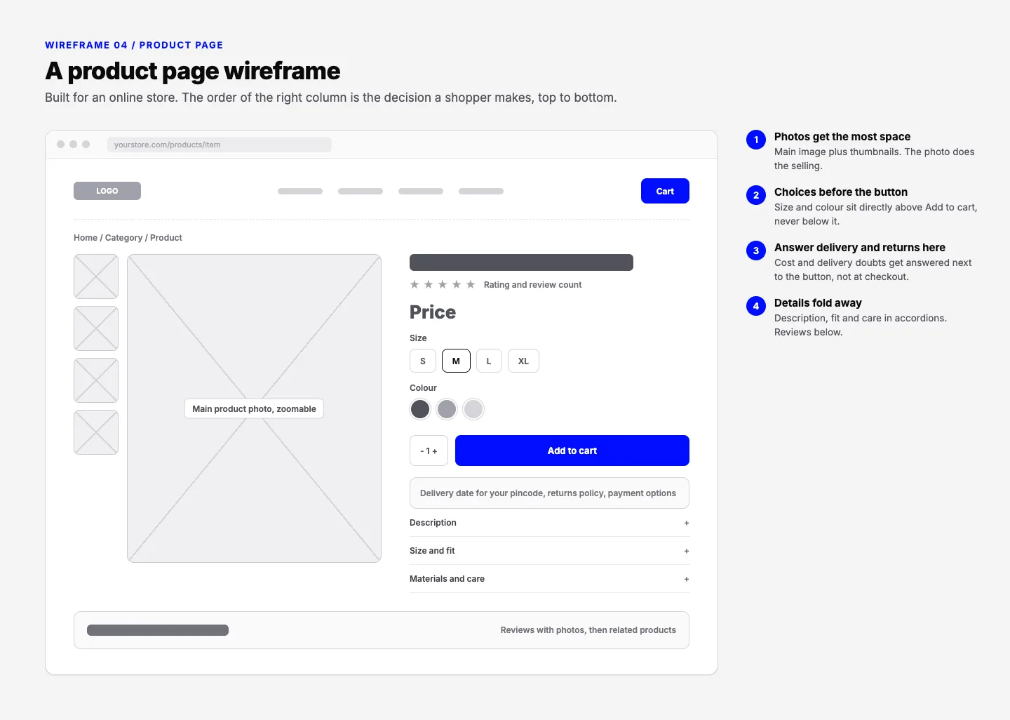
Photos get the most space. Size and colour go directly above Add to cart, and delivery and returns are answered next to the button, not at checkout.
Contact page: four fields and a promise
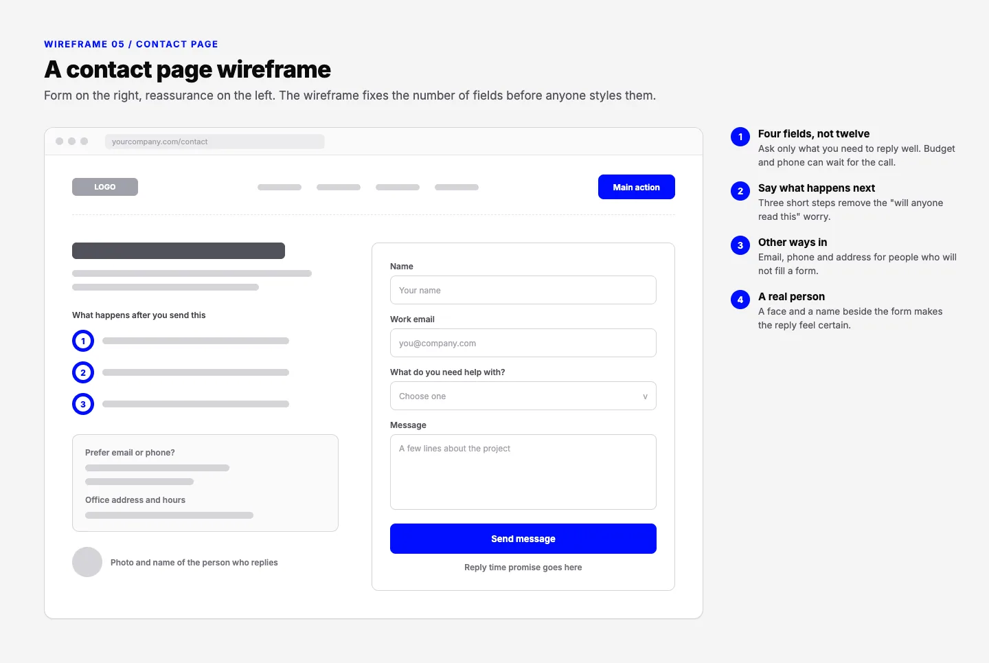
Wireframing a contact page is mostly deleting fields. Ask only what you need to reply well, say what happens after send, and list email and phone for people who skip forms. Our contact page design guide goes deeper.
Blog post: a template, drawn once
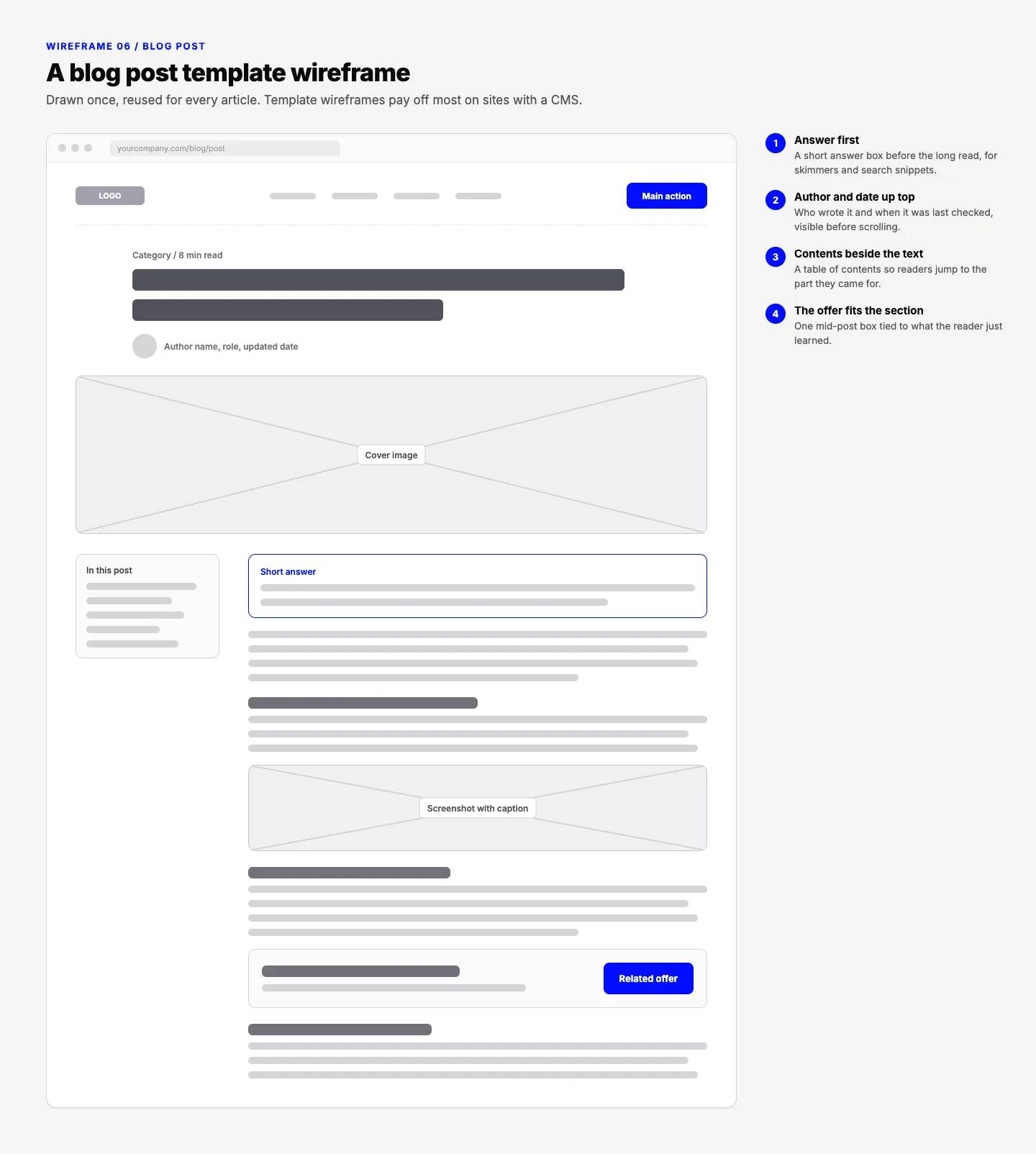
On a CMS-driven site you wireframe the template, not each post. Place the author, date, short answer and mid-post offer once, and every article inherits them.
How to make a website wireframe and take it to a build
This is the order we work in. The first four steps cost almost nothing but time; the rest is design and build.
- List the content before drawing. Write down every section the page needs and what each must prove. A wireframe without a content list is decoration.
- Sketch on paper. Several quick versions per page. Throw most away.
- Draw the low-fidelity wireframe in Figma. Grey boxes, real section names, desktop and phone side by side. Use auto layout from the start, because it pays off at step 6.
- Review it with the people who sell. Founders and sales teams spot the missing objection fastest. Change boxes now, while it costs minutes.
- Turn it into a mockup, then a prototype if the flow is complex. Figma Make accepts attached Figma frames with a prompt, so an approved wireframe can become a clickable prototype. A simple marketing site often needs only the mockup.
- Build in Webflow. According to Webflow's integration page, its Figma plugin converts Auto Layout frames to Webflow flexbox, syncs variables and maps styles to CSS classes, but semantic HTML tags, breakpoints and interactions still need hands-on work. Our Figma to Webflow guide covers where the plugin helps and where a manual rebuild wins.
Where this sits in a full project, from brief to launch, is laid out in our website development process. The short version: a website wireframe is the cheapest place to be wrong. An hour arguing over grey boxes is cheaper than a week redesigning finished pages.
Frequently asked questions
What is a wireframe sketch?
A wireframe sketch is a quick hand drawing of a page layout, made with pen and paper or on a whiteboard before any design tool is opened. It shows boxes for the headline, images, buttons and sections, with no colour or real copy. Its value is speed: you can draw several versions in minutes, compare them, and throw away the weak ones.
What is wireframe in UX design?
In UX design, a wireframe is the structural plan of a screen. It sets the content hierarchy, the position of navigation and actions, and the path a user takes through the page. It comes before visual design, so the team can test whether the layout makes sense to users without being distracted by colours, fonts or images.
How to create wireframes for a website?
Start with a list of every section the page needs and what each must prove. Sketch a few layouts on paper, pick one, then draw it as grey boxes in a tool such as Figma, with desktop and phone versions side by side. Review it with the people who sell, fix the gaps, and only then move on to the visual mockup.
Is a website mockup the same as a wireframe?
No. A wireframe shows structure: what goes where on the page, in grey boxes. A website mockup shows the finished look: real colours, fonts, images and copy, but still static. Most projects go wireframe first, then mockup, then a clickable prototype if the flow needs testing. Skipping the wireframe means layout arguments happen during the far slower mockup stage.
Get the Structure Right First.
Book a free 20-minute call with Waris. Bring your current site or your idea, and leave with a first-screen wireframe plan and a clear route to a Webflow build.