

Quick answer
Buyers pick a plan when the page anchors the price, marks one recommended plan, shows the annual saving, compares features in a table, answers billing questions and uses local currency. Good examples among the nine include Slack's struck-out INR prices, Zoho CRM's single coloured button and Canva's yearly rupee prices with a saving badge.
- Mark only one plan with a badge and the only filled button; two highlighted plans means none is highlighted.
- Offer three or four plans: fewer leaves no middle option, more is hard to compare on a phone.
- For Indian buyers, show ₹ prices and say whether GST is included, and keep the recommended plan in the first phone screen.
Pricing page design decides which plan a buyer picks, and whether they pick one at all. The ones we rate highest do six things: anchor the price, mark one recommended plan, make the annual saving obvious, compare features in a table, answer billing questions on the page, and show the local currency. We captured nine pricing page examples on 7 November 2026 from an Indian connection, on desktop and on a phone. Every price quoted below is visible in our screenshots or on the page we fetched that day.
Pricing page examples at a glance
| Company | What the page does | Idea to steal |
|---|---|---|
| Slack | INR prices with the old price struck out | Billing FAQs and a full comparison table |
| Zoho CRM | Four INR plans, one marked Most Popular | Only the recommended plan gets a coloured button |
| Canva | Yearly INR prices, Business marked Recommended | Daily and weekly options for small budgets |
| Notion | Plans grouped into two panels, currency labelled | Group plans by who buys them |
| Linear | Four plain columns with hard limits | State limits as numbers |
| Figma | Price per seat type per plan | Price the roles, not only the plan |
| Intercom | Seat price plus price per AI outcome | A calculator that recommends a plan |
| Razorpay | Usage fee struck from 2% to 0% for 90 days | Route big buyers to sales with a threshold |
| Framer | Credits picker inside each plan card | Buttons that name the plan |
Pricing page design examples from SaaS and Indian software
1. Slack: INR anchoring and billing answers
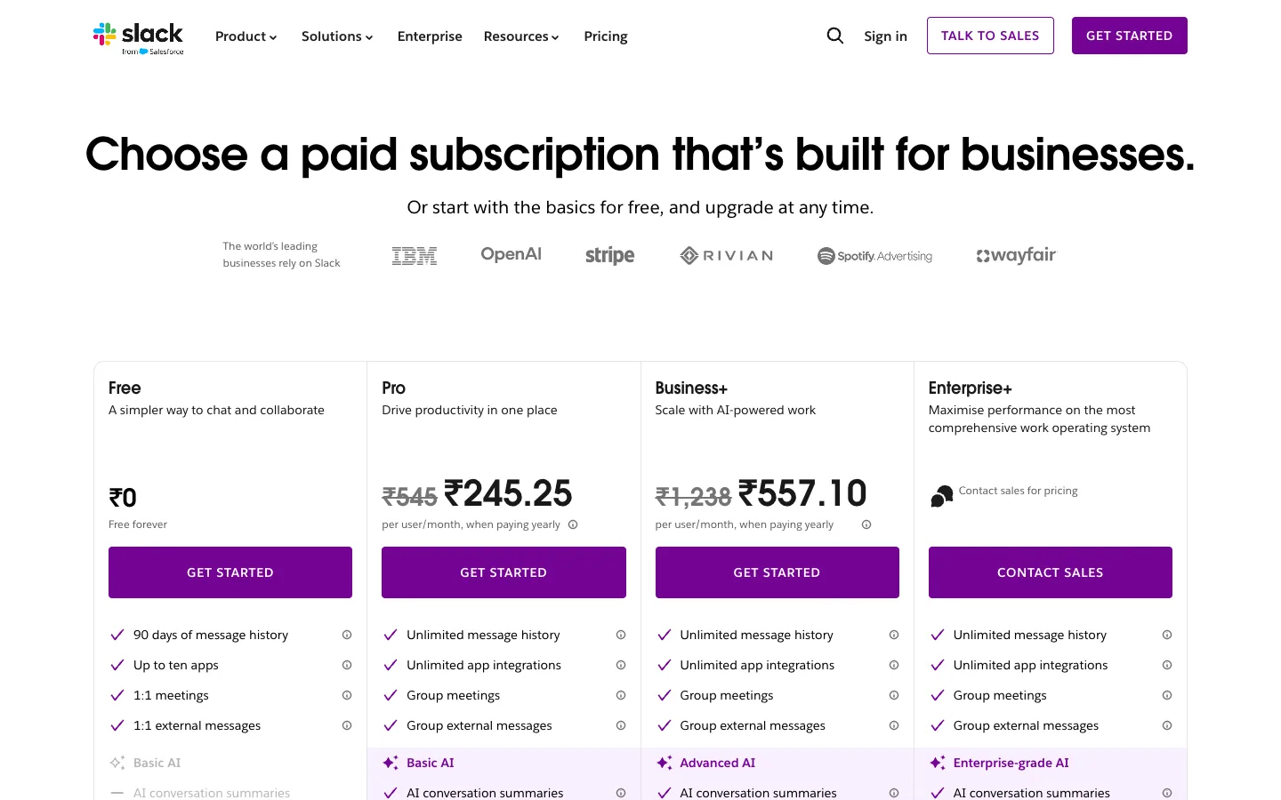
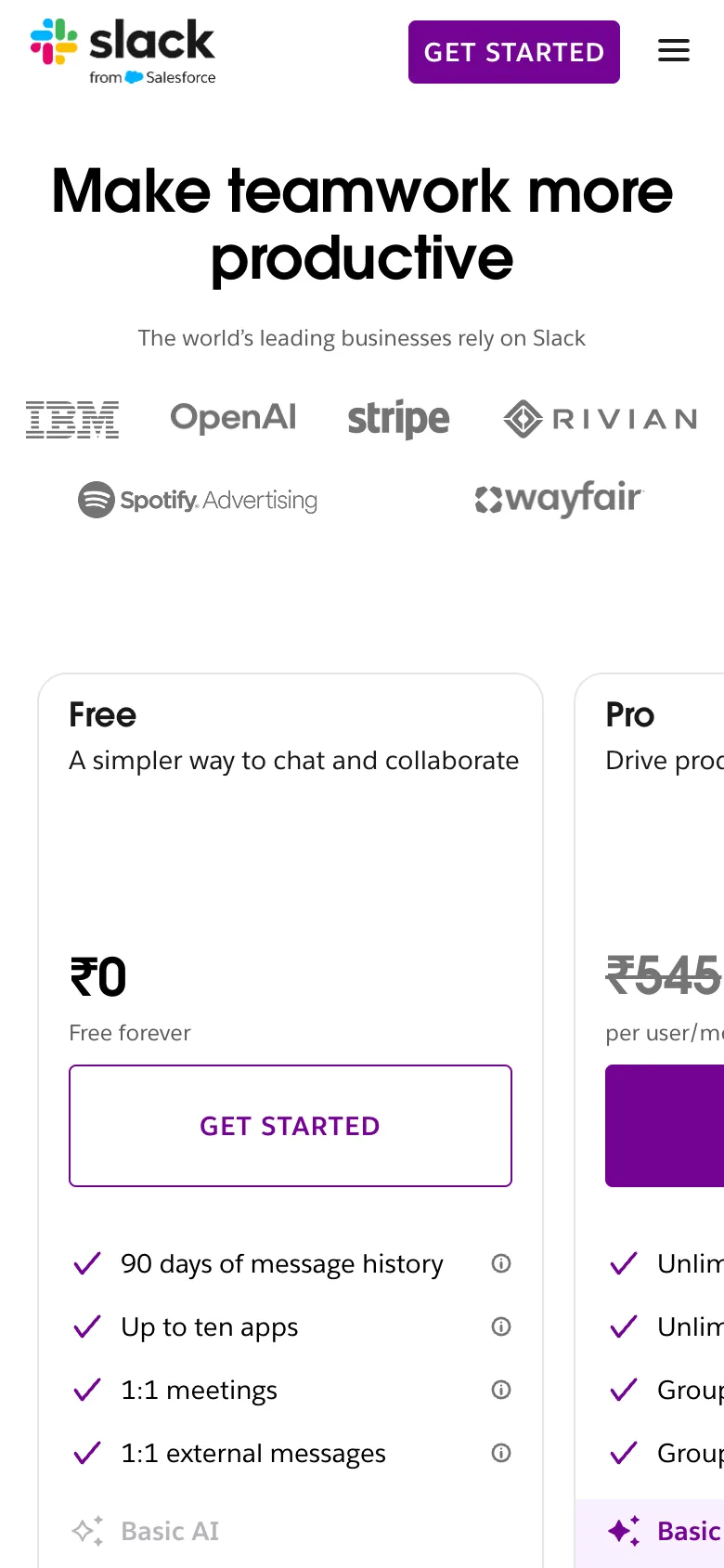
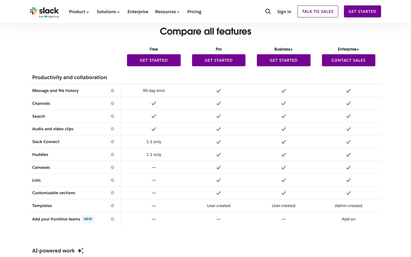
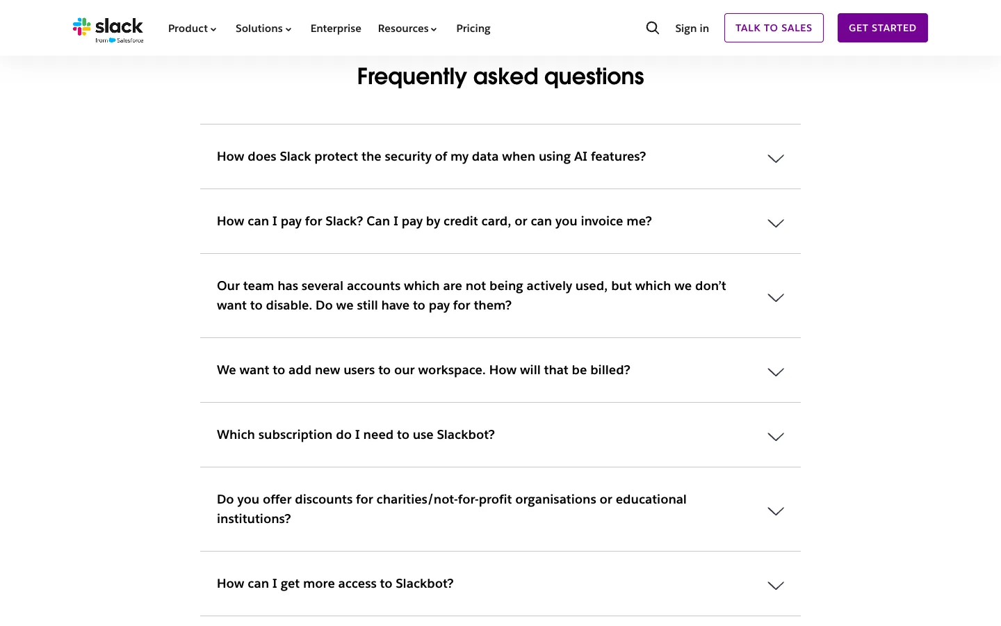
Steal this: Pro shows ₹545 struck out beside ₹245.25 per user a month, paid yearly; the page gives the monthly-billing figure, ₹294.75, too. Further down, a comparison table and a billing FAQ cover invoices and inactive users. Where it slips: on a phone the plans scroll sideways, and the paid plan is half off-screen behind Free.
2. Zoho CRM: one coloured button
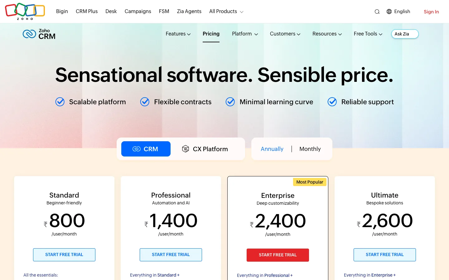
Steal this: four INR prices (₹800 to ₹2,600 per user a month) and one filled red button on Enterprise, tagged Most Popular. Ultimate sits only ₹200 above it, which makes Enterprise look like the sensible middle. Where it slips: the Annually toggle shows no saving, so buyers cannot see what yearly billing is worth.
Is your website designed to win customers?
Conversion optimization starts with what a first-time visitor sees. Our free test reviews your page on desktop and phone and tells you what to fix first.
Take the free test3. Canva: yearly rupees and small-budget options
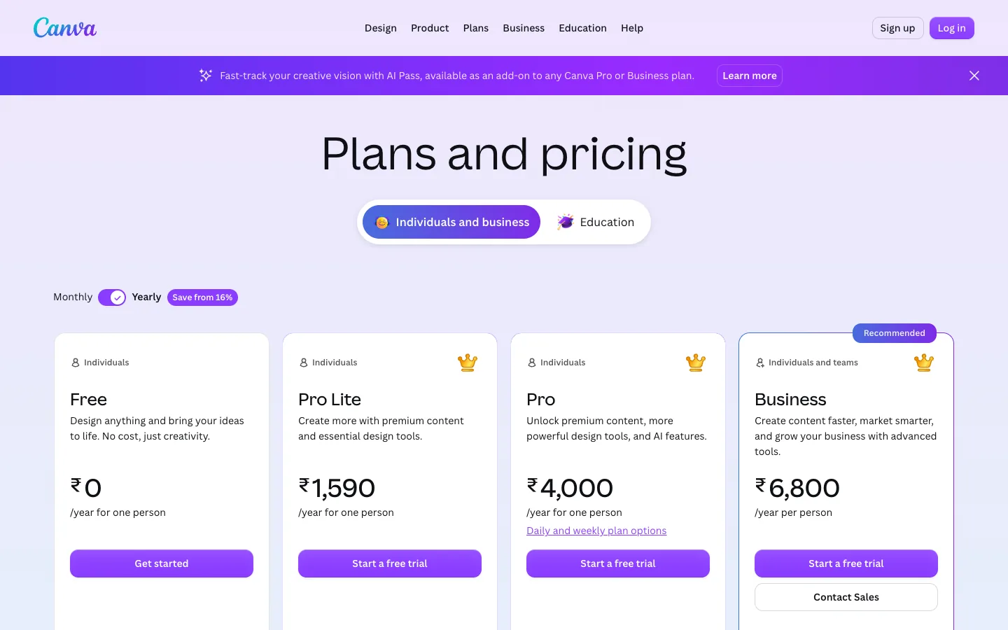
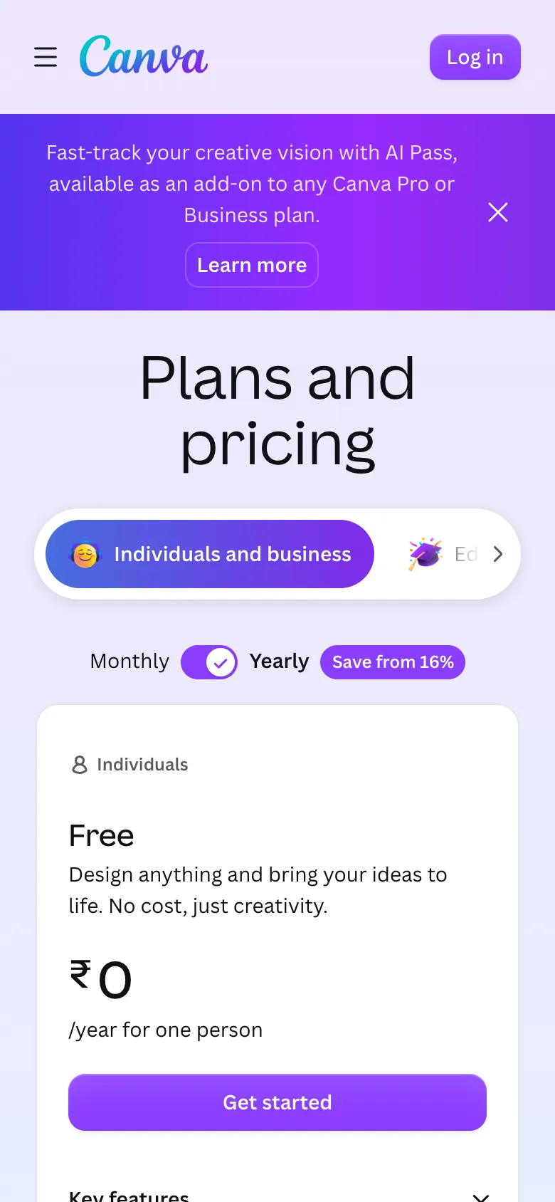
Steal this: prices read per year in rupees (₹1,590 to ₹6,800), the toggle carries a "Save from 16%" badge, and Pro links to daily and weekly plans for buyers who will not commit to a year. Where it slips: on a phone the first plan you meet is Free, the one Canva least needs you to pick.
4. Notion: plans grouped by buyer
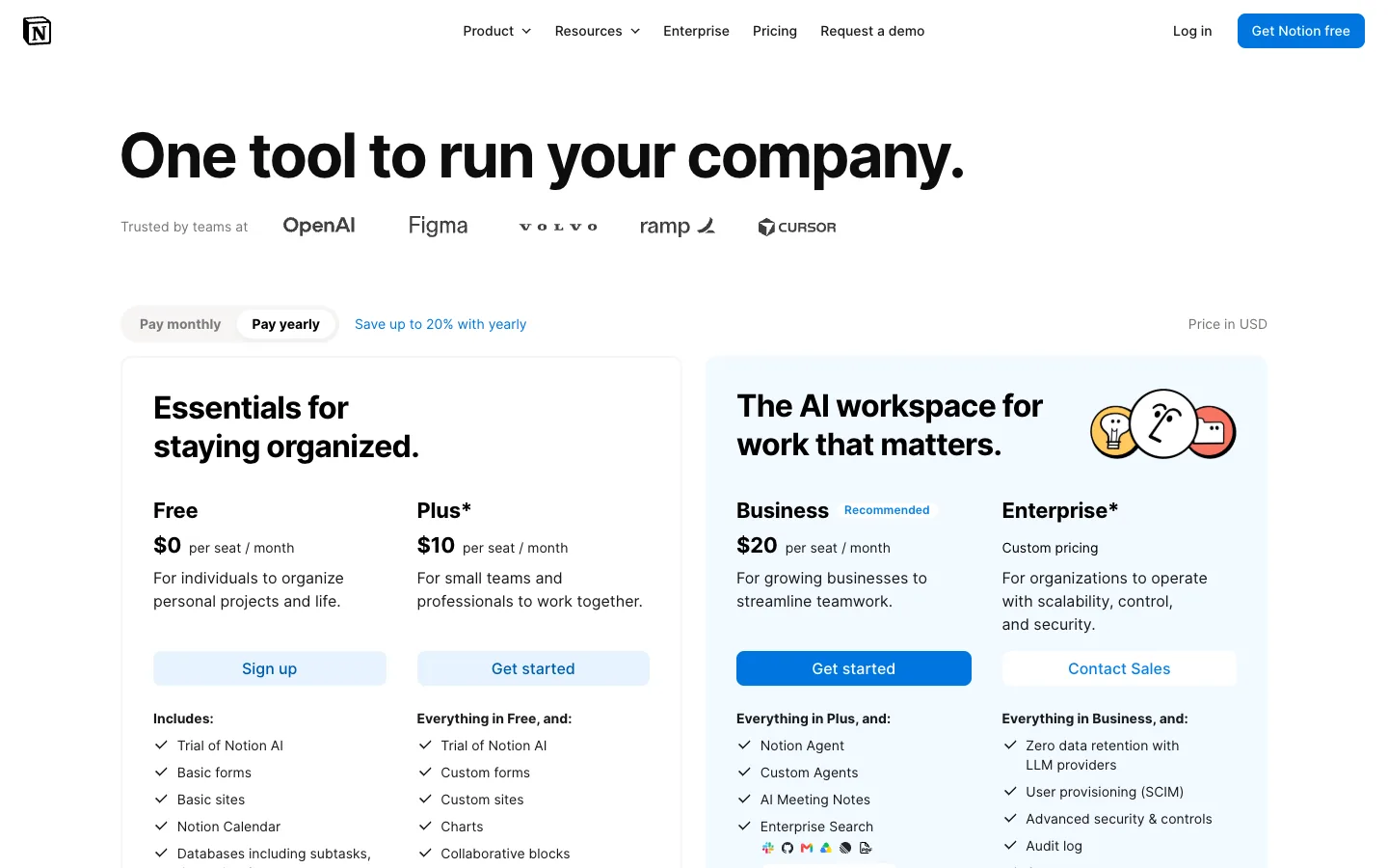
Steal this: Free and Plus sit under "Essentials for staying organized"; Business and Enterprise sit in a tinted panel of their own. A visitor picks a panel first, then a plan. "Save up to 20% with yearly" sits beside the toggle. Where it slips: an Indian visitor gets dollars, with only a small "Price in USD" label.
5. Linear: limits as numbers
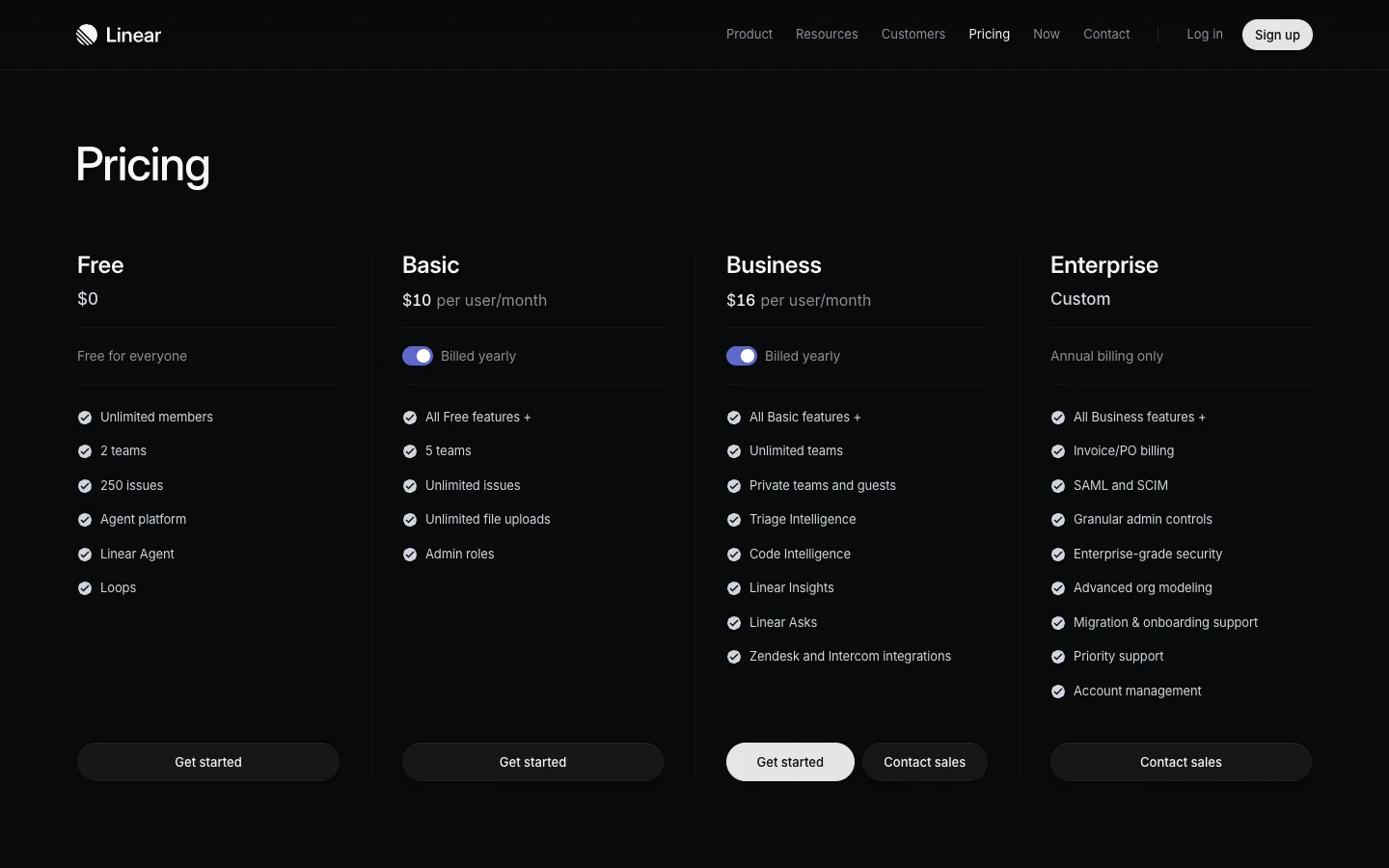
Steal this: Free says "2 teams" and "250 issues"; Basic says "5 teams". A buyer knows the moment they will outgrow a plan. Where it slips: no plan is marked as recommended; the only cue is a lighter button on Business.
6. Figma: a price per role
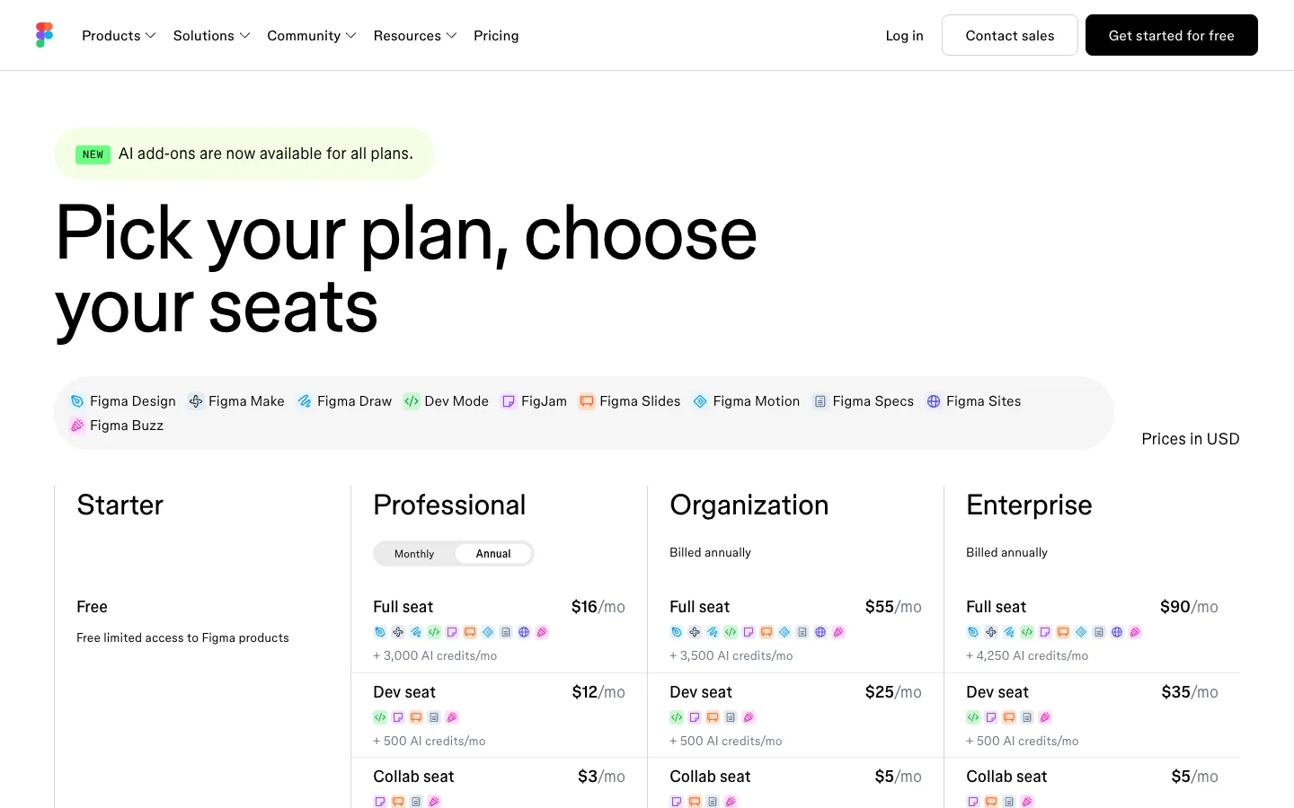
Steal this: if your buyers mix roles, price the roles. On Professional a Full seat is $16 a month, a Dev seat $12, a Collab seat $3, so a team can price designers and reviewers separately. Where it slips: nine seat prices plus AI credit counts is a lot to read before choosing anything.
7. Intercom: a calculator that picks the plan
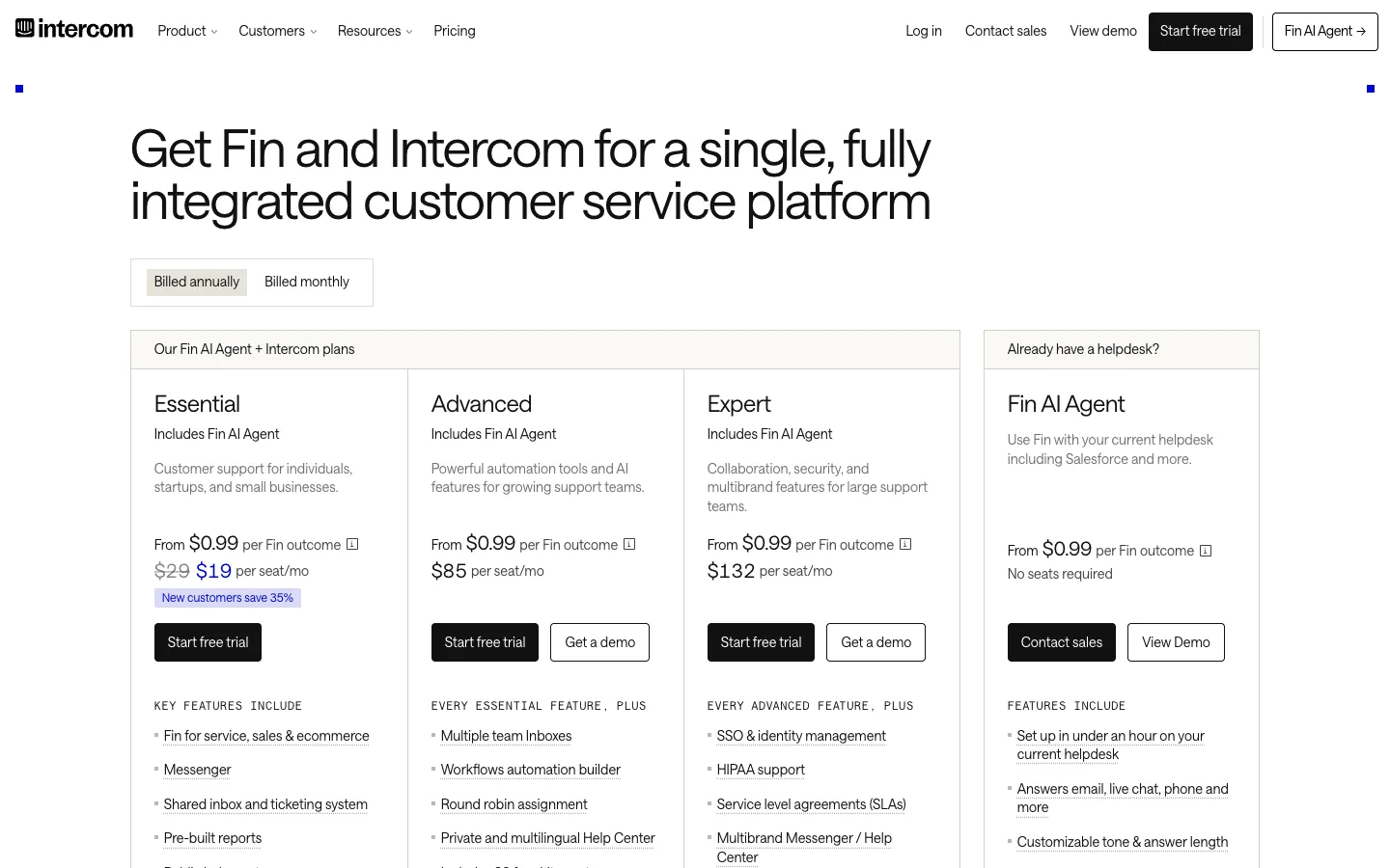
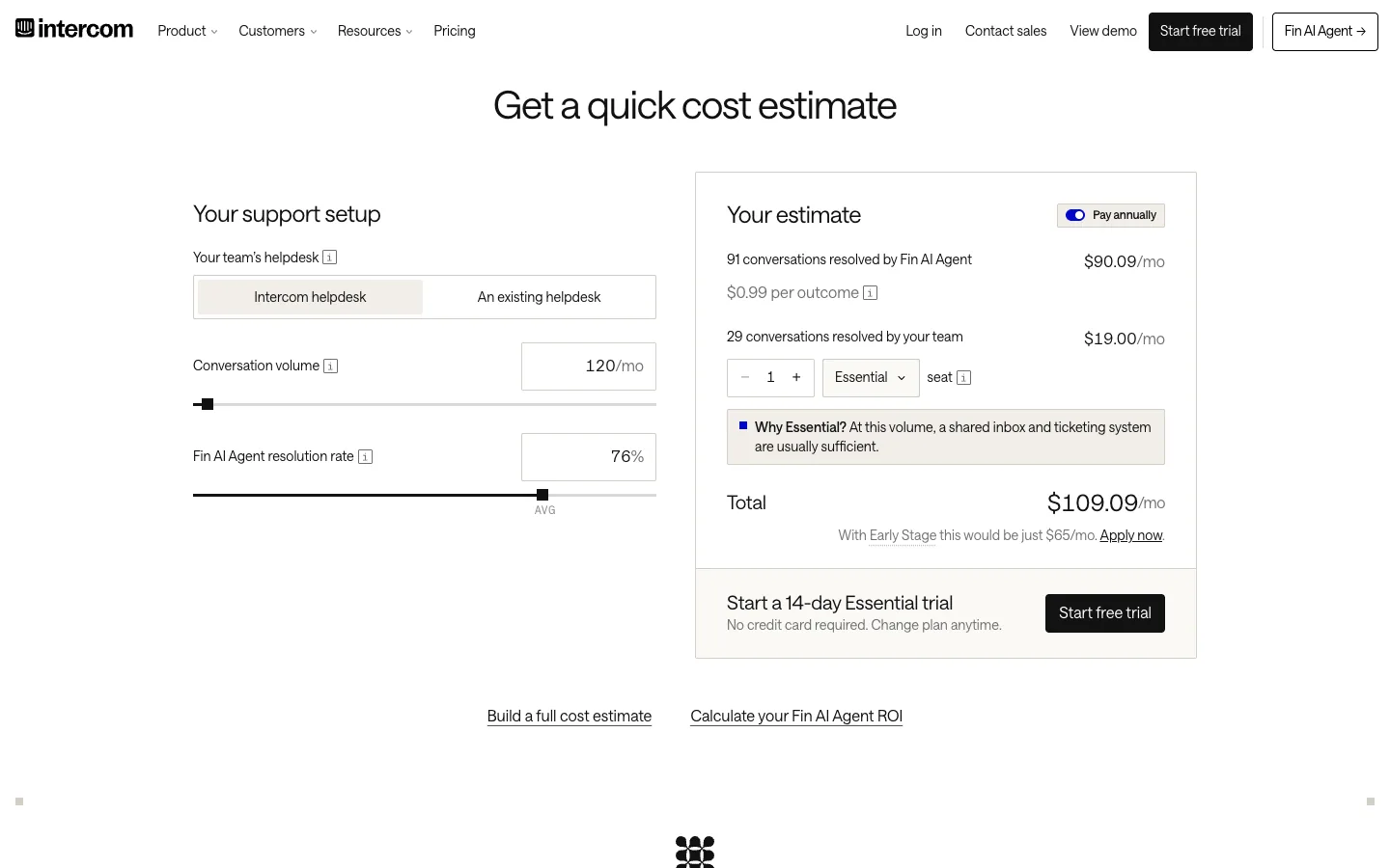
Steal this: for usage pricing, let buyers enter their volume. At 120 conversations a month the estimator shows $109.09 and says why Essential is enough. Where it slips: two price units (per seat, per outcome) on every card make the top of the page harder to compare.
8. Razorpay: anchoring a usage fee
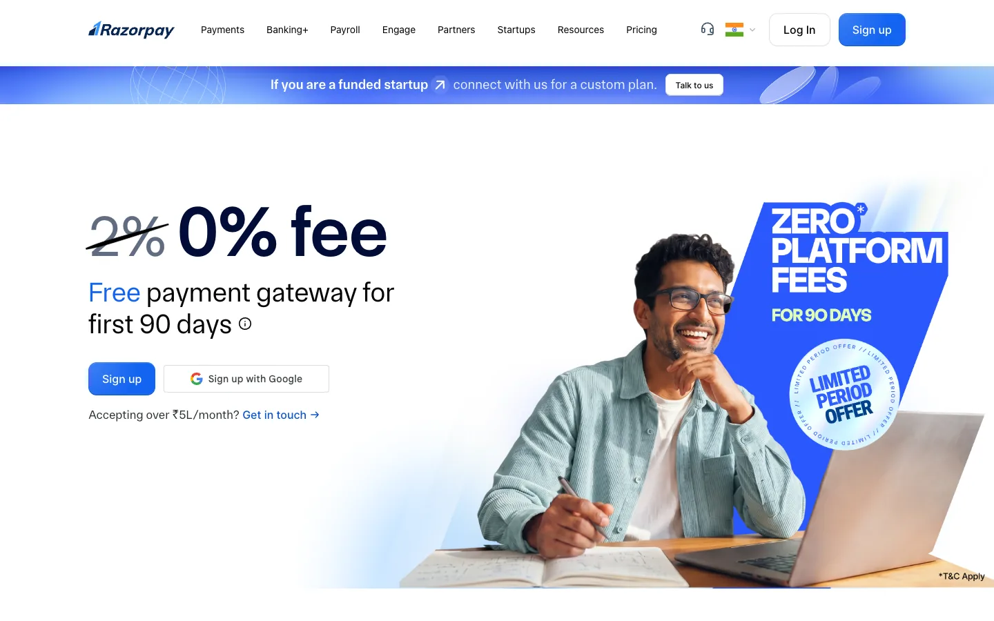
Steal this: the struck "2%" tells you the normal fee while selling the offer. "Accepting over ₹5L/month? Get in touch" routes big merchants to sales without a separate plan, and the page FAQ explains the 2% + GST rate and states a ₹0 setup fee. Where it slips: the offer art takes half the screen.
9. Framer: buttons that name the plan
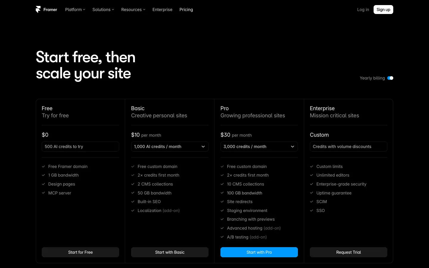
Steal this: each button names its plan ("Start with Basic", "Start with Pro"), and only Pro's is blue. Where it slips: a credits dropdown in every card asks buyers to understand credits before they compare prices. We compared both builders in Framer pricing and Webflow pricing.
What makes buyers pick a plan
- Anchoring. A struck-out price (Slack, Intercom, Razorpay) or a pricier plan beside the target (Zoho's Ultimate) sets the reference point. Use real former or list prices only.
- One recommended plan. Mark it with a badge and the only filled button. Two highlighted plans means none is highlighted.
- An annual toggle that shows the saving. Canva's "Save from 16%" and Notion's "Save up to 20% with yearly" beat a silent toggle like Zoho's.
- A feature comparison below the cards. Cards sell; the table settles doubts. Write limits as numbers or words, not only ticks.
- FAQs on the page. Billing, invoices, GST, seat changes and refunds. Slack, Razorpay, Intercom and Framer all keep them on the pricing page.
- INR for Indian buyers. Slack, Zoho, Canva and Razorpay show rupees; Notion, Linear and Figma show dollars. If you sell in India, show ₹ and say whether GST is included.
- Design the phone view on purpose. Slack and Canva both open on Free on a phone. Put the recommended plan first or keep it visible.
Pricing page design is mostly honest ordering: the plan you want chosen, its price in the buyer's currency, and the answers that remove the last doubt. Our free landing page review checks the main action and the phone view on any page, pricing pages included. For the rest of the site, see our best SaaS websites and product page design examples.
Frequently asked questions
How to display prices on a website?
Show the price in the visitor's currency, with the billing period and tax note next to it, for example "₹2,000 a month + GST". Put plans side by side, mark one as recommended, add a monthly or yearly toggle with the saving stated, and follow the cards with a comparison table and billing FAQs. On phones, keep the recommended plan in the first screen.
How many plans should a pricing page have?
Three or four. Eight of the nine examples above show three or four plans; Razorpay prices by usage instead. Fewer than three leaves no middle option to recommend; more than four makes the comparison hard to read on a phone. If you need more, group them, as Notion does with individual and company plans.
How to present pricing to a client?
For services, lead with the outcome and scope, then show two or three options at different levels, each with what is included and a clear price. Recommend one and say why. Put payment terms, timelines and what costs extra in writing. A client who can compare options picks between them instead of deciding whether to buy at all.
Get a Pricing Page Buyers Can Read.
Share your plans and your current page. Waris will tell you what to reorder and what to cut, or we can design and build the page for you in Webflow.